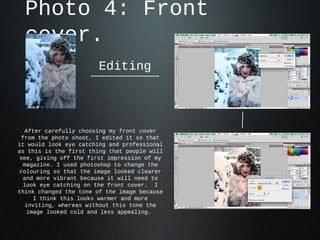
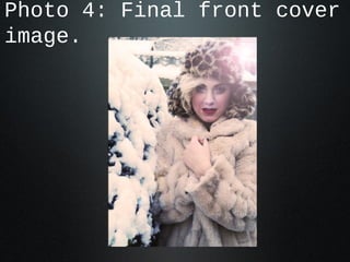
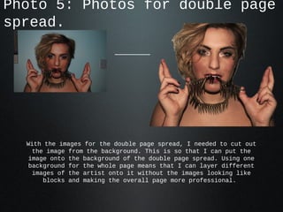
Editing my
     pictures.
  After looking through all my
  pictures I have been able to
select the best ones to edit and
      use in my magazine.
Photo 1:
 My magazine will contain images of album covers     on my
 contents page that I have made on photoshop and     pages.
 My magazine will contain images of album covers     on my
 contents page that I have made on photoshop and     pages.


To edit this photo I changed the colors to ensure the brightness and
  contrast looked more enhanced because the original photo appeared
 too dark. I then copied the photo and flipped it, layering it over
 the original image. I also enlarged it and changed the transparency
 on the top image too create this effect. I added a boarder to make
the image look crisp with a professional finish. I downloaded a font
    from ‘dafont.com’ and added this onto the image, changing the
   spacing so it looked the way the I wanted. I left the text black
 because parts of the image are also black so I thought this looked
                 the most professional and effective.
Photo 2:
My magazine will contain images of album covers   on my
contents page that I have made on photoshop and   pages.
My magazine will contain images of album covers   on my
contents page that I have made on photoshop and   pages.


 With this album cover, I picked the
original image from my photo shoot and
 changed the colouring to a lighter
more pink tone. This matches the calm
music I imagine this band to create. I
then put this image into the frames on
   the background image and added a
title. The title is coloured to match
 the tones in the photo to ensure the
 whole image links together and looks
            professional.
Photo 3:
My magazine will contain an image of another artist on my
contents page.
My magazine will contain an image of another artist on my
contents page.


This image will be used on the contents page to show a variety of
  artists that will be included in the rest of the magazine. The
composition of this image doesn't need an extra editing however I
   did want to change the colour so that it stood out more and
 looked sharper. I did this buy changing the contrast, brightness
                       and tone on Keynote.
Photo 4: Front
  cover.
                       Editing


  After carefully choosing my front cover
 from the photo shoot, I edited it so that
it would look eye catching and professional
as this is the first thing that people will
see, giving off the first impression of my
 magazine. I used photoshop to change the
colouring so that the image looked clearer
 and more vibrant because it will need to
 look eye catching on the front cover. I
think changed the tone of the image because
     I think this looks warmer and more
  inviting, whereas without this tone the
   image looked cold and less appealing.
Photo 4: Final front cover
image.
Photo 5: Photos for double page
spread.


  With the images for the double page spread, I needed to cut out
    the image from the background. This is so that I can put the
   image onto the background of the double page spread. Using one
   background for the whole page means that I can layer different
    images of the artist onto it without the images looking like
       blocks and making the overall page more professional.

Photo edits

  • 1.
    Editing my pictures. After looking through all my pictures I have been able to select the best ones to edit and use in my magazine.
  • 2.
    Photo 1: Mymagazine will contain images of album covers on my contents page that I have made on photoshop and pages. My magazine will contain images of album covers on my contents page that I have made on photoshop and pages. To edit this photo I changed the colors to ensure the brightness and contrast looked more enhanced because the original photo appeared too dark. I then copied the photo and flipped it, layering it over the original image. I also enlarged it and changed the transparency on the top image too create this effect. I added a boarder to make the image look crisp with a professional finish. I downloaded a font from ‘dafont.com’ and added this onto the image, changing the spacing so it looked the way the I wanted. I left the text black because parts of the image are also black so I thought this looked the most professional and effective.
  • 3.
    Photo 2: My magazinewill contain images of album covers on my contents page that I have made on photoshop and pages. My magazine will contain images of album covers on my contents page that I have made on photoshop and pages. With this album cover, I picked the original image from my photo shoot and changed the colouring to a lighter more pink tone. This matches the calm music I imagine this band to create. I then put this image into the frames on the background image and added a title. The title is coloured to match the tones in the photo to ensure the whole image links together and looks professional.
  • 4.
    Photo 3: My magazinewill contain an image of another artist on my contents page. My magazine will contain an image of another artist on my contents page. This image will be used on the contents page to show a variety of artists that will be included in the rest of the magazine. The composition of this image doesn't need an extra editing however I did want to change the colour so that it stood out more and looked sharper. I did this buy changing the contrast, brightness and tone on Keynote.
  • 5.
    Photo 4: Front cover. Editing After carefully choosing my front cover from the photo shoot, I edited it so that it would look eye catching and professional as this is the first thing that people will see, giving off the first impression of my magazine. I used photoshop to change the colouring so that the image looked clearer and more vibrant because it will need to look eye catching on the front cover. I think changed the tone of the image because I think this looks warmer and more inviting, whereas without this tone the image looked cold and less appealing.
  • 6.
    Photo 4: Finalfront cover image.
  • 7.
    Photo 5: Photosfor double page spread. With the images for the double page spread, I needed to cut out the image from the background. This is so that I can put the image onto the background of the double page spread. Using one background for the whole page means that I can layer different images of the artist onto it without the images looking like blocks and making the overall page more professional.