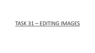
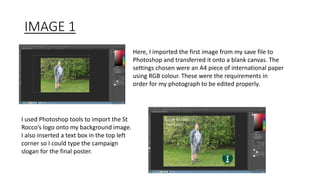
TASK 31 – EDITING IMAGES
IMAGE 1
Here, I imported the first image from my save file to
Photoshop and transferred it onto a blank canvas. The
settings chosen were an A4 piece of international paper
using RGB colour. These were the requirements in
order for my photograph to be edited properly.
I used Photoshop tools to import the St
Rocco’s logo onto my background image.
I also inserted a text box in the top left
corner so I could type the campaign
slogan for the final poster.
IMAGE 1 – CONTINUED
Here, I made some adjustments to ensure that the
image was at the highest definition it could possible be
and brighten up the campaign poster. An eraser tool
was also used on the St Rocco’s logo so that the white
parts were shaded out and the overall logo blended in
with the background.
IMAGE 2
As before, I inserted my second campaign image
onto the blank A4 canvas using RGB colour. This
time however, I haven’t rotated the page as this
image is for the portrait design only. I then
proceeded to re-add the logo an retype the slogan
in the same position as the previous poster.
Once again, I improved the quality of the
photograph using the brightness and contrast
settings to make sure everything was in focus
and was suitable for the summer theme. I also
erased several aspects of the logo to allow it
to blend in amongst the background.
IMAGE 3
On my final image, I carried out the same steps as the
previous two photos. I moved my models body to the left
however to allow a change in position with both the
slogan and charity logo. Same as before, I altered the
brightness settings for deeper quality and blended in the
logo using the eraser tool. This too is a portrait image so
no image rotation was needed here. The same paper
settings have also been used.

Task 31 – editing images

  • 1.
    TASK 31 –EDITING IMAGES
  • 2.
    IMAGE 1 Here, Iimported the first image from my save file to Photoshop and transferred it onto a blank canvas. The settings chosen were an A4 piece of international paper using RGB colour. These were the requirements in order for my photograph to be edited properly. I used Photoshop tools to import the St Rocco’s logo onto my background image. I also inserted a text box in the top left corner so I could type the campaign slogan for the final poster.
  • 3.
    IMAGE 1 –CONTINUED Here, I made some adjustments to ensure that the image was at the highest definition it could possible be and brighten up the campaign poster. An eraser tool was also used on the St Rocco’s logo so that the white parts were shaded out and the overall logo blended in with the background.
  • 4.
    IMAGE 2 As before,I inserted my second campaign image onto the blank A4 canvas using RGB colour. This time however, I haven’t rotated the page as this image is for the portrait design only. I then proceeded to re-add the logo an retype the slogan in the same position as the previous poster. Once again, I improved the quality of the photograph using the brightness and contrast settings to make sure everything was in focus and was suitable for the summer theme. I also erased several aspects of the logo to allow it to blend in amongst the background.
  • 5.
    IMAGE 3 On myfinal image, I carried out the same steps as the previous two photos. I moved my models body to the left however to allow a change in position with both the slogan and charity logo. Same as before, I altered the brightness settings for deeper quality and blended in the logo using the eraser tool. This too is a portrait image so no image rotation was needed here. The same paper settings have also been used.