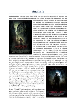
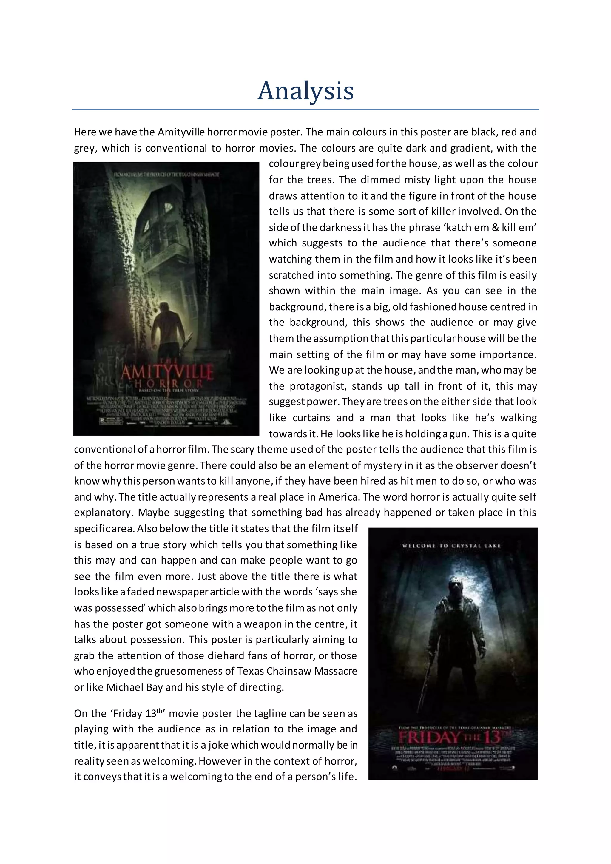
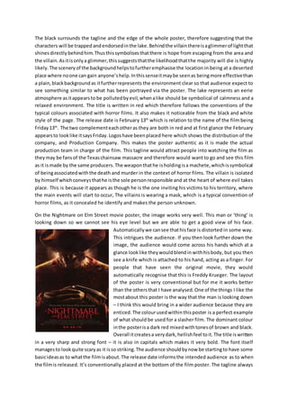
SlideShare a Scribd company logo
Analysis 
Here we have the Amityville horror movie poster. The main colours in this poster are black, red and 
grey, which is conventional to horror movies. The colours are quite dark and gradient, with the 
colour grey being used for the house, as well as the colour 
for the trees. The dimmed misty light upon the house 
draws attention to it and the figure in front of the house 
tells us that there is some sort of killer involved. On the 
side of the darkness it has the phrase ‘katch em & kill em’ 
which suggests to the audience that there’s someone 
watching them in the film and how it looks like it’s been 
scratched into something. The genre of this film is easily 
shown within the main image. As you can see in the 
background, there is a big, old fashioned house centred in 
the background, this shows the audience or may give 
them the assumption that this particular house will be the 
main setting of the film or may have some importance. 
We are looking up at the house, and the man, who may be 
the protagonist, stands up tall in front of it, this may 
suggest power. They are trees on the either side that look 
like curtains and a man that looks like he’s walking 
towards it. He looks like he is holding a gun. This is a quite 
conventional of a horror film. The scary theme used of the poster tells the audience that this film is 
of the horror movie genre. There could also be an element of mystery in it as the observer doesn’t 
know why this person wants to kill anyone, if they have been hired as hit men to do so, or who was 
and why. The title actually represents a real place in America. The word horror is actually quite self 
explanatory. Maybe suggesting that something bad has already happened or taken place in this 
specific area. Also below the title it states that the film itself 
is based on a true story which tells you that something like 
this may and can happen and can make people want to go 
see the film even more. Just above the title there is what 
looks like a faded newspaper article with the words ‘says she 
was possessed’ which also brings more to the film as not only 
has the poster got someone with a weapon in the centre, it 
talks about possession. This poster is particularly aiming to 
grab the attention of those diehard fans of horror, or those 
who enjoyed the gruesomeness of Texas Chainsaw Massacre 
or like Michael Bay and his style of directing. 
On the ‘Friday 13th’ movie poster the tagline can be seen as 
playing with the audience as in relation to the image and 
title, it is apparent that it is a joke which would normally be in 
reality seen as welcoming. However in the context of horror, 
it conveys that it is a welcoming to the end of a person’s life.
The black surrounds the tagline and the edge of the whole poster, therefore suggesting that the 
characters will be trapped and endorsed in the lake. Behind the villain there is a glimmer of light that 
shines directly behind him. Thus this symbolises that there is hope from escaping from the area and 
the villain. As it is only a glimmer, this suggests that the likelihood that the majority will die is highly 
likely. The scenery of the background helps to further emphasise the location in being at a deserted 
place where no one can gain anyone’s help. In this sense it may be seen as being more effective than 
a plain, black background as it further represents the environment clear so that audience expect to 
see something similar to what has been portrayed via the poster. The lake represents an eerie 
atmosphere as it appears to be polluted by evil, when a like should be symbolical of calmness and a 
relaxed environment. The title is written in red which therefore follows the conventions of the 
typical colours associated with horror films. It also makes it noticeable from the black and white 
style of the page. The release date is February 13th which is relation to the name of the film being 
Friday 13th. The two complement each other as they are both in red and at first glance the February 
appears to look like it says Friday. Logos have been placed here which shows the distribution of the 
company, and Production Company. This makes the poster authentic as it is made the actual 
production team in charge of the film. This tagline would attract people into watching the film as 
they may be fans of the Texas chainsaw massacre and therefore would want to go and see this film 
as it is made by the same producers. The weapon that he is holding is a machete, which is symbolical 
of being associated with the death and murder in the context of horror films. The villain is isolated 
by himself which conveys that he is the sole person responsible and at the heart of where evil takes 
place. This is because it appears as though he is the one inviting his victims to his territory, where 
the main events will start to occur, The villains is wearing a mask, which is a typical convention of 
horror films, as it concealed he identify and makes the person unknown. 
On the Nightmare on Elm Street movie poster, the image works very well. This man or ‘thing’ is 
looking down so we cannot see his eye level but we are able to get a good view of his face. 
Automatically we can see that his face is distorted in some way. 
This intrigues the audience. If you then look further down the 
image, the audience would come across his hands which at a 
glance look like they would blend in with his body, but you then 
see a knife which is attached to his hand, acting as a finger. For 
people that have seen the original movie, they would 
automatically recognise that this is Freddy Krueger. The layout 
of the poster is very conventional but for me it works better 
than the others that I have analysed. One of the things I like the 
most about this poster is the way that the man is looking down 
– I think this would bring in a wider audience because they are 
enticed. The colour used within this poster is a perfect example 
of what should be used for a slasher film. The dominant colour 
in the poster is a dark red mixed with tones of brown and black. 
Overall it creates a very dark, hellish feel to it. The title is written 
in a very sharp and strong font – it is also in capitals which makes it very bold. The font itself 
manages to look quite scary as it is so striking. The audience should by now be starting to have some 
basic ideas as to what the film is about. The release date informs the intended audience as to when 
the film is released. It’s conventionally placed at the bottom of the film poster. The tagline always
follows the title as it gives us a small inclination into the storyline. The audience will look at this 
poster and automatically link the phrase ‘new nightmare’ to the grotesque looking man above. 
There’s a small section of writing on the bottom right of the poster; this shows the studio the film 
producers have worked with. If a particular studio is advertised then it may attract certain people 
that like other films produced by these companies. Nightmare on Elm Street is directed by Samuel 
Bayer and distributed by New Line Cinema; therefore fans of Samuel Bayer and New Line Cinema 
entertainment would see the distribution and would be attracted into watching their latest film. 
On the magazine cover analysis I decided to focus on Empire’s “I Am Legend” edition. On this front 
cover we can see a clear red and white theme with the typography and the use of red connotates 
danger and hints to the themes of the film. The use of white typography stands out against the dark 
background of the image. The white typography has 
also been made to look like it is light in the fog. There is 
fog present in the image and so therefore the 
typography anchors with the image. The use of the fog 
in the image further adds to the mystery and unnerving 
nature of the image. The connotations of fog are 
generally mystery and the future being unclear and 
unknown. Looking at these connotations that viewer 
will be able to perceive that the movie contains horror 
or thriller aspects and therefore can decipher the genre 
of the film. The date and price have been made to fit 
within the title, but the masthead of the magazine is 
dominant. The viewer can easily see that ‘I Am Legend’ 
is the film being focused on in this issue of empire. It is 
written in bold typography so it stands out against the 
dark jacket Will Smith is wearing. It is clear that Will 
Smith is the main character in ‘I Am Legend’ as he is the 
only character from the movie to appear on this front cover edition. He is the centre of the cover 
and the audience can also tell that he is of great importance as he is in front of the magazine 
masthead; further drawing attention to him. There is very short description of the basics of the 
movie, the location ‘New York’ and the genre ‘Sci -Fi Horror’. This will immediately inform the viewer 
what the movie will be like and about. The viewer can clearly see that the character is holding a gun 
in the image. Usually weapons are seen as a sign of power and masculinity, but in this image the 
character has his finger ion the trigger (as he can sense or is expecting something bad to jump out at 
him or take place, therefore holding the trigger as a sign that he is prepared to defend himself) and 
the character does not appear to be standing in a masculine way. This could signify that the 
character feels inferior to something, but as this is not included in the cover image it creates a sense 
of enigma. The backlighting in the image creates silhouettes behind the main character. This creates 
a sense of light vs. dark, Will Smith being the light as we can clearly see him (and therefore the good 
in the movie). The use of the silhouettes also creates a sense of mystery and danger as the viewer 
cannot tell what it is, but can tell from the outline that it looks quite threatening. 
In Total Films ‘Shutter Island’ edition, the main image of the film consists of a long wide shot of the 
leading actor Leonardo Di Caprio posed as his character Teddy Daniels. He i s standing on a rock 
empowered by the fog around him, looking downwards; behind him is an island with a lighthouse
built onto it. The image instantly relates to the film title. We are shown straight away that that this is 
where our narrative will take place. The sell line above the film reads “Leo takes over the asylum!” 
This gives us another indication of the films narrative. We 
can picture that on the island in which Di Caprio’s character 
is on is some sort of dysfunctional mental asylum. We can 
further develop out idea of the narrative as Di Capri has a 
police badge on his belt and a gun in his hand. This shows 
that Teddy Daniels is some sort of police officer who us 
investigating the asylum. The gu8n represents that there is 
some sort of threat existing on the island. The mist that 
surrounds the island represents an unknown element. This 
could mean that there is some sort of mystery involved in 
the island. This would imply that the shutter island narrative 
falls under the crime/thriller genre. We therefore are able to 
establish a target audience for the film. The main image is 
able to sell itself to the target audience as they would be 
interested in this sort of narrative. Leonardo Di Caprio is 
however the main selling point of this film due to his 
reputation of being a massive top rated Hollywood actor. This brings a large number of Leonardo 
fans that are attracted to this film because he features in it. The film title that appears on this front 
cover is similar to the one which is on the films official poster. The blocked and bold red colours 
which appear in both this front cover and the island appear once more. This creates a symbiotic link 
between these two promotional media texts as people will be able to distinguish the film through 
these two pieces of iconography. The magazines masthead is in huge upper case letters and is placed 
at the top of the front cover, conventionally so. The white stands out against the dark blue setting of 
the main image allowing it to become striking in the view. The total in the masthead uses the 
background of the main image to allow it to stand out against the white text, a smart method used. 
Despite Leonardo’s covering up some part of the masthead, it is still easily recognisable, as the 
masthead is still shown the same as other previous editions to keep that familiarity and consistency. 
One trailer that I looked at 
was the Friday the 13th 
(2009) teaser trailer. From 
0:09 to 0:13 of the “Friday 
13th” official teaser trailer, 
there are non diegetic 
sounds of birds tweeting. 
This could connote that 
there is an intruder. There 
is also an establishing shot 
of the lake. The lake looks 
very peaceful but this could 
be a symbol that the 
darkness is descending and 
unusual events are about to take place. At 0:15 there is a fade to black transition. It cuts away from
the lake, which implies that the events will now start to happen. From 0:18 to 0:21 there is a non 
diegetic sound which is low and continuous for three rough seconds. This could represent the wind 
surrounding the cabin which is shown in the next scene. At 0:19 there is a point of view shot of a 
disintegrated shot of a mysterious looking light and the background is completely black which 
implies and that there could be something there and the audience can see it. At 0:21 to 0:22 there 
are two images shown by a long shot and its showing the cabin (a horror concept) in two different 
angles this could be to show the audience that the cabin is completely isolated which suggests that 
there may be a killer in there. From 0:22 to 0:24 there is a voiceover of a woman telling the history 
about her son drowning in the lake, here we can see the narrative being told, that way the trailer is 
shortly selling the story to the audience. At 27 seconds there is a creaky door, which is another 
horror concept. Starting at 0:28 and going on to 0:52 there is a voiceover echoed from what 
assumedly must have been a past interview or hearing, it gives context that a boy named Jason 
drowned at Camp Crystal Lake. As the voiceover continues there is a flash of white light which is 
later revealed in the next scene. It is a torch which could connote that there is somebody missing. 
This same flash of light is repeated at 0:59. At 0:29 there is a diegetic sound of someone scared, 
running, this makes it out to be a chase scene. At 0:34 there is a doll on the ground. The doll may 
represent childhood and the feeling of wanting to be young again, this could relate to Jason’s victims 
as he targets and kills young people. In a way, this coul d also relate to Jason’s childhood, as he 
drowned at Camp Crystal Lake due to the negligence of the camp staff. At 0:39 there is an inter-title 
of the director ‘Michael Bay’, this is used in the trailer as a different piece of advertising. Michael Bay 
is a very well known director due to his work in some films such as Pearl Harbour, the Bad Boys 
franchise and Armageddon. This strap may be used to convince those that are fans of Michael Bay 
movies, to go and watch this one. From 0:40 there are collages of the action that is to feature in the 
film, each last a second and show a montages of what’s to happen in the film. 59 seconds into the 
trailer the audience first see a glimpse of the killer, Jason jumps into the scene standing underneath 
a flickering light bulb, which is suppose to make the audience jump as his appearance is unexpected. 
Another trailer I looked at was the Texas 
Chainsaw Massacre (2013) teaser trailer.

More Related Content

What's hot

Poster Analysis
Poster AnalysisPoster Analysis
Poster Analysis
guestfe9cdb8
 
Scream film poster analysis
Scream film poster analysisScream film poster analysis
Scream film poster analysisMollyBloxham
 
Horror film poster analysis
Horror film poster analysisHorror film poster analysis
Horror film poster analysis
ErinHunter98
 
The conjuring – semiotic analysis of movie poster
The conjuring – semiotic analysis of movie posterThe conjuring – semiotic analysis of movie poster
The conjuring – semiotic analysis of movie poster
rsheeres
 
Horror Film Poster Analysis
Horror Film Poster AnalysisHorror Film Poster Analysis
Horror Film Poster Analysis
08beguma
 
Horror Film Poster Analysis
Horror Film Poster AnalysisHorror Film Poster Analysis
Horror Film Poster Analysis
08beguma
 
Science Fiction Film Poster Analysis
Science Fiction Film Poster AnalysisScience Fiction Film Poster Analysis
Science Fiction Film Poster AnalysisTom Chamberlain
 
Poster analysis a nightmare on elm street
Poster analysis a nightmare on elm streetPoster analysis a nightmare on elm street
Poster analysis a nightmare on elm street
Shauna-Mullen
 
Analysis of horror movie posters
Analysis of horror movie postersAnalysis of horror movie posters
Analysis of horror movie postersHeworthMedia1
 
Film poster analysis
Film poster analysisFilm poster analysis
Film poster analysis
lstafford97
 
poster analysis texas chainsaw 3D
poster analysis texas chainsaw 3Dposter analysis texas chainsaw 3D
poster analysis texas chainsaw 3D
Shauna-Mullen
 
Pitch for "The Girl in Red"
Pitch for "The Girl in Red"Pitch for "The Girl in Red"
Pitch for "The Girl in Red"
JaniceBournez
 
Film posters for the genre Sci-Fi
Film posters for the genre Sci-FiFilm posters for the genre Sci-Fi
Film posters for the genre Sci-Fibmillards06
 
Poster conventions powerpoint
Poster conventions powerpointPoster conventions powerpoint
Poster conventions powerpointS912216
 
Film Poster Analysis
Film Poster AnalysisFilm Poster Analysis
Film Poster Analysiskymberlyjadet
 
Movie Posters
Movie PostersMovie Posters
Movie Posters
naomi_pierce
 
Film posters for the genre Sci-Fi
Film posters for the genre Sci-FiFilm posters for the genre Sci-Fi
Film posters for the genre Sci-Fibmillards06
 
Conventions of the sub – genre slasher
Conventions of the sub – genre slasherConventions of the sub – genre slasher
Conventions of the sub – genre slasher
Kalgani
 

What's hot (20)

Poster Analysis
Poster AnalysisPoster Analysis
Poster Analysis
 
Scream film poster analysis
Scream film poster analysisScream film poster analysis
Scream film poster analysis
 
Horror film poster analysis
Horror film poster analysisHorror film poster analysis
Horror film poster analysis
 
The conjuring – semiotic analysis of movie poster
The conjuring – semiotic analysis of movie posterThe conjuring – semiotic analysis of movie poster
The conjuring – semiotic analysis of movie poster
 
Horror Film Poster Analysis
Horror Film Poster AnalysisHorror Film Poster Analysis
Horror Film Poster Analysis
 
Horror Film Poster Analysis
Horror Film Poster AnalysisHorror Film Poster Analysis
Horror Film Poster Analysis
 
Science Fiction Film Poster Analysis
Science Fiction Film Poster AnalysisScience Fiction Film Poster Analysis
Science Fiction Film Poster Analysis
 
Poster analysis a nightmare on elm street
Poster analysis a nightmare on elm streetPoster analysis a nightmare on elm street
Poster analysis a nightmare on elm street
 
Analysis of horror movie posters
Analysis of horror movie postersAnalysis of horror movie posters
Analysis of horror movie posters
 
Poster Analysis
Poster AnalysisPoster Analysis
Poster Analysis
 
Film poster analysis
Film poster analysisFilm poster analysis
Film poster analysis
 
poster analysis texas chainsaw 3D
poster analysis texas chainsaw 3Dposter analysis texas chainsaw 3D
poster analysis texas chainsaw 3D
 
Research Into Film Posters
Research Into Film PostersResearch Into Film Posters
Research Into Film Posters
 
Pitch for "The Girl in Red"
Pitch for "The Girl in Red"Pitch for "The Girl in Red"
Pitch for "The Girl in Red"
 
Film posters for the genre Sci-Fi
Film posters for the genre Sci-FiFilm posters for the genre Sci-Fi
Film posters for the genre Sci-Fi
 
Poster conventions powerpoint
Poster conventions powerpointPoster conventions powerpoint
Poster conventions powerpoint
 
Film Poster Analysis
Film Poster AnalysisFilm Poster Analysis
Film Poster Analysis
 
Movie Posters
Movie PostersMovie Posters
Movie Posters
 
Film posters for the genre Sci-Fi
Film posters for the genre Sci-FiFilm posters for the genre Sci-Fi
Film posters for the genre Sci-Fi
 
Conventions of the sub – genre slasher
Conventions of the sub – genre slasherConventions of the sub – genre slasher
Conventions of the sub – genre slasher
 

Similar to Analyse existing media texts

Poster Analysis Three
Poster Analysis ThreePoster Analysis Three
Poster Analysis Three
StephanieAlabi
 
POSTER ANALYSIS - THE AMITYVILLE HORROR
POSTER ANALYSIS - THE AMITYVILLE HORRORPOSTER ANALYSIS - THE AMITYVILLE HORROR
POSTER ANALYSIS - THE AMITYVILLE HORROR
scarletthayward
 
Horror poster analysis
Horror poster analysisHorror poster analysis
Horror poster analysisamiie666
 
Halloween poster analysis sasiane saku
Halloween poster analysis sasiane sakuHalloween poster analysis sasiane saku
Halloween poster analysis sasiane saku
sapphire29
 
Film Poster Overview
Film Poster OverviewFilm Poster Overview
Film Poster Overview
scarletthayward
 
Film Poster Overview
Film Poster OverviewFilm Poster Overview
Film Poster Overview
scarletthayward
 
Magazine analysis
Magazine analysisMagazine analysis
Magazine analysis
Stephen Adu-Boahene
 
Media Radials
Media RadialsMedia Radials
Media RadialsGreenshaw
 
Media radials
Media radialsMedia radials
Media radialsGreenshaw
 
Media Radials
Media RadialsMedia Radials
Media RadialsGreenshaw
 
Analysis Of 3 Ancillary Products
Analysis Of 3 Ancillary ProductsAnalysis Of 3 Ancillary Products
Analysis Of 3 Ancillary Products
alltimejas
 
Poster Analysis 1
Poster Analysis 1Poster Analysis 1
Poster Analysis 1
Kalgani
 
Film mag analysis 1
Film mag analysis 1Film mag analysis 1
Film mag analysis 1uzzthekid
 
Poster Analysis 1
Poster Analysis 1Poster Analysis 1
Poster Analysis 1
Kalgani
 
Horror Film Posters Analysis
Horror Film Posters AnalysisHorror Film Posters Analysis
Horror Film Posters Analysisnatericafaria
 
Analysis of existing horror posters
Analysis of existing horror postersAnalysis of existing horror posters
Analysis of existing horror posters
Karanveer Sohal
 
20.Poster Analysis - Friday the 13th
20.Poster Analysis - Friday the 13th 20.Poster Analysis - Friday the 13th
20.Poster Analysis - Friday the 13th
Bradley22
 
Research Film Representation Powerpoint
Research Film Representation PowerpointResearch Film Representation Powerpoint
Research Film Representation PowerpointJordan Milson
 
Horror poster research
Horror poster researchHorror poster research
Horror poster research
charlie1234512435
 

Similar to Analyse existing media texts (20)

Film posters powerpoint
Film posters powerpointFilm posters powerpoint
Film posters powerpoint
 
Poster Analysis Three
Poster Analysis ThreePoster Analysis Three
Poster Analysis Three
 
POSTER ANALYSIS - THE AMITYVILLE HORROR
POSTER ANALYSIS - THE AMITYVILLE HORRORPOSTER ANALYSIS - THE AMITYVILLE HORROR
POSTER ANALYSIS - THE AMITYVILLE HORROR
 
Horror poster analysis
Horror poster analysisHorror poster analysis
Horror poster analysis
 
Halloween poster analysis sasiane saku
Halloween poster analysis sasiane sakuHalloween poster analysis sasiane saku
Halloween poster analysis sasiane saku
 
Film Poster Overview
Film Poster OverviewFilm Poster Overview
Film Poster Overview
 
Film Poster Overview
Film Poster OverviewFilm Poster Overview
Film Poster Overview
 
Magazine analysis
Magazine analysisMagazine analysis
Magazine analysis
 
Media Radials
Media RadialsMedia Radials
Media Radials
 
Media radials
Media radialsMedia radials
Media radials
 
Media Radials
Media RadialsMedia Radials
Media Radials
 
Analysis Of 3 Ancillary Products
Analysis Of 3 Ancillary ProductsAnalysis Of 3 Ancillary Products
Analysis Of 3 Ancillary Products
 
Poster Analysis 1
Poster Analysis 1Poster Analysis 1
Poster Analysis 1
 
Film mag analysis 1
Film mag analysis 1Film mag analysis 1
Film mag analysis 1
 
Poster Analysis 1
Poster Analysis 1Poster Analysis 1
Poster Analysis 1
 
Horror Film Posters Analysis
Horror Film Posters AnalysisHorror Film Posters Analysis
Horror Film Posters Analysis
 
Analysis of existing horror posters
Analysis of existing horror postersAnalysis of existing horror posters
Analysis of existing horror posters
 
20.Poster Analysis - Friday the 13th
20.Poster Analysis - Friday the 13th 20.Poster Analysis - Friday the 13th
20.Poster Analysis - Friday the 13th
 
Research Film Representation Powerpoint
Research Film Representation PowerpointResearch Film Representation Powerpoint
Research Film Representation Powerpoint
 
Horror poster research
Horror poster researchHorror poster research
Horror poster research
 

More from tonym17

Evaluation part2
Evaluation  part2Evaluation  part2
Evaluation part2
tonym17
 
camera lighting and soundsc
camera lighting and soundsccamera lighting and soundsc
camera lighting and soundsc
tonym17
 
film trailer overview
film trailer overviewfilm trailer overview
film trailer overview
tonym17
 
Grim tagline
Grim taglineGrim tagline
Grim tagline
tonym17
 
Call sheet
Call sheetCall sheet
Call sheet
tonym17
 
History of horror [recovered]
History of horror [recovered]History of horror [recovered]
History of horror [recovered]
tonym17
 
r plTrailer planning
r plTrailer planningr plTrailer planning
r plTrailer planning
tonym17
 
Slasher
SlasherSlasher
Slasher
tonym17
 
m Costume, hair & make up
m Costume, hair & make upm Costume, hair & make up
m Costume, hair & make up
tonym17
 
b genre research, slasherSlasher research
b genre research, slasherSlasher   researchb genre research, slasherSlasher   research
b genre research, slasherSlasher research
tonym17
 
Mood board
Mood boardMood board
Mood board
tonym17
 
Introduction to sub genres
Introduction to sub genresIntroduction to sub genres
Introduction to sub genres
tonym17
 
Pitch presentation
Pitch presentationPitch presentation
Pitch presentation
tonym17
 
Case study
Case studyCase study
Case study
tonym17
 
Director case study
Director case studyDirector case study
Director case study
tonym17
 
Horror film questionnaire
Horror film questionnaireHorror film questionnaire
Horror film questionnaire
tonym17
 
Poster overview
Poster overviewPoster overview
Poster overview
tonym17
 
Magazine overview
Magazine overviewMagazine overview
Magazine overview
tonym17
 
Focus group presentation
Focus group presentationFocus group presentation
Focus group presentation
tonym17
 
Target audience profile
Target audience profileTarget audience profile
Target audience profile
tonym17
 

More from tonym17 (20)

Evaluation part2
Evaluation  part2Evaluation  part2
Evaluation part2
 
camera lighting and soundsc
camera lighting and soundsccamera lighting and soundsc
camera lighting and soundsc
 
film trailer overview
film trailer overviewfilm trailer overview
film trailer overview
 
Grim tagline
Grim taglineGrim tagline
Grim tagline
 
Call sheet
Call sheetCall sheet
Call sheet
 
History of horror [recovered]
History of horror [recovered]History of horror [recovered]
History of horror [recovered]
 
r plTrailer planning
r plTrailer planningr plTrailer planning
r plTrailer planning
 
Slasher
SlasherSlasher
Slasher
 
m Costume, hair & make up
m Costume, hair & make upm Costume, hair & make up
m Costume, hair & make up
 
b genre research, slasherSlasher research
b genre research, slasherSlasher   researchb genre research, slasherSlasher   research
b genre research, slasherSlasher research
 
Mood board
Mood boardMood board
Mood board
 
Introduction to sub genres
Introduction to sub genresIntroduction to sub genres
Introduction to sub genres
 
Pitch presentation
Pitch presentationPitch presentation
Pitch presentation
 
Case study
Case studyCase study
Case study
 
Director case study
Director case studyDirector case study
Director case study
 
Horror film questionnaire
Horror film questionnaireHorror film questionnaire
Horror film questionnaire
 
Poster overview
Poster overviewPoster overview
Poster overview
 
Magazine overview
Magazine overviewMagazine overview
Magazine overview
 
Focus group presentation
Focus group presentationFocus group presentation
Focus group presentation
 
Target audience profile
Target audience profileTarget audience profile
Target audience profile
 

Recently uploaded

Supporting (UKRI) OA monographs at Salford.pptx
Supporting (UKRI) OA monographs at Salford.pptxSupporting (UKRI) OA monographs at Salford.pptx
Supporting (UKRI) OA monographs at Salford.pptx
Jisc
 
aaaaaaaaaaaaaaaaaaaaaaaaaaaaaaaaaaaaaaaaa
aaaaaaaaaaaaaaaaaaaaaaaaaaaaaaaaaaaaaaaaaaaaaaaaaaaaaaaaaaaaaaaaaaaaaaaaaaaaaaaaaa
aaaaaaaaaaaaaaaaaaaaaaaaaaaaaaaaaaaaaaaaa
siemaillard
 
The French Revolution Class 9 Study Material pdf free download
The French Revolution Class 9 Study Material pdf free downloadThe French Revolution Class 9 Study Material pdf free download
The French Revolution Class 9 Study Material pdf free download
Vivekanand Anglo Vedic Academy
 
Thesis Statement for students diagnonsed withADHD.ppt
Thesis Statement for students diagnonsed withADHD.pptThesis Statement for students diagnonsed withADHD.ppt
Thesis Statement for students diagnonsed withADHD.ppt
EverAndrsGuerraGuerr
 
Sha'Carri Richardson Presentation 202345
Sha'Carri Richardson Presentation 202345Sha'Carri Richardson Presentation 202345
Sha'Carri Richardson Presentation 202345
beazzy04
 
Unit 2- Research Aptitude (UGC NET Paper I).pdf
Unit 2- Research Aptitude (UGC NET Paper I).pdfUnit 2- Research Aptitude (UGC NET Paper I).pdf
Unit 2- Research Aptitude (UGC NET Paper I).pdf
Thiyagu K
 
Template Jadual Bertugas Kelas (Boleh Edit)
Template Jadual Bertugas Kelas (Boleh Edit)Template Jadual Bertugas Kelas (Boleh Edit)
Template Jadual Bertugas Kelas (Boleh Edit)
rosedainty
 
How to Break the cycle of negative Thoughts
How to Break the cycle of negative ThoughtsHow to Break the cycle of negative Thoughts
How to Break the cycle of negative Thoughts
Col Mukteshwar Prasad
 
Ethnobotany and Ethnopharmacology ......
Ethnobotany and Ethnopharmacology ......Ethnobotany and Ethnopharmacology ......
Ethnobotany and Ethnopharmacology ......
Ashokrao Mane college of Pharmacy Peth-Vadgaon
 
How to Split Bills in the Odoo 17 POS Module
How to Split Bills in the Odoo 17 POS ModuleHow to Split Bills in the Odoo 17 POS Module
How to Split Bills in the Odoo 17 POS Module
Celine George
 
Synthetic Fiber Construction in lab .pptx
Synthetic Fiber Construction in lab .pptxSynthetic Fiber Construction in lab .pptx
Synthetic Fiber Construction in lab .pptx
Pavel ( NSTU)
 
MARUTI SUZUKI- A Successful Joint Venture in India.pptx
MARUTI SUZUKI- A Successful Joint Venture in India.pptxMARUTI SUZUKI- A Successful Joint Venture in India.pptx
MARUTI SUZUKI- A Successful Joint Venture in India.pptx
bennyroshan06
 
Operation Blue Star - Saka Neela Tara
Operation Blue Star   -  Saka Neela TaraOperation Blue Star   -  Saka Neela Tara
Operation Blue Star - Saka Neela Tara
Balvir Singh
 
How to Make a Field invisible in Odoo 17
How to Make a Field invisible in Odoo 17How to Make a Field invisible in Odoo 17
How to Make a Field invisible in Odoo 17
Celine George
 
The Art Pastor's Guide to Sabbath | Steve Thomason
The Art Pastor's Guide to Sabbath | Steve ThomasonThe Art Pastor's Guide to Sabbath | Steve Thomason
The Art Pastor's Guide to Sabbath | Steve Thomason
Steve Thomason
 
The Challenger.pdf DNHS Official Publication
The Challenger.pdf DNHS Official PublicationThe Challenger.pdf DNHS Official Publication
The Challenger.pdf DNHS Official Publication
Delapenabediema
 
Digital Tools and AI for Teaching Learning and Research
Digital Tools and AI for Teaching Learning and ResearchDigital Tools and AI for Teaching Learning and Research
Digital Tools and AI for Teaching Learning and Research
Vikramjit Singh
 
2024.06.01 Introducing a competency framework for languag learning materials ...
2024.06.01 Introducing a competency framework for languag learning materials ...2024.06.01 Introducing a competency framework for languag learning materials ...
2024.06.01 Introducing a competency framework for languag learning materials ...
Sandy Millin
 
GIÁO ÁN DẠY THÊM (KẾ HOẠCH BÀI BUỔI 2) - TIẾNG ANH 8 GLOBAL SUCCESS (2 CỘT) N...
GIÁO ÁN DẠY THÊM (KẾ HOẠCH BÀI BUỔI 2) - TIẾNG ANH 8 GLOBAL SUCCESS (2 CỘT) N...GIÁO ÁN DẠY THÊM (KẾ HOẠCH BÀI BUỔI 2) - TIẾNG ANH 8 GLOBAL SUCCESS (2 CỘT) N...
GIÁO ÁN DẠY THÊM (KẾ HOẠCH BÀI BUỔI 2) - TIẾNG ANH 8 GLOBAL SUCCESS (2 CỘT) N...
Nguyen Thanh Tu Collection
 
Model Attribute Check Company Auto Property
Model Attribute  Check Company Auto PropertyModel Attribute  Check Company Auto Property
Model Attribute Check Company Auto Property
Celine George
 

Recently uploaded (20)

Supporting (UKRI) OA monographs at Salford.pptx
Supporting (UKRI) OA monographs at Salford.pptxSupporting (UKRI) OA monographs at Salford.pptx
Supporting (UKRI) OA monographs at Salford.pptx
 
aaaaaaaaaaaaaaaaaaaaaaaaaaaaaaaaaaaaaaaaa
aaaaaaaaaaaaaaaaaaaaaaaaaaaaaaaaaaaaaaaaaaaaaaaaaaaaaaaaaaaaaaaaaaaaaaaaaaaaaaaaaa
aaaaaaaaaaaaaaaaaaaaaaaaaaaaaaaaaaaaaaaaa
 
The French Revolution Class 9 Study Material pdf free download
The French Revolution Class 9 Study Material pdf free downloadThe French Revolution Class 9 Study Material pdf free download
The French Revolution Class 9 Study Material pdf free download
 
Thesis Statement for students diagnonsed withADHD.ppt
Thesis Statement for students diagnonsed withADHD.pptThesis Statement for students diagnonsed withADHD.ppt
Thesis Statement for students diagnonsed withADHD.ppt
 
Sha'Carri Richardson Presentation 202345
Sha'Carri Richardson Presentation 202345Sha'Carri Richardson Presentation 202345
Sha'Carri Richardson Presentation 202345
 
Unit 2- Research Aptitude (UGC NET Paper I).pdf
Unit 2- Research Aptitude (UGC NET Paper I).pdfUnit 2- Research Aptitude (UGC NET Paper I).pdf
Unit 2- Research Aptitude (UGC NET Paper I).pdf
 
Template Jadual Bertugas Kelas (Boleh Edit)
Template Jadual Bertugas Kelas (Boleh Edit)Template Jadual Bertugas Kelas (Boleh Edit)
Template Jadual Bertugas Kelas (Boleh Edit)
 
How to Break the cycle of negative Thoughts
How to Break the cycle of negative ThoughtsHow to Break the cycle of negative Thoughts
How to Break the cycle of negative Thoughts
 
Ethnobotany and Ethnopharmacology ......
Ethnobotany and Ethnopharmacology ......Ethnobotany and Ethnopharmacology ......
Ethnobotany and Ethnopharmacology ......
 
How to Split Bills in the Odoo 17 POS Module
How to Split Bills in the Odoo 17 POS ModuleHow to Split Bills in the Odoo 17 POS Module
How to Split Bills in the Odoo 17 POS Module
 
Synthetic Fiber Construction in lab .pptx
Synthetic Fiber Construction in lab .pptxSynthetic Fiber Construction in lab .pptx
Synthetic Fiber Construction in lab .pptx
 
MARUTI SUZUKI- A Successful Joint Venture in India.pptx
MARUTI SUZUKI- A Successful Joint Venture in India.pptxMARUTI SUZUKI- A Successful Joint Venture in India.pptx
MARUTI SUZUKI- A Successful Joint Venture in India.pptx
 
Operation Blue Star - Saka Neela Tara
Operation Blue Star   -  Saka Neela TaraOperation Blue Star   -  Saka Neela Tara
Operation Blue Star - Saka Neela Tara
 
How to Make a Field invisible in Odoo 17
How to Make a Field invisible in Odoo 17How to Make a Field invisible in Odoo 17
How to Make a Field invisible in Odoo 17
 
The Art Pastor's Guide to Sabbath | Steve Thomason
The Art Pastor's Guide to Sabbath | Steve ThomasonThe Art Pastor's Guide to Sabbath | Steve Thomason
The Art Pastor's Guide to Sabbath | Steve Thomason
 
The Challenger.pdf DNHS Official Publication
The Challenger.pdf DNHS Official PublicationThe Challenger.pdf DNHS Official Publication
The Challenger.pdf DNHS Official Publication
 
Digital Tools and AI for Teaching Learning and Research
Digital Tools and AI for Teaching Learning and ResearchDigital Tools and AI for Teaching Learning and Research
Digital Tools and AI for Teaching Learning and Research
 
2024.06.01 Introducing a competency framework for languag learning materials ...
2024.06.01 Introducing a competency framework for languag learning materials ...2024.06.01 Introducing a competency framework for languag learning materials ...
2024.06.01 Introducing a competency framework for languag learning materials ...
 
GIÁO ÁN DẠY THÊM (KẾ HOẠCH BÀI BUỔI 2) - TIẾNG ANH 8 GLOBAL SUCCESS (2 CỘT) N...
GIÁO ÁN DẠY THÊM (KẾ HOẠCH BÀI BUỔI 2) - TIẾNG ANH 8 GLOBAL SUCCESS (2 CỘT) N...GIÁO ÁN DẠY THÊM (KẾ HOẠCH BÀI BUỔI 2) - TIẾNG ANH 8 GLOBAL SUCCESS (2 CỘT) N...
GIÁO ÁN DẠY THÊM (KẾ HOẠCH BÀI BUỔI 2) - TIẾNG ANH 8 GLOBAL SUCCESS (2 CỘT) N...
 
Model Attribute Check Company Auto Property
Model Attribute  Check Company Auto PropertyModel Attribute  Check Company Auto Property
Model Attribute Check Company Auto Property
 

Analyse existing media texts

  • 1. Analysis Here we have the Amityville horror movie poster. The main colours in this poster are black, red and grey, which is conventional to horror movies. The colours are quite dark and gradient, with the colour grey being used for the house, as well as the colour for the trees. The dimmed misty light upon the house draws attention to it and the figure in front of the house tells us that there is some sort of killer involved. On the side of the darkness it has the phrase ‘katch em & kill em’ which suggests to the audience that there’s someone watching them in the film and how it looks like it’s been scratched into something. The genre of this film is easily shown within the main image. As you can see in the background, there is a big, old fashioned house centred in the background, this shows the audience or may give them the assumption that this particular house will be the main setting of the film or may have some importance. We are looking up at the house, and the man, who may be the protagonist, stands up tall in front of it, this may suggest power. They are trees on the either side that look like curtains and a man that looks like he’s walking towards it. He looks like he is holding a gun. This is a quite conventional of a horror film. The scary theme used of the poster tells the audience that this film is of the horror movie genre. There could also be an element of mystery in it as the observer doesn’t know why this person wants to kill anyone, if they have been hired as hit men to do so, or who was and why. The title actually represents a real place in America. The word horror is actually quite self explanatory. Maybe suggesting that something bad has already happened or taken place in this specific area. Also below the title it states that the film itself is based on a true story which tells you that something like this may and can happen and can make people want to go see the film even more. Just above the title there is what looks like a faded newspaper article with the words ‘says she was possessed’ which also brings more to the film as not only has the poster got someone with a weapon in the centre, it talks about possession. This poster is particularly aiming to grab the attention of those diehard fans of horror, or those who enjoyed the gruesomeness of Texas Chainsaw Massacre or like Michael Bay and his style of directing. On the ‘Friday 13th’ movie poster the tagline can be seen as playing with the audience as in relation to the image and title, it is apparent that it is a joke which would normally be in reality seen as welcoming. However in the context of horror, it conveys that it is a welcoming to the end of a person’s life.
  • 2. The black surrounds the tagline and the edge of the whole poster, therefore suggesting that the characters will be trapped and endorsed in the lake. Behind the villain there is a glimmer of light that shines directly behind him. Thus this symbolises that there is hope from escaping from the area and the villain. As it is only a glimmer, this suggests that the likelihood that the majority will die is highly likely. The scenery of the background helps to further emphasise the location in being at a deserted place where no one can gain anyone’s help. In this sense it may be seen as being more effective than a plain, black background as it further represents the environment clear so that audience expect to see something similar to what has been portrayed via the poster. The lake represents an eerie atmosphere as it appears to be polluted by evil, when a like should be symbolical of calmness and a relaxed environment. The title is written in red which therefore follows the conventions of the typical colours associated with horror films. It also makes it noticeable from the black and white style of the page. The release date is February 13th which is relation to the name of the film being Friday 13th. The two complement each other as they are both in red and at first glance the February appears to look like it says Friday. Logos have been placed here which shows the distribution of the company, and Production Company. This makes the poster authentic as it is made the actual production team in charge of the film. This tagline would attract people into watching the film as they may be fans of the Texas chainsaw massacre and therefore would want to go and see this film as it is made by the same producers. The weapon that he is holding is a machete, which is symbolical of being associated with the death and murder in the context of horror films. The villain is isolated by himself which conveys that he is the sole person responsible and at the heart of where evil takes place. This is because it appears as though he is the one inviting his victims to his territory, where the main events will start to occur, The villains is wearing a mask, which is a typical convention of horror films, as it concealed he identify and makes the person unknown. On the Nightmare on Elm Street movie poster, the image works very well. This man or ‘thing’ is looking down so we cannot see his eye level but we are able to get a good view of his face. Automatically we can see that his face is distorted in some way. This intrigues the audience. If you then look further down the image, the audience would come across his hands which at a glance look like they would blend in with his body, but you then see a knife which is attached to his hand, acting as a finger. For people that have seen the original movie, they would automatically recognise that this is Freddy Krueger. The layout of the poster is very conventional but for me it works better than the others that I have analysed. One of the things I like the most about this poster is the way that the man is looking down – I think this would bring in a wider audience because they are enticed. The colour used within this poster is a perfect example of what should be used for a slasher film. The dominant colour in the poster is a dark red mixed with tones of brown and black. Overall it creates a very dark, hellish feel to it. The title is written in a very sharp and strong font – it is also in capitals which makes it very bold. The font itself manages to look quite scary as it is so striking. The audience should by now be starting to have some basic ideas as to what the film is about. The release date informs the intended audience as to when the film is released. It’s conventionally placed at the bottom of the film poster. The tagline always
  • 3. follows the title as it gives us a small inclination into the storyline. The audience will look at this poster and automatically link the phrase ‘new nightmare’ to the grotesque looking man above. There’s a small section of writing on the bottom right of the poster; this shows the studio the film producers have worked with. If a particular studio is advertised then it may attract certain people that like other films produced by these companies. Nightmare on Elm Street is directed by Samuel Bayer and distributed by New Line Cinema; therefore fans of Samuel Bayer and New Line Cinema entertainment would see the distribution and would be attracted into watching their latest film. On the magazine cover analysis I decided to focus on Empire’s “I Am Legend” edition. On this front cover we can see a clear red and white theme with the typography and the use of red connotates danger and hints to the themes of the film. The use of white typography stands out against the dark background of the image. The white typography has also been made to look like it is light in the fog. There is fog present in the image and so therefore the typography anchors with the image. The use of the fog in the image further adds to the mystery and unnerving nature of the image. The connotations of fog are generally mystery and the future being unclear and unknown. Looking at these connotations that viewer will be able to perceive that the movie contains horror or thriller aspects and therefore can decipher the genre of the film. The date and price have been made to fit within the title, but the masthead of the magazine is dominant. The viewer can easily see that ‘I Am Legend’ is the film being focused on in this issue of empire. It is written in bold typography so it stands out against the dark jacket Will Smith is wearing. It is clear that Will Smith is the main character in ‘I Am Legend’ as he is the only character from the movie to appear on this front cover edition. He is the centre of the cover and the audience can also tell that he is of great importance as he is in front of the magazine masthead; further drawing attention to him. There is very short description of the basics of the movie, the location ‘New York’ and the genre ‘Sci -Fi Horror’. This will immediately inform the viewer what the movie will be like and about. The viewer can clearly see that the character is holding a gun in the image. Usually weapons are seen as a sign of power and masculinity, but in this image the character has his finger ion the trigger (as he can sense or is expecting something bad to jump out at him or take place, therefore holding the trigger as a sign that he is prepared to defend himself) and the character does not appear to be standing in a masculine way. This could signify that the character feels inferior to something, but as this is not included in the cover image it creates a sense of enigma. The backlighting in the image creates silhouettes behind the main character. This creates a sense of light vs. dark, Will Smith being the light as we can clearly see him (and therefore the good in the movie). The use of the silhouettes also creates a sense of mystery and danger as the viewer cannot tell what it is, but can tell from the outline that it looks quite threatening. In Total Films ‘Shutter Island’ edition, the main image of the film consists of a long wide shot of the leading actor Leonardo Di Caprio posed as his character Teddy Daniels. He i s standing on a rock empowered by the fog around him, looking downwards; behind him is an island with a lighthouse
  • 4. built onto it. The image instantly relates to the film title. We are shown straight away that that this is where our narrative will take place. The sell line above the film reads “Leo takes over the asylum!” This gives us another indication of the films narrative. We can picture that on the island in which Di Caprio’s character is on is some sort of dysfunctional mental asylum. We can further develop out idea of the narrative as Di Capri has a police badge on his belt and a gun in his hand. This shows that Teddy Daniels is some sort of police officer who us investigating the asylum. The gu8n represents that there is some sort of threat existing on the island. The mist that surrounds the island represents an unknown element. This could mean that there is some sort of mystery involved in the island. This would imply that the shutter island narrative falls under the crime/thriller genre. We therefore are able to establish a target audience for the film. The main image is able to sell itself to the target audience as they would be interested in this sort of narrative. Leonardo Di Caprio is however the main selling point of this film due to his reputation of being a massive top rated Hollywood actor. This brings a large number of Leonardo fans that are attracted to this film because he features in it. The film title that appears on this front cover is similar to the one which is on the films official poster. The blocked and bold red colours which appear in both this front cover and the island appear once more. This creates a symbiotic link between these two promotional media texts as people will be able to distinguish the film through these two pieces of iconography. The magazines masthead is in huge upper case letters and is placed at the top of the front cover, conventionally so. The white stands out against the dark blue setting of the main image allowing it to become striking in the view. The total in the masthead uses the background of the main image to allow it to stand out against the white text, a smart method used. Despite Leonardo’s covering up some part of the masthead, it is still easily recognisable, as the masthead is still shown the same as other previous editions to keep that familiarity and consistency. One trailer that I looked at was the Friday the 13th (2009) teaser trailer. From 0:09 to 0:13 of the “Friday 13th” official teaser trailer, there are non diegetic sounds of birds tweeting. This could connote that there is an intruder. There is also an establishing shot of the lake. The lake looks very peaceful but this could be a symbol that the darkness is descending and unusual events are about to take place. At 0:15 there is a fade to black transition. It cuts away from
  • 5. the lake, which implies that the events will now start to happen. From 0:18 to 0:21 there is a non diegetic sound which is low and continuous for three rough seconds. This could represent the wind surrounding the cabin which is shown in the next scene. At 0:19 there is a point of view shot of a disintegrated shot of a mysterious looking light and the background is completely black which implies and that there could be something there and the audience can see it. At 0:21 to 0:22 there are two images shown by a long shot and its showing the cabin (a horror concept) in two different angles this could be to show the audience that the cabin is completely isolated which suggests that there may be a killer in there. From 0:22 to 0:24 there is a voiceover of a woman telling the history about her son drowning in the lake, here we can see the narrative being told, that way the trailer is shortly selling the story to the audience. At 27 seconds there is a creaky door, which is another horror concept. Starting at 0:28 and going on to 0:52 there is a voiceover echoed from what assumedly must have been a past interview or hearing, it gives context that a boy named Jason drowned at Camp Crystal Lake. As the voiceover continues there is a flash of white light which is later revealed in the next scene. It is a torch which could connote that there is somebody missing. This same flash of light is repeated at 0:59. At 0:29 there is a diegetic sound of someone scared, running, this makes it out to be a chase scene. At 0:34 there is a doll on the ground. The doll may represent childhood and the feeling of wanting to be young again, this could relate to Jason’s victims as he targets and kills young people. In a way, this coul d also relate to Jason’s childhood, as he drowned at Camp Crystal Lake due to the negligence of the camp staff. At 0:39 there is an inter-title of the director ‘Michael Bay’, this is used in the trailer as a different piece of advertising. Michael Bay is a very well known director due to his work in some films such as Pearl Harbour, the Bad Boys franchise and Armageddon. This strap may be used to convince those that are fans of Michael Bay movies, to go and watch this one. From 0:40 there are collages of the action that is to feature in the film, each last a second and show a montages of what’s to happen in the film. 59 seconds into the trailer the audience first see a glimpse of the killer, Jason jumps into the scene standing underneath a flickering light bulb, which is suppose to make the audience jump as his appearance is unexpected. Another trailer I looked at was the Texas Chainsaw Massacre (2013) teaser trailer.