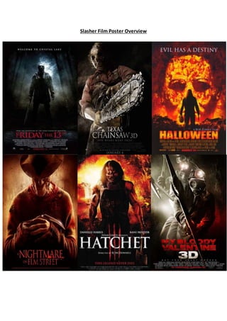
The document analyzes six slasher film posters and identifies common design conventions. It notes that each poster features a masked male antagonist holding a signature weapon, using a color scheme of black, red, white and grey. Key patterns are placing the film title in large text at the bottom and including a tagline that hints at the plot. Overall, the posters effectively promote the slasher genre through visual cues and layout that would attract fans of graphic horror films.
Read| The latest issue of The Challenger is here! We are thrilled to announce that our school paper has qualified for the NATIONAL SCHOOLS PRESS CONFERENCE (NSPC) 2024. Thank you for your unwavering support and trust. Dive into the stories that made us stand out!
2024.06.01 Introducing a competency framework for languag learning materials ...Sandy Millin
http://sandymillin.wordpress.com/iateflwebinar2024
Published classroom materials form the basis of syllabuses, drive teacher professional development, and have a potentially huge influence on learners, teachers and education systems. All teachers also create their own materials, whether a few sentences on a blackboard, a highly-structured fully-realised online course, or anything in between. Despite this, the knowledge and skills needed to create effective language learning materials are rarely part of teacher training, and are mostly learnt by trial and error.
Knowledge and skills frameworks, generally called competency frameworks, for ELT teachers, trainers and managers have existed for a few years now. However, until I created one for my MA dissertation, there wasn’t one drawing together what we need to know and do to be able to effectively produce language learning materials.
This webinar will introduce you to my framework, highlighting the key competencies I identified from my research. It will also show how anybody involved in language teaching (any language, not just English!), teacher training, managing schools or developing language learning materials can benefit from using the framework.
Operation “Blue Star” is the only event in the history of Independent India where the state went into war with its own people. Even after about 40 years it is not clear if it was culmination of states anger over people of the region, a political game of power or start of dictatorial chapter in the democratic setup.
The people of Punjab felt alienated from main stream due to denial of their just demands during a long democratic struggle since independence. As it happen all over the word, it led to militant struggle with great loss of lives of military, police and civilian personnel. Killing of Indira Gandhi and massacre of innocent Sikhs in Delhi and other India cities was also associated with this movement.
The French Revolution, which began in 1789, was a period of radical social and political upheaval in France. It marked the decline of absolute monarchies, the rise of secular and democratic republics, and the eventual rise of Napoleon Bonaparte. This revolutionary period is crucial in understanding the transition from feudalism to modernity in Europe.
For more information, visit-www.vavaclasses.com
We all have good and bad thoughts from time to time and situation to situation. We are bombarded daily with spiraling thoughts(both negative and positive) creating all-consuming feel , making us difficult to manage with associated suffering. Good thoughts are like our Mob Signal (Positive thought) amidst noise(negative thought) in the atmosphere. Negative thoughts like noise outweigh positive thoughts. These thoughts often create unwanted confusion, trouble, stress and frustration in our mind as well as chaos in our physical world. Negative thoughts are also known as “distorted thinking”.
Students, digital devices and success - Andreas Schleicher - 27 May 2024..pptxEduSkills OECD
Andreas Schleicher presents at the OECD webinar ‘Digital devices in schools: detrimental distraction or secret to success?’ on 27 May 2024. The presentation was based on findings from PISA 2022 results and the webinar helped launch the PISA in Focus ‘Managing screen time: How to protect and equip students against distraction’ https://www.oecd-ilibrary.org/education/managing-screen-time_7c225af4-en and the OECD Education Policy Perspective ‘Students, digital devices and success’ can be found here - https://oe.cd/il/5yV
Model Attribute Check Company Auto PropertyCeline George
In Odoo, the multi-company feature allows you to manage multiple companies within a single Odoo database instance. Each company can have its own configurations while still sharing common resources such as products, customers, and suppliers.
How to Split Bills in the Odoo 17 POS ModuleCeline George
Bills have a main role in point of sale procedure. It will help to track sales, handling payments and giving receipts to customers. Bill splitting also has an important role in POS. For example, If some friends come together for dinner and if they want to divide the bill then it is possible by POS bill splitting. This slide will show how to split bills in odoo 17 POS.
Palestine last event orientationfvgnh .pptxRaedMohamed3
An EFL lesson about the current events in Palestine. It is intended to be for intermediate students who wish to increase their listening skills through a short lesson in power point.
2. These 6 film posters havebeen successfully designed to promote films within
the Slasher sub-genre. Each of the six film posters features typical film poster
conventions. They each havesimilar stylistic features, similar layout and similar
content. They are each film posters for a Slasher film so are produced with the
intention of attracting an audience of Slasher fans and making them wantto go
out and watch the film. By comparing these posters, I will be likely to identify
shared features and patterns used by all horror film posters and Slasher
posters specifically. Equally, I will be able to recognisewhat make them
effective and what allows the audience to instantly recognisethat a Slasher
horror is being promoted.
Each of these posters follows the conventional layoutof a film poster and
features key general conventions. There are expected features of a main image
that dominates and fills the entire frame, combined with a tagline that anchors
the image and gives the audience a hint as to what the narrativeentails and
horrific imagery. On each poster, the title of the film is the largest text in the
frame. Itis in a central position at the bottom of the frame, sitting beneath the
main image. This is to ensurethat the film title is the last thing the audience
sees, so it will morethan likely stick in their minds. This is an effective use of
layout, as it will ensurethat the audience is hooked in by the main image and
the restof the poster, beforethe title is revealed. Itis vital that the audience
see the film title last as it is the most important feature on the poster; if they
don’t remember the name this could prevent them fromgoing to see the film
and encouraging others to do so. In all six of the posters, the text used for the
title is in upper case in a bold and simple font that is highly visible. The text is
simple yet effective to allow the audience to focus more on and be drawn in by
the image. All of the posters usea display font and in four of the posters this is
in a serif style. This makes the font simple and easy to read and effective. Each
of the posters, except Nightmare on Elm Street, features a tagline that helps to
anchor or reinforcethe image. Oneof the reasons that a Nightmare on Elm
Street doesn’t is due to the fact that it is a classic. The poster is filled by
Freddie Crougar, who Slasher fans would instantly recognise; Freddie alone is
enough and so the image doesn’tneed to be reinforced. Also, this is a teaser
poster as it has a lack of institutional information on the bottom. Teaser
posters tend to have limited text and feature largely an image and a title. This
reinforces the idea of FreddieCrougar being enough to promote the film. On
3. the Friday the 13th
and Halloween posters the slogan is placed at the top of the
frame, a fairly common position for the tagline. The tagline for Friday the 13th
is “Welcome to CrystalLake”. This gives the audience an insightinto the
location of the film and the narrative as it implies that the film will surround a
group of characters who go to CrystalLake and the audience will guess that,
once there, they will be tormented by the antagonist in the image. Also the use
of the word ‘welcome’ is ironic, of course, as the treatment they encounter
once there will be anything but warmand welcoming. The other three posters
feature the tagline underneath the title. This helps to complete the poster as it
would be the very last thing the audience read and will leave the audience with
a lingering senseof what is to come when they see the film. This choice of
layout works better froma logistical viewpoint too; as the tagline would be
covering key parts of the image if it were to be placed at the top. 5 of the 6
posters feature institutional information that is positioned at the baseof the
poster.
We see other repeated patterns through the useof image. In each of the
posters, the image focuses around a main male character, who we can
instantly tell is the antagonist. Each antagonist in the main image is wearing a
mask. This is a well-known convention of the slasher sub-genreas the killer is
nearly always masked to increase the suspenseabout his true identity and to
horrify his victim, as well as the audience, of course. The Mise-en-sceneused
instantly tells us that this poster belongs to the slasher sub-genre. As wellas
the mask, the antagonist’s costumefeatures some formof overalls and he is
holding his signature weapon. For example, in the My Bloody Valentine poster,
the antagonistis wear a gas mask and overalls holding a pitch-axe. This is Mise-
en-scene typical of the Slasher sub-genreas in every slasher film the antagonist
uses a weapon that will cause a long and painful death with the most blood
and gorepossible. There is a clear pattern in these slasher posters of placing
the weapon in a prominent position to draw the audience’s attention to it and
give them an insightinto how the victims will be killed. For example, in the
Texas Chainsaw poster, our eyes are instantly drawn to the chainsaw that
holds a central position in the frame and is presented at a low angle to
maximise its size. The reason for this may be that slasher fans would be drawn
in by the knowledge that if the film is centred on a gruesomeweapon such as a
chainsaw, the film will be bloody and gory in the extreme.
4. There is a consistent pattern in the colours schemes used in each of the six
posters with only slight differences between them. Black, red, white and grey
appear to be the dominant colours across each poster, except Halloween
whereorange, the signaturecolour of the Halloween season, dominates. The
combination of black and red signify death and blood. Itallows the audience to
instantly recognisethe poster as a Slasher poster as the useof red reflects the
large scale of blood and gore that would feature in a Slasher film. Whereas,
with supernaturalposters, palecold colours are used to signala chilling mood
and to reflect the arrivalof a sinister spiritwill draw all life, colour and hope
fromthe characters’ lives. A pattern I haverecognised is with the posters that
emphasisethe weapon such as My Bloody Valentine, Texas Chainsaw and
Friday the 13th
, the poster is mainly dominated by dark colours such as grey
and black with a hint of red. Here, using dark colours allows the audience’s
attention to focus on the weapon, as it shimmers through the darkness.
Further to this, low angle shots are utilised to emphasisethe weapon rather
than the antagonisthimself. The posters for Halloween and Hatchet, on the
other hand, use the colour scheme to emphasisethe background, with orange
and red being the dominating colours. This may be due to the fact that by
emphasising the background, the audience’s focus is on the antagonist. Italso
allows the audience to focus on the body shapeof the antagonist. The bright
background creates a silhouette around his body and shows theaudience how
intimidating he is and to reflect how these human beings are dark through and
through. This is emphasised through the use of a medium long shotto show
the entire antagonist.
All of the posters in the selection are effective in drawing in the audience and
promoting the film. Each of the posters follow the same principle of less is
more by letting the image, the colours and the text do the talking. Key
iconography, meanwhile, is introduced successfully in all posters to attract the
typical fan of slasher horror.