
Recommended
More Related Content
What's hot
What's hot (18)
Similar to Film Poster Overview
Similar to Film Poster Overview (20)
Recently uploaded
Recently uploaded (20)
Film Poster Overview
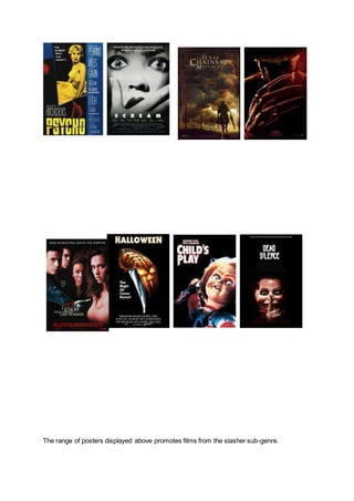
- 1. The range of posters displayed above promotes films from the slasher sub-genre.
- 2. The eight posters have been carefully and conventionally designed in order to successfully promote films within the slasher genre of horror. When looking at all eight posters together it is evident that they all promote the same genre; common conventions include the use of red and black, featuring the weapon, bold white text and the villain is shown on the majority of posters. By comparing all posters together it is possible for me to identify commonly shared conventions in order for me to transfer and adapt some of the features when making my own poster. There are repetitive patterns that can be picked out. Every slasher movie seems to feature a female character who takes a strong lead in the film, she is always the one to suffer from physical or psychological torment from the villain. In the poster for ‘I Know What You Did Last Summer’ the female lead is positioned to the far right and closest to the camera, mise en scene suggests that she is the final girl due to the colour of her clothing, light colours suggest that she is the saviour and the fact that she is positioned closest to the weapon which is ripping through the poster furtherly suggests that she is the closest to danger. The title is in white font on a lot of these posters indicating that it is the most significant piece of text, alongside the text the image is emphasised in contrast to the black background. Each image is a signifier to the audiences of something important for example the villain is a conventional main image and therefore signifies the role of that character to the audience. ‘Scream’ on the other hand breaks common conventions due to the smart marketing technique deployed by the producers; ‘Scream’ was intended to be almost comical by mocking the common conventions that viewers had become tired of repeatedly seeing, by using Drew Barrymore as the main image, the audience would have been instantly enticed; the fact that she was killed off within the opening scene of the movie was strange seeing as every other poster features something/someone significant from the movie. The film posters themselves similar stylistic features and layout, by furtherly analysing these features, I will be able to recognise how effective or not it is as a promotional poster, based on this I will also be able to establish what the audience is drawn towards. In six of the eight posters, the antagonist is shown on the poster; these posters generally shine a spotlight on the villain and the background is extremely low key or entirely blacked out, this emphasises the common fear of ‘what hides in the dark?’ and accentuates the villain as the focal point of the poster. In five of the eight featured posters above the weapon is displayed, this is conventional for a slasher movie poster as the weapon is one of the most important pieces of horror iconography in the movie and therefore audiences can determine before the film what the murder weapon will be. The ‘A Nightmare on Elm Street’ film poster indicates that Freddie Krueger’s murder weapon will be blades that replace his fingers, due to the placement of the weapon on the poster; the audience can establish how the villain intends on harming and killing his victims. The main purpose of the tagline is to create a link between the image and tagline, this results in the audience having a better understanding of the film prior to watching the entire movie and without giving away the whole plot. ‘Halloween’ and ‘A Nightmare on Elm Street’ both include taglines that imply horrific imagery; ‘the night he came home’ gives off a scary vibe, and entices audience even more to find out who ‘he’ is. The fact that the title is ‘Halloween’ makes audiences even more frightened due to the fact that everyone including the killer will be in disguise, this gives away small details about the plot. ‘Welcome to your
- 3. new nightmare’ is a relevant yet still scary tagline for ‘A Nightmare on Elm Street’, it implies that the film itself may be similar to a real life nightmare, which similarly to the characters could result in them becoming sleep deprived or tortured during their sleep. Most of the taglines featured leave the audience with unanswered questions enticing them to watch the movie strictly based on an image and tagline. Another feature which is similar between all six of these posters is the colour. Each colour which is going to be used seems to be dark and suggesting that there is ‘something hiding in the shadows’, the sense of unknown and mystery is a chilling concept to the audience as the use of dark colours such as black denotes the evil which could be lurking in the darkness. The main image for ‘Texas Chainsaw’ is take outside at night. Red is nearly always featured on the film posters, it is a strong colour which can be related to a male presence, this also indicates that the antagonists will be male. They are therefore dominant over their victims due to common stereotypes and viewed as more powerful. This can be backed up by the images on the front of Friday the 13th and Texas Chainsaw 3D being taken outside, at night time. Another colour that crops up a lot is the colour red,which is a strong masculine colour, which could relate to the idea that the antagonists are male. They are therefore dominant over their victims and are almost undefeatable. Red is also commonly linked to blood; blood obviously would signify the sub-genre of slasher as slasher movies idolise gruesome killings with a lot of blood and guts. A colour which is frequently used is white, this indicates the innocent characters and their purity, a final girl is usually seen to be wearing lighter colours as she is the saviour. The placement of the title varies on the poster but remains one of the main attractions besides the main image. As audiences eyes will move from left to right in a z line formation, whilst moving down the poster it is important that all the essential information is taken in by the audience, the release date is generally displayed at the bottom of the poster in a smaller font enabling audiences to look at the whole poster first before this; relating to the rule of thirds. Whatever is placed at the bottom of the poster is more likely to be memorable as it is the last thing which audiences see. Every poster shown seems to feature the same or similar font, proving that it is conventional; ‘Halloween’ and ‘Scream’ both use Sans Serif, this is a simplistic yet effective font to use, writing in capital letters emphasises it even more. The ‘Scream’ poster’s title has added a special character for the ‘M’ it looks like to end of two blades meeting, furtherly indicating which genre the movie belongs to and providing some horror iconography. Besides the title and tagline, institutional information is also featured at the very bottom of the page, this is because it is not necessarily important. All the posters are successful in promoting the slasher genre and encapsulate audiences by using a range of features without revealing too much of the plot. Conventionally each poster is simplistic yet able to draw in a wide range of target groups including teenagers. The bold text and image both stand out, accentuating what is important and giving away key factors about the movie without spoiling it.