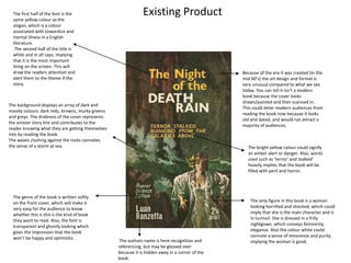
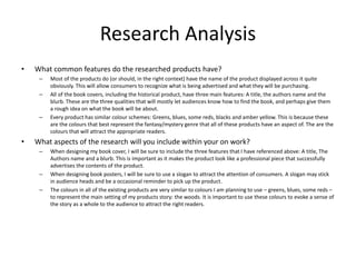
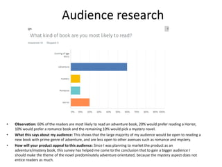
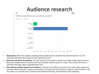
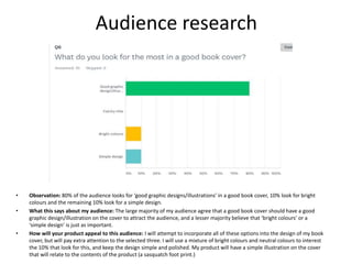
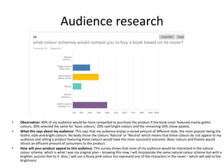
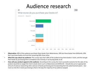
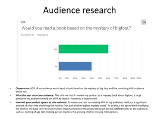
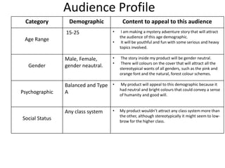
The document analyzes research from an audience questionnaire about preferences for book products. It found that the target audience is primarily 16-19 year old females who prefer adventure books and are most compelled by intriguing blurbs and visually appealing covers with good graphic design. The research will help focus the book product on these preferences to best appeal to this audience.


![4. book proposal [comp]](https://cdn.slidesharecdn.com/ss_thumbnails/4-180618152155-thumbnail.jpg?width=640&height=640&fit=bounds)
![2. research 2 [comp]](https://cdn.slidesharecdn.com/ss_thumbnails/2-180618151757-thumbnail.jpg?width=640&height=640&fit=bounds)

![5. pre production [comp]](https://cdn.slidesharecdn.com/ss_thumbnails/5-180618152320-thumbnail.jpg?width=640&height=640&fit=bounds)


![7. evaluation [comp]](https://cdn.slidesharecdn.com/ss_thumbnails/7-180618152616-thumbnail.jpg?width=640&height=640&fit=bounds)


![6. production reflection [comp]](https://cdn.slidesharecdn.com/ss_thumbnails/6-180709112803-thumbnail.jpg?width=640&height=640&fit=bounds)
![6. production reflection [comp]](https://cdn.slidesharecdn.com/ss_thumbnails/6-180618152458-thumbnail.jpg?width=640&height=640&fit=bounds)


![3. production experiments [comp]](https://cdn.slidesharecdn.com/ss_thumbnails/3-180618152041-thumbnail.jpg?width=640&height=640&fit=bounds)


