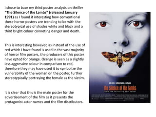
This poster for The Silence of the Lambs follows horror movie poster conventions through its use of white, black and orange. It features a close-up of a woman's face with her eyes colored orange to draw the audience in and convey a sense of victimization. The credits at the bottom and inclusion of the lead actors' names aim to promote audience interest in the film adaptation of the best-selling novel.
1. I chose to base my third poster analysis on thriller
“The Silence of the Lambs” (released January
1991) as I found it interesting how conventional
these horror posters are trending to be with the
stereotypical use of shades white and black and a
third bright colour connoting danger and death.
This is interesting however, as instead of the use of
red which I have found is used in the vast majority
of horror film posters, the producers of this poster
have opted for orange. Orange is seen as a slightly
less aggressive colour in comparison to red,
therefore they may have used it to symbolize the
vulnerability of the woman on the poster, further
stereotypically portraying the female as the victim.
It is clear that this is the main poster for the
advertisement of the film as it presents the
protagonist actor names and the film distributors.
2. The title portrays a great deal of significance on
this horror poster as it is the only writing on the
page which is actually in colour. Immediately the
audience will be drawn to this title as it stands out
and follows the same colour as the subjects eyes
and the butterfly. The three things in proper The use of well defined eyes with the
colour could be symbolic of a link to nature with subject gazing straight forward into
the text ‘lambs’, the butterfly and the eyes of a the eyes of the audience makes it
human in colour- it could be representing lives more direct and causes an
being in danger. The fact that the title is in lower engagement with the audience. It
case letters stereotypically challenges the could give the target audience a
conventional trend of a horror poster as normally feeling of victimization and
the title is upper case to highlight its significance. intimidation because of the sharp
This could have been done to work with the orange/red colour of the subjects
naming of the title- ‘silence’ and ‘lamb’ gives a eyes. Her eyes are so serious, making
sense of vulnerability and peace as lambs are seen you aware it’s a horror film
as completely defenceless. It could symbolise advertisement.
backing down and inferiority of victims.
3. The fact that the background character has a
white face, with a shadowy effect of blue
around one edge of her face gives very cold
and still connotations. It links to the theme of
death as she literally appears lifeless. The
white could be symbolic of purity and
innocence on her person; further
demonstrating a sense of vulnerability which
follows the stereotypical conventions of the
woman being the victim in horror. This
women links in with the title as she
completely demonstrates ‘silence’. The black
on the poster’s right hand corner could be
connoting death. The use of extremely low
key lighting gives it a dark, eerie image. It
follows conventions of a horror piece as it
stereotypically uses the colours of white and
black and one proper colour, which in this
case is a shade of orange.
4. From the image, the audience will
immediately be drawn into
assuming the woman to be the
subject of victimisation in the
horror movie. We can tell it is a
woman from her facial shape and
features. The fact that a close up
has been used for this poster makes
the audience reach it at more of a
personal level and feel more
involved with it.
5. The use of the moth covering the woman’s
face also links in with the wording of the
title ‘silence’- the fact that she is being
prevented from talking further highlights
her vulnerability and inferiority. The moth
is a ‘death’s head moth’ showing that this
film is going to highlight the theme of
death. The face used for this moth plays a
high level of significance in the poster as it
is of women forming a skull face. It is
possibly a hidden meaning in the poster as
it isn’t directly visible to the naked eye
unless zoomed in. This was created by the
Dali and it could be placing further
emphasis on the victimization of women in
the horror film.
6. This makes the audience aware that a book The actors who will be starring in a film plays
was produced before the movie itself. People a great deal of significance when it is being
who found the book appealing may therefore advertised; therefore the protagonist names
be interested in seeing the screen adaptation. have conventionally been displayed on this
It will also help vice versa for the production of poster. If the actors are well known and also
the book if people are impressed with the film. respected for previous works then it will draw
The fact that the book was a ‘best seller’ also in more audience attention and they will want
helps towards the production of the film as it to go and see it.
may be viewed as a ‘must see’.
The credits always stereotypically go at the bottom of a
poster to give an attributed mention to everyone who had
an important role towards the film’s production. It
presents the name of the production company which
would also draw in audience attention if it is well-known.