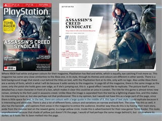
The document discusses the cover designs of several video games and magazines. It analyzes design elements like fonts, color schemes, images and layouts. Key points include:
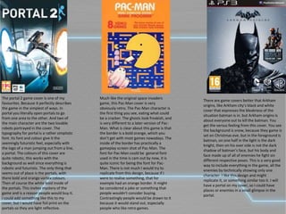
1) Game covers like Portal 2 effectively portray the game through simple visuals like characters and portals. Magazine covers stand out with bold background images and use of color schemes associated with their console brand.
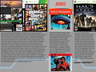
2) Designs are inspired by retro games like Pac-Man and Space Invaders for their recognizable fonts and use of bold borders. Game covers also portray the tone and themes of the game through characters and environments.
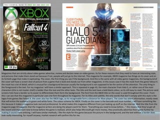
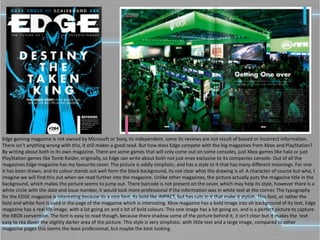
3) Magazine layouts emphasize detailed background images and utilize different fonts and text styles for visual interest. They advertise upcoming


![T shirt%20 designs%20pro-forma(1)[1]](https://cdn.slidesharecdn.com/ss_thumbnails/t-shirt20designs20pro-forma11-130515100634-phpapp01-thumbnail.jpg?width=640&height=640&fit=bounds)


