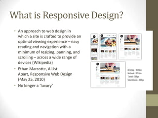
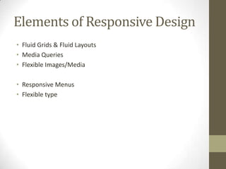
Approaches to
Responsive Design &
Development
January 21, 2013
What is Responsive Design?
 • An approach to web design in
   which a site is crafted to provide an
   optimal viewing experience – easy
   reading and navigation with a
   minimum of resizing, panning, and
   scrolling – across a wide range of
   devices (Wikipedia)
 • Ethan Marcotte, A List
   Apart, Responsive Web Design
   (May 25, 2010)
 • No longer a ‘luxury’
Elements of Responsive Design
• Fluid Grids & Fluid Layouts
• Media Queries
• Flexible Images/Media

• Responsive Menus
• Flexible type
Fluid Layouts
• Benefits vs. fixed-width layout; drawbacks
• Target / Context = Result


   Fixed-Width (based on pixels)               Fluid Layout (based on %’s)
Fluid Grids
• Typically 12 or 16 columns with column width and gutters
  based on %’s
• Example:
Using Fluid Grids
•   1140gs – cssgrid.net (PSD template included)
•   Foundation by Zurb (framework)
•   Twitter Bootstrap (framework)
•   Use 12/16 column PSD template when creating mockup
Media Queries
• Placed in stylesheet (can also use Javascript detection)
• Looks at the capability of the device and checks for:
  • Width & Height of browser window
  • Orientation
  • Resolution

• http://css-tricks.com/snippets/css/media-queries-for-
  standard-devices/
• http://nmsdvid.com/snippets/
Media Query Example

@media only screen and (min-device-width
: 320px) and (max-device-width : 480px)
{
     #primary-nav {display:none;}
     #responsive-nav {display:block;}
}

• Example: RoomTemp
• Concept of ‘breakpoints’
Media Query Breakpoints
• Browser widths that have a media query declaration to change
  the layout once the browser is within the declared range
• 320 px — Mobile portrait
• 480 px — Mobile landscape
• 600 px — Small tablet
• 768 px — Tablet portrait
• 1024 px — Tablet landscape/Netbook
• 1280 px & greater — Desktop
Flexible Images & Media
img, embed, iframe {
Max-width:100%;
Height:auto;
}
• http://css-tricks.com/video-source-by-screen-size/ -
  Different videos depending on screen size and device
• http://retinajs.com/ - Retina Images
Responsive Menus
•   Full Horizontal
•   Select Box (ex. RoomTemp)
•   Custom Dropdown (ex. Daystar)
•   Off Canvas


• http://css-tricks.com/responsive-menu-concepts/
Flexible Typography
• Set body to font-size:100% / 1em (16px)
• Base all fonts relative to the base font size, so a 32px H1 would
  be 2em (32 / 16 = 2)
• This makes it easy to adjust all typography with a single media
  query, changing the body font-size up or down
• PxtoEm.com
• CSS3 rems (based off HTML element, no nesting)
Responsive Frameworks
• Based around a fluid grid (except Skeleton); some contain user
  interface elements and additional features
• Skeleton
• Twitter Bootstrap
• Zurb Foundation
• 1140 CSS Grid
Advantages of Frameworks
•   Basic media queries & responsiveness done for you
•   Cross-browser tested
•   Rapid protoyping; grid template provided for designing
•   Drawbacks: learning curve, lots of markup, can be tough to
    create highly custom designs
Helpful Plugins
• CSS3-Mediaqueries.js (support for media queries on IE8 and
  below)
• Retina.js (serve up high res images)
• Fittext.js (scalable headlines)
• FlexSlider (responsive slider)
• FitVids.js (fluid video embeds)
Hacking Responsive Wordpress
Themes
• Inspect the behavior of the site
• Look at the media queries
• Determine if they are using a framework…learn how to
  incorporate that
• Example: Teamate.us

Approaches to Responsive Wen Design & Development

  • 1.
    Approaches to Responsive Design& Development January 21, 2013
  • 2.
    What is ResponsiveDesign? • An approach to web design in which a site is crafted to provide an optimal viewing experience – easy reading and navigation with a minimum of resizing, panning, and scrolling – across a wide range of devices (Wikipedia) • Ethan Marcotte, A List Apart, Responsive Web Design (May 25, 2010) • No longer a ‘luxury’
  • 3.
    Elements of ResponsiveDesign • Fluid Grids & Fluid Layouts • Media Queries • Flexible Images/Media • Responsive Menus • Flexible type
  • 4.
    Fluid Layouts • Benefitsvs. fixed-width layout; drawbacks • Target / Context = Result Fixed-Width (based on pixels) Fluid Layout (based on %’s)
  • 5.
    Fluid Grids • Typically12 or 16 columns with column width and gutters based on %’s • Example:
  • 6.
    Using Fluid Grids • 1140gs – cssgrid.net (PSD template included) • Foundation by Zurb (framework) • Twitter Bootstrap (framework) • Use 12/16 column PSD template when creating mockup
  • 7.
    Media Queries • Placedin stylesheet (can also use Javascript detection) • Looks at the capability of the device and checks for: • Width & Height of browser window • Orientation • Resolution • http://css-tricks.com/snippets/css/media-queries-for- standard-devices/ • http://nmsdvid.com/snippets/
  • 8.
    Media Query Example @mediaonly screen and (min-device-width : 320px) and (max-device-width : 480px) { #primary-nav {display:none;} #responsive-nav {display:block;} } • Example: RoomTemp • Concept of ‘breakpoints’
  • 9.
    Media Query Breakpoints •Browser widths that have a media query declaration to change the layout once the browser is within the declared range • 320 px — Mobile portrait • 480 px — Mobile landscape • 600 px — Small tablet • 768 px — Tablet portrait • 1024 px — Tablet landscape/Netbook • 1280 px & greater — Desktop
  • 10.
    Flexible Images &Media img, embed, iframe { Max-width:100%; Height:auto; } • http://css-tricks.com/video-source-by-screen-size/ - Different videos depending on screen size and device • http://retinajs.com/ - Retina Images
  • 11.
    Responsive Menus • Full Horizontal • Select Box (ex. RoomTemp) • Custom Dropdown (ex. Daystar) • Off Canvas • http://css-tricks.com/responsive-menu-concepts/
  • 12.
    Flexible Typography • Setbody to font-size:100% / 1em (16px) • Base all fonts relative to the base font size, so a 32px H1 would be 2em (32 / 16 = 2) • This makes it easy to adjust all typography with a single media query, changing the body font-size up or down • PxtoEm.com • CSS3 rems (based off HTML element, no nesting)
  • 13.
    Responsive Frameworks • Basedaround a fluid grid (except Skeleton); some contain user interface elements and additional features • Skeleton • Twitter Bootstrap • Zurb Foundation • 1140 CSS Grid
  • 14.
    Advantages of Frameworks • Basic media queries & responsiveness done for you • Cross-browser tested • Rapid protoyping; grid template provided for designing • Drawbacks: learning curve, lots of markup, can be tough to create highly custom designs
  • 15.
    Helpful Plugins • CSS3-Mediaqueries.js(support for media queries on IE8 and below) • Retina.js (serve up high res images) • Fittext.js (scalable headlines) • FlexSlider (responsive slider) • FitVids.js (fluid video embeds)
  • 16.
    Hacking Responsive Wordpress Themes •Inspect the behavior of the site • Look at the media queries • Determine if they are using a framework…learn how to incorporate that • Example: Teamate.us