1. 1/5/2021
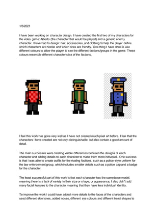
I have been working on character design. I have created the first two of my characters for
the video game: Alberto (the character that would be played) and a generic enemy
character. I have had to design: hair, accessories, and clothing to help the player define
which characters are hostile and which ones are friendly. One thing I have done is use
different colours to allow the player to see the different factions/groups in the game. These
colours resemble different characteristics of the factions.
I feel this work has gone very well as I have not created much pixel art before. I feel that the
characters I have created are not only distinguishable but also contain a good amount of
detail.
The main successes were creating visible differences between the designs of each
character and adding details to each character to make them more individual. One success
is that I was able to create outfits for the rivaling factions, such as a police-style uniform for
the law enforcement group, which includes smaller details such as a police cap and a badge
for the character.
The least successful part of this work is that each character has the same base model,
meaning there is a lack of variety in their size or shape, or appearance, I also didn't add
many facial features to the character meaning that they have less individual identity.
To improve the work I could have added more details to the faces of the characters and
used different skin tones, added noses, different eye colours and different head shapes to
2. further differentiate each character.
My next step is to create a background for the final product that resembles Bolivia,
the country that my game takes place in.
3. 1/6/2021
I have been finishing off my character creation today and also working on the background
design. I have created the main character for the game that the user will play and given him
a different uniform/clothing to what other people in his faction wear, to make him easily
recognizable. I have based the background on Bolivia. The country the game is set in and
incorporated two different features of their land (the mountains and desert).
I feel that the character design has gone well as I have created a new character based on
the old one, but incorporated new features to the design to make it appear differently. I think
that the background design work has gone very well as I have been able to replicate an
actual Bolivian setting into pixel art. I am very pleased with how the background has turned
out as I think it uses different details at different distances such as the mountains, houses,
and the sky.
4. One main success of the character design was the fact that I was able to create a new
character that is easily distinguishable from the others in its faction. It uses a new design
and customizations to allow the player to see who their character is and makes that
character stand out from the rest. One key success of the background design was that I was
able to create two houses, similar to a traditional style of Bolivian building. I think that this is
a success as it adds to the style of the background.
5. 1/7/2021
I have been creating a magazine cover for my game. I have tried to base my magazine
cover off of gaming magazines to get the style right and display some of their key
conventions. I had to combine p[arts of my pixel art that I have created already to make this
magazine cover, Then added subheadings with general news stories and articles you could
find in a gaming magazine. For the title, I had to find a custom font for the title which I think
fits with the pixel art style as well.
I feel this work has gone okay. I feel there are lots of improvements that I could have made.
I could have chosen better colours for the font so that they look better and are more eye-
catching. I do like the picture that I used for the magazine as I feel it captures the style and
mood that I wanted to create with the game and I think it looks quite interesting and would
make someone want to read the magazine.
I think the main success with my work was the magazine cover image of the game. I think
that it looks very good and also really fits the style and tone that I wanted to portray with my
work. I think the placement of two of the main characters in the foreground makes it appear
to be more interesting as it makes the audience question who they are.
One of the less successful elements of my magazine was the subheadings, as I feel that the
colour that I chose to use for them did not suit the magazine as I had liked. I felt that it stood
out too much and somewhat clashed with the rest of the page. This is not good and it would
make it less appealing to a reader as it would appear to be poorly made.
I could have filled in the dead/empty space on the page as I feel that there is too much of it
and it takes away from the exciting element that I wanted to create with the poster. Most
gaming magazines have a packed front page to also make better use of title and
6. subheading positioning, which I didn't do very well.
Next, I will create the game's poster, as another form of advertising for it.