Escorts Service Model mount abu 👉 Just CALL ME: 8617370543 💋 Call Out Call Bo...
Construction part 2
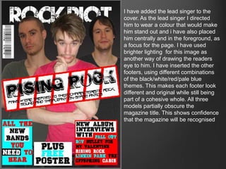
1. I have added the lead singer to the
cover. As the lead singer I directed
him to wear a colour that would make
him stand out and i have also placed
him centrally and in the foreground, as
a focus for the page. I have used
brighter lighting for this image as
another way of drawing the readers
eye to him. I have inserted the other
footers, using different combinations
of the black/white/red/pale blue
themes. This makes each footer look
different and original while still being
part of a cohesive whole. All three
models partially obscure the
magazine title. This shows confidence
that the magazine will be recognised
2. All the models images are now in
place with Pete the centre of
attention again. I have included him
rather more in the foreground than
the other band members. I used
outerglow on all the images which
makes them stand out effectively
from the background. I have also
inserted the editors image, alongside
the editors comment.
3. I changed the layout of the pictures again to
bigger images of each band member as this
makes the page look more simple and more
personal to the reader. I placed Chris (red
trousers) casually sitting to connote a laid back
personality, related to the article. Chris’ foot
and Ollie's hand overlap the page and become
part of the script to make a connection
between the images and the writing. I gave all
the band members drop shadows, as you can
see with Chris and Greg to frame the images
and make them stand out.
4. All the images have drop shadow to emphasise their
importance. As shown in the insets, I have given them a text
wrap so the article will surround them, and they become an
integral part of the article, as shown by Ollie’s hand and
Chris’ foot.
5. I used the same background style and similar colouring as the cover page and contents
page to connect all three pages as part of the same magazine. I changed the colour of
the subtitle and the pop out quotes to make them stand out to anyone just flicking
through the magazine. They are designed to grab the readers interest and encourage
them to read the whole article.
I used the same
colours and
style as I used
on the front
cover to give a
sense of
continuity. The
images are
designed to be
two high and
two low to give
balance and
interest to the
overall image.
They are shown
closely grouped
to emphasise the closeness of their friendship. Their poses reflect their personalities;
Pete the bad boy, laid back Chris, pretty boy Ollie and mad odd Greg.
6. In the article there was a space at
the bottom right that was empty so I
decided to design a band logo to
use. I used the “no entry” symbol
that I used on the front cover to
advertise this article, I think it
connects the band to the advert on
the front cover. The alliteration in
the bands name looks effective as
the two Rs in the logo. I started with
a white circle, putting a red stroke
around it and a red line through it.
Then I put in the two Rs in the font
Hard Rock, the same font I used on
the front cover for the whole name.
7. Now the logo is in the dead space, next to the band members, so that it is readily
associated with the band.
8. Using the same fonts as the front cover
and the article (Hard Rock, Urban
Jungle for the numbers and Urban
Slick). I used the same colour themes,
red for the numbers, white for the titles
and blue for the descriptions. This was
to give a sense of continuity to the
magazine. “Contents” is mirrored by
“Tickets”. This adds interest to the page
and also gives a feeling of product
identity as the styles are similar.