Enzyme, Pharmaceutical Aids, Miscellaneous Last Part of Chapter no 5th.pdf
FACTUAL PAGE LAYOUT- TASK 5
1. Before I began production for this task I played around with a couple of
ideas and different fonts and came to the idea of creating a poster where
the names of the bands would create the frame for the ‘F’ for Fibbers.
Whilst creating this I thought it would be a good idea to separate the
bands creating them in a different fonts but when I tried to do the placing
to create the ‘F’ the overall look didn’t look clear. I tried the same design
again but using the same font for all the text, this worked better and gave
the end result that I wanted. This overall look didn’t look clear and
professional even though it was creative.
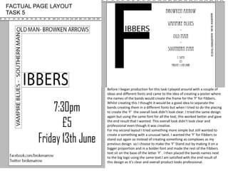
For my second layout I tried something more simple but still wanted to
create a something with a unusual twist. I wanted the ‘F’ for Fibbers to
stand out again so instead of creating something as complexes as my
previous design so I choose to make the ‘F’ Stand out by making it on a
bigger proportion and in a bolder font and made the rest of the Fibbers
text sit on the base of the letter ‘F’ . I then placed the bands names next
to the big logo using the same text.I am satisfied with the end result of
this design as it’s clear and overall product looks professional.
FACTUAL PAGE LAYOUT
TASK 5