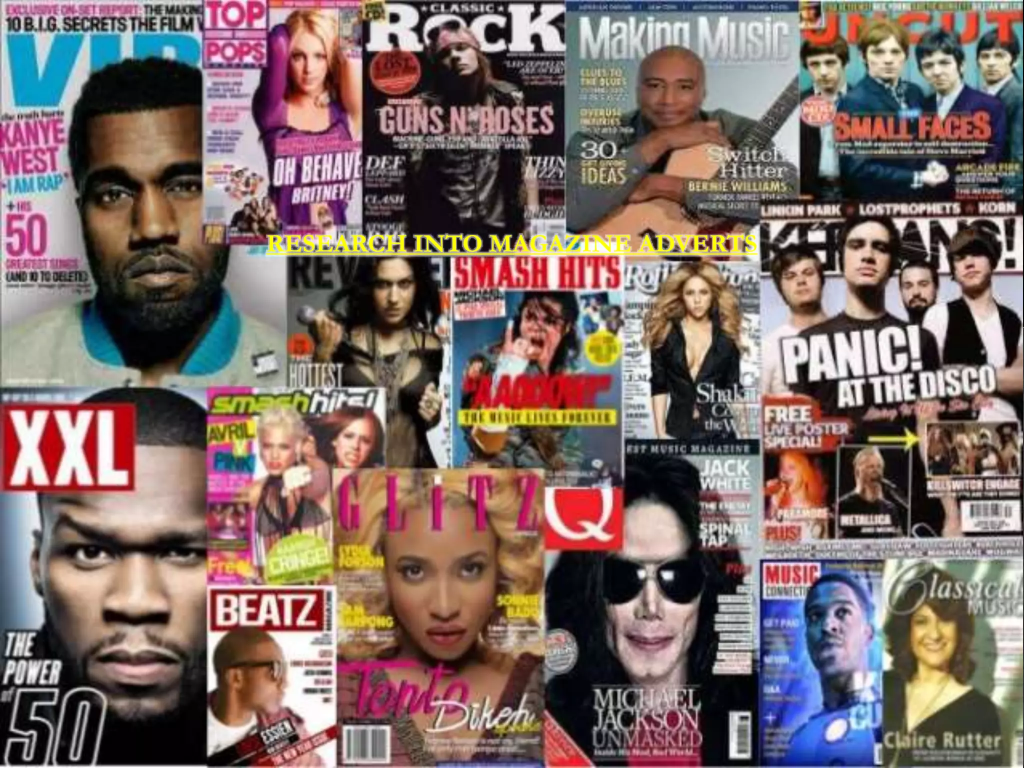
RESEARCH INTO MAGAZINE ADVERTS
RESEARCH INTO Q MAGAZINE
SPECIFICALLY
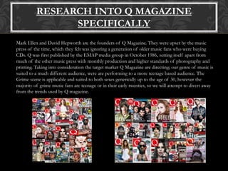
Mark Ellen and David Hepworth are the founders of Q Magazine. They were upset by the music
press of the time, which they felt was ignoring a generation of older music fans who were buying
CDs. Q was first published by the EMAP media group in October 1986, setting itself apart from
much of the other music press with monthly production and higher standards of photography and
printing. Taking into consideration the target market Q Magazine are directing; our genre of music is
suited to a much different audience, were are performing to a more teenage based audience. The
Grime scene is applicable and suited to both sexes generically up to the age of 30, however the
majority of grime music fans are teenage or in their early twenties, so we will attempt to divert away
from the trends used by Q magazine.
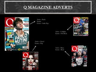
Q MAGAZINE ADVERTS
Artist – Paulo
Nutini
Genre – Indie Pop
Artist – Coldplay
Genre – Soft Rock
Artist – Muse
Genre – Rock
Artist – Cheryl
Genre – Pop
ARTIST : PAOLO NUTINI
GENRE: INDIE POP
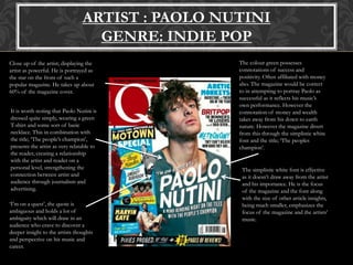
Close up of the artist; displaying the
artist as powerful. He is portrayed as
the star on the front of such a
popular magazine. He takes up about
60% of the magazine cover.
It is worth noting that Paolo Nutini is
dressed quite simply, wearing a green
T-shirt and some sort of basic
necklace. This in combination with
the title; ‘The people’s champion’,
presents the artist as very relatable to
the reader, creating a relationship
with the artist and reader on a
personal level, strengthening the
connection between artist and
audience through journalism and
advertising.
The colour green possesses
connotations of success and
positivity. Often affiliated with money
also. The magazine would be correct
to in attempting to portray Paolo as
successful as it reflects his music’s
own performance. However the
connotation of money and wealth
takes away from his down to earth
nature. However the magazine divert
from this through the simplistic white
font and the title; ‘The peoples
champion’.
The simplistic white font is effective
as it doesn’t draw away from the artist
and his importance. He is the focus
of the magazine and the font along
with the size of other article insights,
being much smaller, emphasizes the
focus of the magazine and the artists’
music.
‘I’m on a quest’, the quote is
ambiguous and holds a lot of
ambiguity which will draw in an
audience who crave to discover a
deeper insight to the artists thoughts
and perspective on his music and
career.
ARTIST : CHERYL
GENRE: MAINSTREAM POP
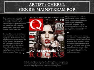
Cheryl is renowned for her looks
probable more so than her music
talent. The magazine cover focuses
heavily on this and angles her
inescapable sex appeal. The red
lipstick is evocative towards her sex
appeal and the water running down
her holds sexual connotation.
Cheryl is wearing a lot of makeup,
you can see she is biting her long fake
nails, wearing dark black mascara and
wearing an iconic red lipstick; overall
emphasizing the sexual nature of the
artist. This voyeuristic image presents
a sexual draw from men as well as
women wanting to emulate her
image. This could differ to a non
heterosexual audience.
There is a consistent paint pallet used
on the magazine cover, Cheryl’s
makeup pallet contrasts with her
natural complexion, presenting a bold
look for the artist, she is possibly
hoping that her music stands out in
the same way her image does.
The title of the is very simplistic, you
could argue that an artists image is a
huge part of the music scene today;
this proposal can be reinforced by the
fact the simplistic title proves that
little can be taken away from her
look. Her title of the time ‘Cheryl
Cole’, followed by the adjective;
‘rocks’ presents the artist in a positive
light; both her image and her music
could be described in this way
Similarly to the Q cover featuring Paolo Nutini; Cheryl is staring directly
at the camera citing the audiences attention and drawing the audience to
read more and perhaps discover her music on a stronger level.
ARTIST : COLDPLAY
GENRE: SOFT ROCK
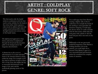
The font used to title the bands’
article in combination with the font
used to write subtitles for the band, is
the colour white which captures a
calm mood; in addition the font style
is quite casual and possible reflects
the light hearted; non serious nature
of the bands’ music.
The lighthearted approach to font
choice and colour is emphasized
through the broad and diverse paint
pallet in the background of the
magazine advertisement.
You could argue that Chris Martin is
wearing a slightly odd; or diverse
outfit here. For example the brand of
the clothing is unrecognizable and
therefore intriguing. I would argue
the diverse choice of outfit coincides
with the bans music, which takes the
rock genre with a pinch of salt; the
band and puts there own twist on the
genre.
Differently to the two previously
studied Q magazines, Chris Martin is
looking elsewhere (not at the
camera), you could imply this is
because Chris Martin is apart of a
very successful band and therefore
cannot be considered the complete
centre of attention.
A distinct key to the cover or
advertisement of an artist and there
music is the attention drawn to them
within the image. For example in all 3
the artist in question occupies at least
50% of the cover, this implies the key
to successful advertisement is the
image of the artist and the
aesthetically pleasing nature of the
picture.
RESEARCH INTO XXL MAGAZINE
SPECIFICALLY
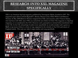
XXL is an American hip hop magazine, published by Townsquare Media, founded in 1997. The
magazine's past editors include Reginald C. Dennis, Sheena Lester, Elliott Wilson and Datwon
Thomas. In May 2009 Datwon Thomas resigned from XXL and executive editor Vanessa Satten,
who had been with XXL since 1998, was named the new Editor-in-Chief. The magazine is a hip-hop
magazine, or so considered in the USA. However such a perception is twisted when transferred over
to the UK. In the UK and perhaps London more specifically we would consider such a genre as
R&B or rap music. Grime is a form of rap, originated in the suburbs of the USA and streets of
England mainly. This suits are video’s target market and song specifically.
XXL MAGAZINE ADVERTS
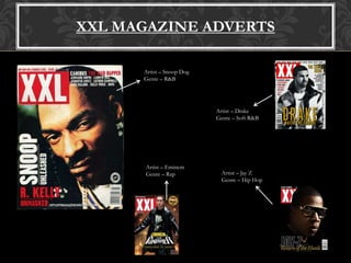
Artist – Snoop Dog
Genre – R&B
Artist – Drake
Genre – Soft R&B
Artist – Jay Z
Genre – Hip Hop
Artist – Eminem
Genre – Rap
ARTIST : SNOOP DOG
GENRE: R&B
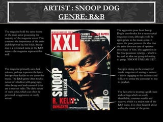
The magazine hold the same theme
of the main actor possessing the
majority of the magazine cover. This
connotes the importance of the artist
and the power he/she holds. Snoop
dog is a renowned name in the R&B
scene – the magazine represent this
well.
The magazine primarily uses dark
colours, perhaps represent the lyrics
Snoop often decides to use across his
music. The R&B genre often holds a
nature of rebellion with gang signs
often being used and censored lyrics
are a must on radio. The dark nature
of such lyrics, which can often be
perceived as aggressive or overly
sexual.
The aggressive pose from Snoop
Dog is unorthodox for a stereotypical
magazine cover, although could be
appropriate to the music genre. It
seems the pose presents the idea that
the artist does not care of opinion
those have of him. The aggression in
his pose possesses synergy – which is
key and an idea our group is looking
to grasp; “SNOOP UNLEASHED”.
Snoop is taking on the concept of
media magazine of staring at camera
– this is engaging to the audience and
is likely to entice the consumer to buy
to product.
The fact artist is wearing a gold chain
and earrings which are easily
identifiable, connotes wealth and
success, which is a major part of the
R&B scene. It is often boasted about
within the music of the genre.
ARTIST : DRAKE
GENRE: SOFT R&B
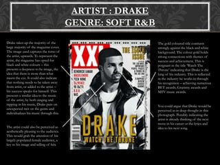
Drake takes up the majority of the
large majority of the magazine cover.
The image used captures the torso of
the artist, upwards. To represent the
artist, the magazine has opted for
black and white colours – this
presents a deepness to he image, the
idea that there is more than what
meets the eye. It could also indicate
that nothing needs to be taken away
from artist, or added to the artist –
his success speaks for himself. This
presents a similar idea to the music
of the artist, by both singing and
rapping in his music, Drake puts on
unexpected twit on the genre and
individualizes his music through this.
The gold coloured title contrasts
strongly against the black and white
background. The colour gold holds
strong connections with themes of
success and achievement. This is
poignant in the title ‘Watch The
Throne’ indicating that Drake is the
king of his industry. This is reflected
in the industry he works in through
his recognition – achieving numerous
BET awards; Grammy awards and
MTV music awards.
You could argue that Drake would be
perceived as in deep thought in this
photograph. Possibly indicating the
artist is already thinking of the next
move in his career or the lyrics and
idea to his next song.The artist could also be perceived as
aesthetically pleasing to the audience.
This would grab the attention of his
largely populated female audience, a
key to his image and selling of hits.
ARTIST : JAY Z
GENRE: HIP-HOP
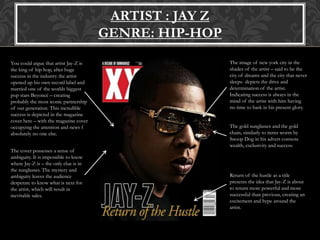
You could argue that artist Jay-Z is
the king of hip hop, after huge
success in the industry the artist
opened up his own record label and
married one of the worlds biggest
pop stars Beyoncé – creating
probably the most iconic partnership
of our generation. This incredible
success is depicted in the magazine
cover here – with the magazine cover
occupying the attention and news f
absolutely no one else.
The cover possesses a sense of
ambiguity. It is impossible to know
where Jay-Z is – the only clue is in
the sunglasses. The mystery and
ambiguity leaves the audience
desperate to know what is next for
the artist, which will result in
inevitable sales.
The image of new york city in the
shades of the artist – said to be the
city of dreams and the city that never
sleeps- depicts the drive and
determination of the artist.
Indicating success is always in the
mind of the artist with him having
no time to bask in his present glory.
The gold sunglasses and the gold
chain, similarly to items worm by
Snoop Dog in his advert connote
wealth, exclusivity and success.
Return of the hustle as a title
presents the idea that Jay-Z is about
to return more powerful and more
successful than previous, creating an
excitement and hype around the
artist.
COMPARISON
Q VS XXL
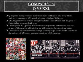
 Q magazine mainly promotes mainstream music and focuses on a more elderly
audience, in contrast to XXL mainly adopting a hip-hop/R&B genre
 XXL magazine would be more fitting for our artist Isaiah Dreads, with his genre of
Grime falling nearer the R&B genre
 The images of XXL present their artists as more powerful and exclusive than the
adverts of Q magazine, which is how we wish to depict the artist of our video.
 The audience we hope to channel through our song ‘Hype In The Booth’ – relates to
the audience of XXL more so than the audience of Q magazine.

Magazine analysis work

  • 1.
  • 2.
    RESEARCH INTO QMAGAZINE SPECIFICALLY Mark Ellen and David Hepworth are the founders of Q Magazine. They were upset by the music press of the time, which they felt was ignoring a generation of older music fans who were buying CDs. Q was first published by the EMAP media group in October 1986, setting itself apart from much of the other music press with monthly production and higher standards of photography and printing. Taking into consideration the target market Q Magazine are directing; our genre of music is suited to a much different audience, were are performing to a more teenage based audience. The Grime scene is applicable and suited to both sexes generically up to the age of 30, however the majority of grime music fans are teenage or in their early twenties, so we will attempt to divert away from the trends used by Q magazine.
  • 3.
    Q MAGAZINE ADVERTS Artist– Paulo Nutini Genre – Indie Pop Artist – Coldplay Genre – Soft Rock Artist – Muse Genre – Rock Artist – Cheryl Genre – Pop
  • 4.
    ARTIST : PAOLONUTINI GENRE: INDIE POP Close up of the artist; displaying the artist as powerful. He is portrayed as the star on the front of such a popular magazine. He takes up about 60% of the magazine cover. It is worth noting that Paolo Nutini is dressed quite simply, wearing a green T-shirt and some sort of basic necklace. This in combination with the title; ‘The people’s champion’, presents the artist as very relatable to the reader, creating a relationship with the artist and reader on a personal level, strengthening the connection between artist and audience through journalism and advertising. The colour green possesses connotations of success and positivity. Often affiliated with money also. The magazine would be correct to in attempting to portray Paolo as successful as it reflects his music’s own performance. However the connotation of money and wealth takes away from his down to earth nature. However the magazine divert from this through the simplistic white font and the title; ‘The peoples champion’. The simplistic white font is effective as it doesn’t draw away from the artist and his importance. He is the focus of the magazine and the font along with the size of other article insights, being much smaller, emphasizes the focus of the magazine and the artists’ music. ‘I’m on a quest’, the quote is ambiguous and holds a lot of ambiguity which will draw in an audience who crave to discover a deeper insight to the artists thoughts and perspective on his music and career.
  • 5.
    ARTIST : CHERYL GENRE:MAINSTREAM POP Cheryl is renowned for her looks probable more so than her music talent. The magazine cover focuses heavily on this and angles her inescapable sex appeal. The red lipstick is evocative towards her sex appeal and the water running down her holds sexual connotation. Cheryl is wearing a lot of makeup, you can see she is biting her long fake nails, wearing dark black mascara and wearing an iconic red lipstick; overall emphasizing the sexual nature of the artist. This voyeuristic image presents a sexual draw from men as well as women wanting to emulate her image. This could differ to a non heterosexual audience. There is a consistent paint pallet used on the magazine cover, Cheryl’s makeup pallet contrasts with her natural complexion, presenting a bold look for the artist, she is possibly hoping that her music stands out in the same way her image does. The title of the is very simplistic, you could argue that an artists image is a huge part of the music scene today; this proposal can be reinforced by the fact the simplistic title proves that little can be taken away from her look. Her title of the time ‘Cheryl Cole’, followed by the adjective; ‘rocks’ presents the artist in a positive light; both her image and her music could be described in this way Similarly to the Q cover featuring Paolo Nutini; Cheryl is staring directly at the camera citing the audiences attention and drawing the audience to read more and perhaps discover her music on a stronger level.
  • 6.
    ARTIST : COLDPLAY GENRE:SOFT ROCK The font used to title the bands’ article in combination with the font used to write subtitles for the band, is the colour white which captures a calm mood; in addition the font style is quite casual and possible reflects the light hearted; non serious nature of the bands’ music. The lighthearted approach to font choice and colour is emphasized through the broad and diverse paint pallet in the background of the magazine advertisement. You could argue that Chris Martin is wearing a slightly odd; or diverse outfit here. For example the brand of the clothing is unrecognizable and therefore intriguing. I would argue the diverse choice of outfit coincides with the bans music, which takes the rock genre with a pinch of salt; the band and puts there own twist on the genre. Differently to the two previously studied Q magazines, Chris Martin is looking elsewhere (not at the camera), you could imply this is because Chris Martin is apart of a very successful band and therefore cannot be considered the complete centre of attention. A distinct key to the cover or advertisement of an artist and there music is the attention drawn to them within the image. For example in all 3 the artist in question occupies at least 50% of the cover, this implies the key to successful advertisement is the image of the artist and the aesthetically pleasing nature of the picture.
  • 7.
    RESEARCH INTO XXLMAGAZINE SPECIFICALLY XXL is an American hip hop magazine, published by Townsquare Media, founded in 1997. The magazine's past editors include Reginald C. Dennis, Sheena Lester, Elliott Wilson and Datwon Thomas. In May 2009 Datwon Thomas resigned from XXL and executive editor Vanessa Satten, who had been with XXL since 1998, was named the new Editor-in-Chief. The magazine is a hip-hop magazine, or so considered in the USA. However such a perception is twisted when transferred over to the UK. In the UK and perhaps London more specifically we would consider such a genre as R&B or rap music. Grime is a form of rap, originated in the suburbs of the USA and streets of England mainly. This suits are video’s target market and song specifically.
  • 8.
    XXL MAGAZINE ADVERTS Artist– Snoop Dog Genre – R&B Artist – Drake Genre – Soft R&B Artist – Jay Z Genre – Hip Hop Artist – Eminem Genre – Rap
  • 9.
    ARTIST : SNOOPDOG GENRE: R&B The magazine hold the same theme of the main actor possessing the majority of the magazine cover. This connotes the importance of the artist and the power he/she holds. Snoop dog is a renowned name in the R&B scene – the magazine represent this well. The magazine primarily uses dark colours, perhaps represent the lyrics Snoop often decides to use across his music. The R&B genre often holds a nature of rebellion with gang signs often being used and censored lyrics are a must on radio. The dark nature of such lyrics, which can often be perceived as aggressive or overly sexual. The aggressive pose from Snoop Dog is unorthodox for a stereotypical magazine cover, although could be appropriate to the music genre. It seems the pose presents the idea that the artist does not care of opinion those have of him. The aggression in his pose possesses synergy – which is key and an idea our group is looking to grasp; “SNOOP UNLEASHED”. Snoop is taking on the concept of media magazine of staring at camera – this is engaging to the audience and is likely to entice the consumer to buy to product. The fact artist is wearing a gold chain and earrings which are easily identifiable, connotes wealth and success, which is a major part of the R&B scene. It is often boasted about within the music of the genre.
  • 10.
    ARTIST : DRAKE GENRE:SOFT R&B Drake takes up the majority of the large majority of the magazine cover. The image used captures the torso of the artist, upwards. To represent the artist, the magazine has opted for black and white colours – this presents a deepness to he image, the idea that there is more than what meets the eye. It could also indicate that nothing needs to be taken away from artist, or added to the artist – his success speaks for himself. This presents a similar idea to the music of the artist, by both singing and rapping in his music, Drake puts on unexpected twit on the genre and individualizes his music through this. The gold coloured title contrasts strongly against the black and white background. The colour gold holds strong connections with themes of success and achievement. This is poignant in the title ‘Watch The Throne’ indicating that Drake is the king of his industry. This is reflected in the industry he works in through his recognition – achieving numerous BET awards; Grammy awards and MTV music awards. You could argue that Drake would be perceived as in deep thought in this photograph. Possibly indicating the artist is already thinking of the next move in his career or the lyrics and idea to his next song.The artist could also be perceived as aesthetically pleasing to the audience. This would grab the attention of his largely populated female audience, a key to his image and selling of hits.
  • 11.
    ARTIST : JAYZ GENRE: HIP-HOP You could argue that artist Jay-Z is the king of hip hop, after huge success in the industry the artist opened up his own record label and married one of the worlds biggest pop stars Beyoncé – creating probably the most iconic partnership of our generation. This incredible success is depicted in the magazine cover here – with the magazine cover occupying the attention and news f absolutely no one else. The cover possesses a sense of ambiguity. It is impossible to know where Jay-Z is – the only clue is in the sunglasses. The mystery and ambiguity leaves the audience desperate to know what is next for the artist, which will result in inevitable sales. The image of new york city in the shades of the artist – said to be the city of dreams and the city that never sleeps- depicts the drive and determination of the artist. Indicating success is always in the mind of the artist with him having no time to bask in his present glory. The gold sunglasses and the gold chain, similarly to items worm by Snoop Dog in his advert connote wealth, exclusivity and success. Return of the hustle as a title presents the idea that Jay-Z is about to return more powerful and more successful than previous, creating an excitement and hype around the artist.
  • 12.
    COMPARISON Q VS XXL Q magazine mainly promotes mainstream music and focuses on a more elderly audience, in contrast to XXL mainly adopting a hip-hop/R&B genre  XXL magazine would be more fitting for our artist Isaiah Dreads, with his genre of Grime falling nearer the R&B genre  The images of XXL present their artists as more powerful and exclusive than the adverts of Q magazine, which is how we wish to depict the artist of our video.  The audience we hope to channel through our song ‘Hype In The Booth’ – relates to the audience of XXL more so than the audience of Q magazine.