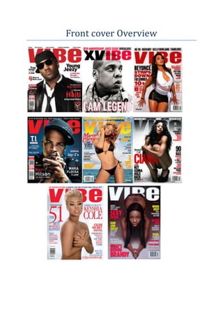
2. All front covers are from the front cover of “Vibe” magazine and therefore they have all been
designed with the intention of attracting fans of hip-hop/ Rap and R “n” B music. By carrying out an
investigation of them and by comparing each cover to another, I have been able to identify shared
features within them and to establish repeated patterns.
The eight front covers all feature general magazine front cover conventions. Expected general and
layout conventions are shown in each of the magazine covers, such as the inclusion of a main image
that fills the front cover, sell-lines that surround the main image, Important article features that
relate to content inside and a masthead designed in an appropriate font.
As well as this, other repeated patterns are shown. Each of the front covers features a solo artist as
the main image. Clearly, we expect to see some kind of music artist on the front of a music
magazine, but the consistent appearance of a solo artist on “Vibe” suggests that Bands are rare in
the world of Hip – hop/Rap and R “n” B. In each of the covers, one artist is always shown. This is a
clever way of attracting the magazine’s target audience, as the Solo artist is probably likely to be
easliy recognisable and liked by most in that target audience, having more than one popluar artist
does show at times in music magazines like Vibe however its not that popluar amongst rap/ hip-hop
and RnB music magaiznes in general.
Interestingly enough,there is a fair mix between male and female apperances on the front cover of
Vibe magazines. This applies to the smaller feature article photographs that appear too, but males
are represented as strong and in control, and the females as sex objects. This suggests that ‘Vibe’ is
supporting traditional gender stereotypes in its representations; the reason behind this is because
it’s what the target audience of today is used to seeing within the media. It’s what they can relate to
easier. Although it may not always be fair or right, by using the stereotypes that other media texts
have shown, magazines such as vibe, can boost their sales and readership through using the light
stereotypes that they do such as viewing females as sex objects on their front covers.
We can see other similarities in the mise-en-scene elements that are presented on each front cover.
In terms of costume, the male artists are united by the fact that they are all wearing formal but
casual dark clothes. Usually they wear a snapback cap, as seen in two of the Vibe front covers(T.I
Front cover and Young Jeezy front cover) at times we may see the artist wearing an expensive piece
of jewlarery like an expensive watch, as seen in T.I’s front cover. Chains are sometimes seen to be
worn by the artists which is also seen in T.I’s front cover. However, the artist may be wearing a
formal casual suit. The suit may be worn casualy with the top button undone as seen in Young
Jeezy’s front cover, or done up completly and worn formally. While female artists are shown in
little/sexual or no clothing at all, if the artist is wearning clothing, the clothing will very lossly worn
and very reveling. In addition to this, the artist will also be standing in a sexy pose with their chest
out, as seen in Beyonce’s front cover. This reflects heavliy on how female artists are represented in
the rap/hip-hop genre.
On each front cover, the signature Vibe masthead appears in exactly the same bold display font and
in exactly the same place and always kept plain and simple, yet effecive. Each time, the masthead is
either black on a white background,white on a black background, red on a white background or a
differnt colour interly due to special editions but always kept in the same font to keep brand
identity. The three colours, Red white and black are usually seen on the front cover on vibe,
therefore the target audience will have associated these three covers with this magazine. The
3. colours themselves are considered as masculine colours, they are also very plain and simple colours
that are used well by Vibe to give an effective impression on the target audience. Without exception,
the head of the artist is placed in front masthead so that it is not fully visible. This suggests the
success and popularity that Vibe has achieved as a publication, as it would be too much of an unwise
move if the magazine was new, unestablished or did not have a loyal fanbase. Another repeated
feature comes in the form of a strapline that always sits directly above the Vibe masthead. Each
time, this is used to draw attention to the artists that will feature inside.
Interestingly, sell-lines feature quite often. The vast number of sell-lines could indicate that the
magazine has lots of content and that it has a serious approach to the subject of music .In all of the
eight front covers there is a huge quantity of selllines on the page. This could be because of the fact
that the frame has already been dominated by the main image but it leaves space for selllines as
otherwise there wouldn’t be much on the cover itself. All front covers feature a sell-line that comes
in the form of a list of artists, giving a clear idea of whose inside to draw in fans of these artists and
to make clear the genre. The fonts for the sell-lines are in a, uppercase and lowercase font in san-
serif, this may depend on the importance of the sell line its self and how popular they think that the
article will be. On special editions of the magazine, some of the sell-lines will be in a script font as
seen on Mariah Carey’s font cover. The main sell-line is always the name of the artists featured on
the front.
Colour-wise, vibe tends to stick to a similar colour scheme in each issue. Red and white feature most
consistently and these two colours are accompanied by black, and in the case of one front cover,
blue. Being primary colours, these will appeal to a male readership, while the use of red and white
captures the light yet aggressive, formal and informal nature of Rap/ Hip-hop music.
Layout is consistent across the eight front covers too. In all of the front covers, the main sell-line is
placed on either the left or right side of the frame. This is a key area of the front cover where the
audience’s eye will automatically go. Feature article photographs, meanwhile, are generally never
placed on the cover of Vibe magazines.
Having carried out this overview, it is obvious that vibe has its own brand identity and signature look
that can be easily recognized by its target audience. This is maintained through the repetition of
stylistic and layout features from issue to issue and is a wonderful way of helping the magazine to
sell and succeed.