
Recommended
More Related Content
What's hot
What's hot (20)
Similar to Movie poster analysis drag me to hell
Similar to Movie poster analysis drag me to hell (20)
More from rpatel35
More from rpatel35 (17)
Recently uploaded
Recently uploaded (20)
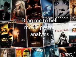
Movie poster analysis drag me to hell
- 1. Drag me to hell movie poster analysis
- 3. Main image -There is one main image on the poster, it acts as the poster’s background, the main image is of a female, and from her body language you can tell she is a victim.The female has her mouth open, her head back and leaned over, this shows the she getting attacked, therefore portraying her as a victim.The image plays on the stereotypical view on the “damsel in distress”, this is a familiar convention used in horror films, where females are often the victim, and this shows the genre of the film. Her facial expressions show pain and suffering and also a sense of possessed as an old monster hand is touching her.These elements all create a good horror films.
- 4. Mise –En- Scene-The model wears casual hair, she is a stereotypical English woman with blonde hair, all the custom and make up all suggest she is an average person, the use of an average person creates more of an effect on the audience, it creates a direct link because they can relate to an average person more as they can put themselves into the position. There is a monster like hand grabbing hold of the female, the hand tells the audience that the villain in the film is something supernatural as the hand suggest the villain in inhuman.The hand pulls the female down into the fire below, this connotates hell and evil and implies the film is horror.The house in the background appears to be a modern day house, this creates a direct link between the character and the audience as the audience can put themselves in the characters shoes
- 5. Colour - A range of colours are used; red, orange, black and grey are the main colours shown. Red and orange are used for the fire, these bright colours make the fire stand out and allow it to become more visible, therefore creating more of an impact on the audience as it connotates evil and the devil.The bright colours contrast with the dark dull grey background, the dark grey background could show how the character is feeling (lifeless), the dull colours helps create the atmosphere and create enigma as the lack of colour on the poster could connotate the lack of information about the film.On the poster a house can be seen, however it is old fashioned and dull in colour, it is surrounded in darkness, this could create a link between the house and the main character as it could be hers.
- 6. Genre -This poster illustrates horror, creature horror is displayed through the monster hand grabbing hold of the woman, horror is also shown through the fire used at the bottom of the poster to represent hell. Hell has a direct link to horror films. Target audience -This poster is directed towards horror lovers young adults, the poster demonstrates the genre of horror through the images used and the masterhead and typefaces shown.The actress is a young address therefore aimed at the younger generation. On the poster the tag line says “Christine Brown had a good job”, my stating she has a job implied she is from a working class background, so it is aimed at the working class/middle class audience.
- 7. Typeface- is simple and easy to read, for a passing by audience this makes it easier to read the masterhead of the poster.The edges are pointy; the sharp jiggered edges could connotate sharp weapons that are used in horror films. The typeface is white, this adds to the simple effect, the simple effect makes it more appealing as it doesn’t overload the page.The tag line is kept simple and easy to read, the typeface for the tagline is not over done, it doesn’t overcrowd the page and doesn’t take attention away from the writing.The credits are thin and narrow, which is a common convention, this is done because it is not the main focus on the poster.
- 8. Connotations - A girl screaming in pain, she is surrounded by fire, which could link to the title “hell”, showing that is where she is being dragged down to, this can be shown through her body language as she is hunched back Lighting- is very bright, in the background lighting is used for the house, this is done to indict where the storyline is based around, this is a stereotypical thing.The top half of the poster is very dark and lacks light; the darkness used at the top represents the gloomy atmosphere. As you move own the poster the lighting used becomes brighter as bright bold fire is shown. The brightness of the fire could connotate war and chaos.