(Dipika) Call Girls in Bangur ! 8250192130 ₹2999 Only and Free Hotel Delivery...
Ancillary product analysis
1. Ancillary product analysis
Posters
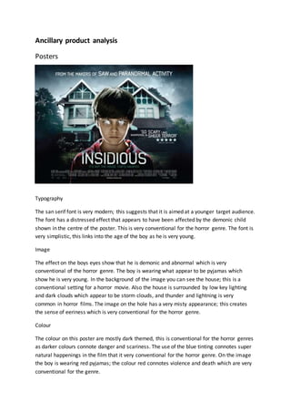
Typography
The san serif font is very modern; this suggests that it is aimed at a younger target audience.
The font has a distressed effect that appears to have been affected by the demonic child
shown in the centre of the poster. This is very conventional for the horror genre. The font is
very simplistic, this links into the age of the boy as he is very young.
Image
The effect on the boys eyes show that he is demonic and abnormal which is very
conventional of the horror genre. The boy is wearing what appear to be pyjamas which
show he is very young. In the background of the image you can see the house; this is a
conventional setting for a horror movie. Also the house is surrounded by low key lighting
and dark clouds which appear to be storm clouds, and thunder and lightning is very
common in horror films. The image on the hole has a very misty appearance; this creates
the sense of eeriness which is very conventional for the horror genre.
Colour
The colour on this poster are mostly dark themed, this is conventional for the horror genres
as darker colours connote danger and scariness. The use of the blue tinting connotes super
natural happenings in the film that it very conventional for the horror genre. On the image
the boy is wearing red pyjamas; the colour red connotes violence and death which are very
conventional for the genre.
2. Layout
The main image of the boy is in the centre of the poster, this implies that he is he main
character of the filmand shows that he is very important. The layout is conventional as it
follows the route of the eye; there is text along the top, the image in the middle and then
the title at the bottom. This is a very common layout for film posters.
Language
There is not much text on this poster, but terms such as ‘haunted’ and ‘sheer terror’ are
used which shows that the film is scary which is conventional, and these are common terms
used in or to describe a horror film. The lack of text makes the poster more visually
appealing and would draw people in to find out more.
Conventions
This poster is very conventional, the san serif font is conventional as it is very simple and
connotes a sense of distress and the presence of demons. The colours are very plain and
there is a lot of dark, which is conventional for the horror genre. The image is also
conventional as it shows the boy to be demonic and the conventional use of the house
setting and stormy sky. The form of the poster is also very conventional as it is laid out to
the route of the eye and the contents of the poster are very conventional. The lack of text is
typical of a filmposter.
Typography
On this poster they have used san serif font. This tells
me that the film has an older target audience. The san
serif font is also old fashioned which is very
conventional for the horror genre which are often
based on old tales or past events.
Image
The image on the poster is very conventional. At the
front of the image is the tree, the tree looks like it is
very old and spooky which is conventional for the
genre. Hanging from the tree is a noose, which
connote death and depression as they are linked with
suicide. In the background there is an old fashioned
looking house which is a very conventional setting.
The house appears to be very isolated which is conventional for the genre. In the image it is
3. very foggy, this makes the setting seem very spooky, also the overcast sky makes the area
look very dull and the lighting is very low key.
Colour
The colour on this poster is very dull, there aren’t any light colours. This gives the poster a
very old fashioned appeal which is conventional for the genre. The use of dull colours also
makes the setting look more spooky and eerie which fits perfectly into the horror genre.
Layout
The layout of this poster is very conventional; it follows the route of the eye meaning that
the title of the film will be in the initial focus of the audience. This is effective as people will
know what filmthe poster is for instantly. The image is in the middle of the poster with
some information such as the release date of the film at the bottom.
Language
The filmtitle is The Conjuring, conjuration relates to summoning the devil and also black
magic. This is conventional for horror movies as both black magic and the devil are things
that are very common among horror movies.
Conventions
This poster is very conventional for the horror genre. Its low key lighting and various links to
death and isolation are extremely conventional. The form the poster is also conventional as
it follows the route of the eye and has a very common yet effective layout that will draw the
audience in to the film.
Magazine covers
Typography
The masthead on this magazine cover is very
conventional for the horror genre. The fire effect on it
connotes violence and anger and also is linked with hell
and the devil, which is very conventional. The title of
the film is written in san serif font, this gives the cover a
masculine appearance which is conventional for the
genre. The font is also modern which suggests that the
film has a slightly younger target audience than many
other horror movies.
4. Image
The image on this cover is very conventional for the horror genre. The image is of a devil
character, this is conventional of horror movies as the devil is a very horror related
character that is linked with death and hell.
Colour
The use of the colour red is very conventional. Red connotes violence and anger and can
also signify fire or even blood which are very conventional for the horror genre. The
background of the cover is black giving the cover a darker and more conventional look. The
text is in white which makes it stand out well.
Layout
The layout of the cover is very conventional, it follows he route of the eye with the
masthead being at the top of the page, the main image in the middle and the cover story, or
the title of the movie at the bottom. This layout means that the important information is
clear and wouldn’t be missed by the audience when they see the cover of the magazine.
Language
The title of the filmis Hellboy, this is very conventional as it is linked to hell and the devil
and therefore death and violence which is very conventional. The cover contains more
explicit language such as a cover story about ‘getting sex’. This shows that the film is aimed
at a target audience of people over the age of 18 which is conventional for horror movies as
they can be very violent and gory.
Conventions
The cover is very conventional for a horror film as it links with death and hell because of the
character from Hellboy, the use of the colour red, and the fire effect used on the masthead.
The layout of the cover is very conventional as it follows the route of the eye. The cover has
a clear masthead and a few cover stories which is conventional and expected of a horror
movie.
5. Typography
The font on this cover is san serif, this is conventional for
the horror genre as it is very masculine.
Image
The image is very conventional, the use of high key
lighting is very conventional as it hides the face of the
main antagonist of the film which shows that he is a very
mysterious character who doesn’t want his identity to
be known.
Colour
The use of the colour red is very conventional as it
connotes violence, anger and death. These are all very
conventional of the horror genre.
Layout
The layout of this cover is very conventional, this is because it follows the route of the eye
with the masthead at the top, the image in the middle and the cover story towards the
bottom of the cover. This is an effective layout as all of the key information is clearly visible
to the audience.
Language
The title of the filmis ‘Hannibal’; this is the name of the main antagonist. The name is very
similar to the word cannibal which is what the film is about. This is a conventional title as it
suggests violence and cannibalismwhich can be linked to horror movies and characters such
as vampires and zombies.
Conventions
This cover is very conventional of the horror genre because of its connotations of violence
and blood. The layout is also very conventional as it follows the route of the eye and
contains many of the things that would be expected on a magazine cover like the masthead
and cover stories.