Download to read offline
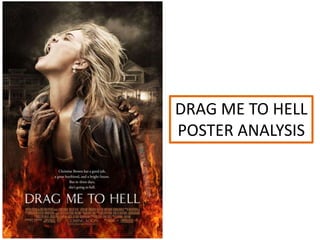
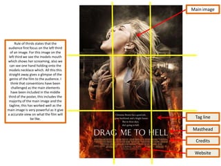

The poster depicts a woman screaming as demonic hands drag her towards flames. This creates intrigue by showing a typical woman in danger from supernatural forces. The colors red, orange and black convey danger and evil, drawing the eye. Text provides context that the protagonist's life will take a dark turn. Overall the poster effectively summarizes the horror plot and genre through visuals and text to attract the target young adult audience.


