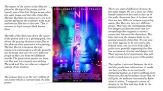
1. The names of the actors in the film are
placed at the top of the poster, this is
usually one of the first things we see after
the main image and the title of the film.
The fact that the two names are very well
known will make the audience want to go
and see the film due to the cast. This is
common in high concept block buster
films.
The title of the film runs down the centre
of the poster and is in a glowing pink, this
shows the gaming element in the film as
the glow us often associated with gaming.
The fact that it is between the two
characters could suggest a divide, possibly
the fact that they are two very different
people or they are from two different
worlds. The pink colour stands out from
the blue and is extremely eyecatching.
The pink and blue are also stereotypical
colours of the genders.
There are several different elements to
the main image. We see a close up of the
female characters face and a close up of
the male characters face, it is clear that
they are two different images suggesting,
again, that they are two very different
people. However, the overlapping of the
two images and the fact that they are
merged together suggests a unusual
connection between the characters. The
blue tint over the images links to the
gaming element of the film. We can also
see what appears to be cars and a city
behind them, one car even looks like a
police cars, possibly suggesting the film
has an element of crime and danger to it.
Their serious facial expressions also add
to the overall mise en scene of the poster.
The tagline is situated between the title
and the production information. It reads
‘we dare you’ this is an extremely
intriguing tagline as it gives nothing away
about the plot and storyline of the film yet
still gets the audience interested to know
what its about. It suggests a sense of
danger in the film and also links to the
gaming element.
The release date is at the very bottom of
the poster which is conventional of a film
poster.