
Recommended
More Related Content
What's hot
What's hot (20)
Viewers also liked
Viewers also liked (18)
Similar to Poster analysis three
Similar to Poster analysis three (20)
More from rebeccadahl98
More from rebeccadahl98 (15)
Recently uploaded
Recently uploaded (20)
Poster analysis three
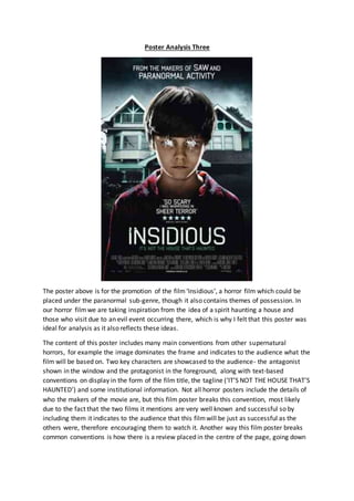
- 1. Poster Analysis Three The poster above is for the promotion of the film‘Insidious’, a horror film which could be placed under the paranormal sub-genre, though it also contains themes of possession. In our horror filmwe are taking inspiration from the idea of a spirit haunting a house and those who visit due to an evil event occurring there, which is why I felt that this poster was ideal for analysis as it also reflects these ideas. The content of this poster includes many main conventions from other supernatural horrors, for example the image dominates the frame and indicates to the audience what the film will be based on. Two key characters are showcased to the audience- the antagonist shown in the window and the protagonist in the foreground, along with text-based conventions on display in the form of the film title, the tagline (‘IT’S NOT THE HOUSE THAT’S HAUNTED’) and some institutional information. Not all horror posters include the details of who the makers of the movie are, but this film poster breaks this convention, most likely due to the fact that the two films it mentions are very well known and successful so by including them it indicates to the audience that this filmwill be just as successful as the others were, therefore encouraging them to watch it. Another way this film poster breaks common conventions is how there is a review placed in the centre of the page, going down
- 2. like a list which again encourages people to watch it as they can see that it has been successful in frightening other people. The poster’s mise-en-scene displays what appears to be an urban setting, which is quite atypical of the horror genre as usually houses are displayed with a lot of empty land around them to create the idea that there is no one to help them, whereas here although there are trees surrounding the house, it is clearly one of many on a street as this is quite a typical design of a house. This again breaks horror conventions as usually the house is very large and Victorian looking, whereas this one looks quite modern. This links with the tagline being ‘It’s not the house that’s haunted’, and how while the action does take place in the home, it is because of an event which has occurred there. This would be effective in frightening the audience as they would feel a lot more similar to the characters in the situation and therefore adds to the scare factor. What exactly is haunting the house is displayed through the mysterious shadow displayed in the window, along with the fact the young boy has had his eyes scratched out of the photo, indicating that there is something not quite right about him. There is an obvious irony in the fact that this is a young boy standing outside his house, as this it is usually quite common for children to play and have fun outside their houses when they’re young, whereas in this image the child looks the opposite of playful. The lighting used in this frame is, like most horror posters, is dark, grey and shadowy, and is done to create a feeling of terror in the frame. Grey and black also suggest loneliness and fear, common human emotions, which could link to both the antagonist (the spirit) and the victims. Under lightning is made use of to illuminate the face of the boy in the foreground, therefore drawing the audience’s attention towards him and presenting him to be the main source of evil within the frame. This also signals the sub-genre of the film to the audience as it is a common feature in paranormal/possession movies to use children and other innocent objects as carriers of evil, as the audience will be a lot more shocked to see a child behaving in an evil manor as opposed to an adult. The bottom and top sections of the frame are in complete darkness, and only the area on and around the boy’s face are visible on the page. This effect makes it looks like the boy and the house are being looked at through the eyes of a dark spirit, or perhaps that the light in the boy’s life is slowly being snuffed out. Compositionally speaking, the male character dominates the frame more than any other feature and is one of the most eye catching pieces on the page, which is explained by the rule of thirds. The audience is presented with a mid-shot of the child standing in front of a regular looking house, and while the house itself doesn’t appear to have anything wrong with it, it is made clear through the positioning of the boy and the fact that his eyes are scratched out that he is the cause for the mysterious and uninviting vibe which is being given from the image. By using a child as the portal for evil appeals to Levi-Strauss’ theory of binary opposites of good versus evil. Despite the attention being drawn to the boy as he is in the centre of the frame, presenting him to be the perpetrator in the situation, there is some indication given that he is being controlled by an unearthly source due to the fact that there is a shadowy figure standing by the window watching him, almost as though it is acting through the boy. It is fairly obvious that this child has a strange sense of adult power surrounding him, due to his mature and serious stance which you wouldn’t usually see in a
- 3. child, along with the slight hint of a wicked smile on his face, as though he is aware of the power which he holds. The idea that we can’t actually see the child’s eyes links with the expression of the eyes being a window to the soul, therefore saying that he doesn’t have one anymore. In addition to this, the fact that we can’t see any features on the shadow in the window indicates that it is also a void of identity, and is quite possibly completely inhuman. The costume of the boy is very typical for a child of that age. From what is on show, the audience can see that he is wearing a pair of tartan printed pyjamas. At first glance, this may appear to be fairly usual, but it is only when you pay particular attention to them that you begin to see the darker undertones behind them. This is coming from the fact that the pyjamas are completely red and black, which are two quite vivid and dark colours for someone so young to be wearing, as they connote the idea of danger, blood and also loss of hope so the fact that a potentially possessed child is wearing theses colours links strongly to the role of his character. This links to the fact that the colours that appear the most are black, grey and red, continuing these connotations. Perhaps an ‘ordinary’ child would be more likely to wear something brighter, colourful and aesthetically pleasing to them, as even the style of these pyjamas could be seen as quite mature for someone of his age. The hairstyle of the boy is also completely typical of a child of his age, again showing to the audience that the events in the movie could happen to them. The title of the film‘Insidious’ is quite unique and unlike typical words used as supernatural film titles such as ‘possession’ ‘exorcism’ or ‘devil’, making this film appear unique to its kind. The word ‘Insidious’ means to proceed in a subtle way but to create dangerous effects, which suggests that in the movie there will be a lot of tension building moments, as the evil will not be immediately obvious but rather will gradually build itself to create catastrophic situation. The title is presented in uppercase sans serif font, and has been given a slightly scratched effect which works well with the fact that the boys eyes have been scratched out, suggesting that something has perhaps attacked the page in anger. The font itself is written in white which is quite ironic as white brings to mind the idea of peace and innocence yet the child appears to be far from that. The tagline for this film is featured below the film title, as if following on from it in a sentence. It is presented in a rotting green colour reflecting the abnormality of the situation and how things will perhaps be slowly destroyed. Much like the title, it is presented in the same font and in capitals as though someone is shouting the tagline as a warning that what is inside is not what you would expect. There is also a real significance in the tagline as a whole, as it is displaying how the movie is not like any other film of its kind which is typically based around a haunted house, but this one is focused more on the people which have been inside it. This would be exciting for the audience to know that they are going to see something different and unlike anything that they have watched before, though also terrifying as the tagline warns that ‘it’s not the house that’s haunted’.