
Recommended
More Related Content
What's hot
What's hot (19)
Similar to Annotations of existing horror movie posters
Similar to Annotations of existing horror movie posters (20)
Recently uploaded
Recently uploaded (20)
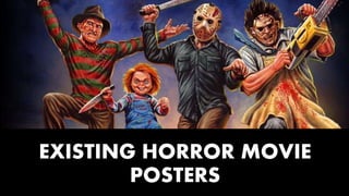
Annotations of existing horror movie posters
- 2. There is clear binary opposition within this poster as the girl’s face is highlighted and brought out of the mise-en-scene vividly with bright white lighting, contrasting massively with the dark shadows around her and particularly towards the bottom of the poster. This represents the two opposing forces within the story; light vs dark, good vs evil and purity vs corruption. There is a tagline on this poster which is a very conventional feature of film posters. They allow some insight into the narrative of the story. It is also very conventional for a tagline to involve some kind of pun; this is a stroke to the viewers intelligence and makes them feel part of something. The title of ‘SCREAM’ in itself shows clear connotations of horror. For example, the white font colour represents purity and it is against a grey gradient into darkness, almost as if the letters represent the victims as they are all spaced out individually standing letters (symbolising their isolated one-by-one homicides) with the darkness (killer) creeping in on them; similar to the shadow creeping behind the letters.Additionally, the ‘M’ in ‘SCREAM’ has a sharp pointed mid-part which is noticeably unique from the other letters. This refers to the sharp instrument of murder which the killer will use on their victims. The words ‘highly acclaimed new’ followed by the well-known director’s name serve as ‘buzz words’ as they are words which create an excitement. Having the clear mention of who directed the film, alerts the audience to the fact that this film has a certain status by having a well known, well respected director tied to it. This therefor helps with the audience appeal as they are more likely to watch a film by someone they are familiar with as they may have enjoyed their past projects. This poster is very formulaic as the principal cast and crew are placed in a conventional diamond- rectangular shape towards the bottom of the poster. This serves the function of acknowledging some of those involved in the film, but most importantly, identifies this as a film poster due to it’s conventional reputation. The irises of the girl’s eyes are the only vivid splash of colour we see on this vastly monochromatic poster. This might allude to the fact that she is the final girl and the light blue colour symbolises innocents. Also, it has connotations of freedom as it is reminiscent of clear blue skies meaning she is the only one to survive in the end; to be free. However, her pupils have a spreading darkness effect, appearing to spread the black into the irises. This represents her transition from her normal life to the one filled with terror. The conventional placement of the company logos at the bottom of the poster under the principal cast and crew additionally identify this as a film poster. Also, it demonstrates a level of synergy as the website for the film is visible as well.
- 3. The lightning splits the chucky doll’s face in half and presents a darker side and lighter side. This visually fractures the face and therefor depicts the damage he is going to cause, but also the two sides of Chucky. The sweet lovable doll on the surface, but the binary opposite of the deranged murderer within, highlighted by the shadow on half his face. By having the killer’s face in the dark sky, he is given that supernatural immortality which is conventionally conveyed in slasher posters; they are feared because they cannot be killed. Also, because the audience can project their worst fears onto the ‘monster’ in the film; which is why his face is kept mostly in the shadows with only his eyes showing - playing on the ‘fear of the unknown’. He appears almost God-like, omnisciently watching over though with malicious intentions. The lightning helps to give him this inhumane, unnatural sense of ‘another being’. There are many elements of German expressionism in this poster such as the non-naturalistic angle of the building, as well as the fractured shapes on the mise-en-scene caused by the lightning. The shadows also echo this. These aspects disorients the audience and thereby creates a sense of discomfort. The flat building seems like an ordinary living place but it has been morphed and placed ajar with the lightning glow and irregular angle; this makes even the familiar fearful. The film name is written in white which highly contrasts the background and so, contrasts the ‘evil’ with the appearance of good. The font is in a childlike style which once again, plays on the idea of binary opposites. Binary opposites such as things representing childhood (Chucky doll), are particularly effective is slasher films as the demonic take on something ‘pure’ makes it hard to question what’s good anymore. For example, the innocent title of ‘Child’s play’ is corrupted by a splatter of blood which alludes to violence and death. The company logos and the principal cast and crew are formulaic film poster features which are visible here. However, they are placed in a slightly non-formulaic way; rather than a diamond shape spreading across the bottom of the poster, it is on the bottom left corner. This is to follow the main shape and image in the poster, as does the title and tagline. The tagline conventionally involves a pun – ‘make-believe’ referring to children and their naivety. It also offers insight into the narrative. In having the woman falling out of the building, we are expecting of the gore that will occur. This does not follow all slasher conventions by making parents ineffective or absent altogether as the usually are because the woman I a mother. She is wearing a professional jacket suggesting she works and provides for a child, and she is not sexualised by the mise-en-scene. This makes it more horrific a mother is a caring figure which would care more about.
- 4. Under her dress, we can see the slight refection of it. Once again emphasising how shiny and grand the event is. However, it could also be a nod towards Barbara creed’s ‘woman are monsters’ theory as there are essentially two of her in this poster, the one we can see and the reflection that is cut off; the potential monster within her. Synergy is visible as the website for the film is on the bottom of the poster underneath the conventionally placed, diamond shaped principle cast and crew. The tagline reads “it must have been the best day of my life”. This shows the juxtaposed expectation of what a wonderful experience ones wedding day would be, with the bloodbath it will actually be; it’s an ironic tagline which in fact says “it will be the worst day of my life”. There are obvious binary opposites within this poster. The biggest one being the white of the background and dress with the blood. Wedding dresses are traditionally white to represent purity and innocence; like the Virgin Mary. However, this purity becomes corrupted. Polluted by the blood at the bottom of her dress and the horror sow her wedding will actually represent. This poster is very unconventional in terms of slasher horrors. This is because the colour palette is very non- formulaic in the lack of dark colours. However, this poster uses the red in small yet impactful proportions to shock the viewer and make them uncomfortable by making such a beautiful image frightening. The patterned boarder on the poster makes it looks like a wedding invitation. The elegant corners complemented by the calligraphic fonts help to emphasis this angelic goodness. In fact, the upper half of the poster would not suggest horror or violence at all. The title is ‘REC’ which is short for ‘recording’ which we see on the corner of a camcorder screen with the red light when it is recording. The red light, however, is replaced with a red blood splatter. This suggests brutality and violence which will disrupt her special day, as it has disrupted her dress. This is the third instalment of a trilogy which is clearly stated with the number 3. The title is written in a grey font which contrasts to the whit somewhat as grey has connotations of masculinity and strength whereas white connotes delicates and femininity. This could symbolise the protagonist’s rise to battle as it is conventional for the final girls to defeat whatever monster hunts for her. This foreshadowing of her heroism reflects how she is looking into the camera lens; as if she is challenging the viewer - all the white and innocence is just a façade. The director’s name is placed under the title in the same calligraphic font; this poster therefore has the status of being a ‘Paco Plaza film which his fans will be interested in.