
Recommended
More Related Content
What's hot
What's hot (20)
Viewers also liked
Similar to Poster analysis one
Similar to Poster analysis one (20)
More from rebeccadahl98
More from rebeccadahl98 (20)
Recently uploaded
Recently uploaded (20)
Poster analysis one
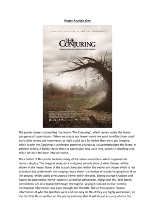
- 1. Poster Analysis One The poster above is promoting the movie ‘The Conjuring’, which comes under the horror sub-genre of supernatural. When we create our horror movie we want to reflect how small and subtle noises and movements at night could be a lot darker than what you imagine, which is why the Conjuring is a relevant poster to analyse as it also emphasises this factor. In addition to this, it boldly states that it is based upon true case files, which is something else which we wish to factor into our movie. The content of this poster includes many of the main conventions which supernatural horrors display. The image is eerie, dark and gives an indication of what themes will be shown in the movie. None of the actual characters within the movie are shown which is not as typical, but underneath the hanging noose there is a shadow of a body hanging from it on the ground, which subtly gives away a theme within the plot. Seeing strange shadows and figures on paranormal horror posters is a familiar convention. Along with this, text based conventions are also displayed through the tagline (saying it is based on true events), institutional information and even through the film title. Not all film posters feature information of who the directors were and can only do this if they are highly well known, so the fact that this is written on the poster indicates that it will be just as successful as the
- 2. other movies the directors have made. One way this poster breaks typical films conventions is through the placement of the institutional information, as usually this is placed at the bottom, centre of the poster, whereas here it is placed on the left hand side, drawing more attention to the shadow on the ground. The mise-en-scene for this poster is showing a very rural setting, with mist surrounding the area. The setting is highly significant for the movie as it is where all the supernatural events occur. The most significant part of the image is the noose hanging from the dead tree and shows immediately how this house has death hanging over it, and how perhaps nothing can thrive here as the area is so contaminated with an evil presence. There is an obvious link between the placement of the house and the noose as it has been made to look like it is hanging over the house itself, reminding the audience that whatever terrible event occurred has left its mark on the house. The house is surrounded by trees and mist, indicating how there is no escape of the natural forces taking place here. Structurally, the house has many deep windows sunken into the walls creating dark dips all over it. This not only removes any connotations of cosiness or comfort which usually go with the idea of home, but also makes it look hollow and menacing, as though anyone who enters would be highly unwelcome. The dark clouds hanging overhead add to the grey, dying atmosphere and show how there is no light or happiness to be found there. Nature plays a strong role in this poster as the fact that nothing is growing and there are rotting leaves on the ground highlights how the destruction which occurred here is unchangeable. The lighting used in this frame is natural, muted and dark. This is done to create the idea of lost hope and terror within, as light can be used as a symbol of hope so without it there is an idea of being lost with no positive outcome. By using natural lighting, it continues the idea of nature being a powerful force within the movie so by the lighting being dark and gloomy it is reflecting how nature acts in the movie, clearly signalling to the audience the themes which will appear. The lightest part of the image is from an off white, mysterious cloud hovering over the house, which is what is shining on the tree to create the shadow of the body hanging on the ground. The fact that the shining light is over the house and making something visible which would usually not be seen is a highly effective yet subtle way of indicating how things are perhaps not quite right in this area, and the paranormal sightings are reflective of the sub-genre. There is a slight contrast between the foreground and the background, as the front part of the frame appears to have the darkest and largest shadows whereas behind it there is a slightly lighter patch hanging over the house. The whole image is slightly off focus due to the use of fog, showing how the terrors inside are not completely obvious and you have to pay attention for them to be revealed. Composition wise, the tree with a noose hanging from it, along with the house are the two focal points of the frame. The audience is presented with an extreme long shot of the house, with the tree standing closer to the camera. The noose hanging from the dead branches is particularly bold within the frame as the shadows make them appear black in colour. The connotations which come with the colour black are of power, death and evil so the fact that these are the colours dominating these particular props shows how much power they will hold over the plot and how they are the central theme in the movie, and are
- 3. most likely going to have some greater significance. The positioning of the shadowed body on the ground below the noose also serves great importance. The fact we can’t actually see the person hanging from the tree, only a shadowed figure on the ground indicates how the victim of this death was weaker and more vulnerable than whatever killed them, and gives an idea of the power behind the forces at work. We also cannot see the victim’s face which is significant too as it creates the idea of them being a ‘faceless’, ‘nameless’ void of identity. This could be used as an idea that they had no meaning to whatever was behind the death and was potentially just a sacrifice or a result of being haunted, and there is no recognition of what exactly made that person get into that position which furthers the mystery behind the plot. Because of this, the audience is forced to use their own imagination to fill the gaps in the cover image’s story. Despite the body of the victim being invisible in the frame, the costume of the shadow on the ground gives some indication as to who the victim was. From examining the shadow, it appears that the victim is wearing a long nightgown, which is typically a very old fashioned type of nightwear, indicating that this person is most likely a young girl. Using children as a victim of evil is a typical convention of supernatural horrors, and by using a child as a victim of this makes it even more distressing and emotionally provoking for the audience to watch. In addition to this, the due to the prehistoric cut of the costume, it seems more than likely that the death happened a long time ago, though the composition of the land makes it seem like nothing has changed since this event- almost as though time has frozen around this event, preserving the evil forces. By using old fashioned houses, props and costume in movies is a typical theme that runs in supernatural films which is why it is more than likely that this is a long old fashioned night dress. By the victim wearing a dress which is very long gives her a bit of a ghostly look, but also adds to her child like innocence and femininity. We can see through the shadow that the victim is barefoot, which provokes more questions for the audience as we want to know why a young girl was wandering around the garden at night barefoot, and also adds a sense of chills and coldness as it presents her as being in a completely natural state, when in reality it is something quite the opposite. The title of the film being ‘The Conjuring’ goes well with the image of the deserted, lonely house as it indicates to the audience clearly that there is more to this strange house than meets the eye, and that it is going to be revealed in the movie what made it look so desolate. The word ‘conjure’ means to see a spirit or ghost through a ritual, which is a common theme in supernatural films so this would appeal to fans of this genre. The word also links to the shadow of the body on the ground and hints that this process of revealing the invisible has already begun. The title itself is presented in black upper case serif font. By using capital letters it makes the title seembolder and more eye catching, and by placing the word ‘the’ above ‘conjuring’ almost makes it look like the title of a children’s story book, adding to the idea of corrupt innocence. The black contrasts with the grey clouds it sits on adding to the bleak, dead look. A tagline features directly below the title, almost becoming part of it, so it is easily noticed by the audience. The font is slightly smaller than the title, but still upper case, making it clear that it is not part of the title but is strongly linked with it. There is a real significance to
- 4. the tagline as a whole, as it is advertising the fact that everything being shown in this movie is based on a real case file, and even gives the name of the family who the events happened to, therefore making it appear more realistic and personal. Saying that the movie is based on true events is a good way of frightening the audience and is fairly common within the horror genre, but something which isn’t usually done is giving the name of who it happened to. This gives the idea that it is a unique movie unlike any other within the supernatural genre, therefore encouraging more people to watch it.