
Recommended
More Related Content
What's hot
What's hot (20)
Similar to A Level Media Studies - Poster Textual Analysis
Similar to A Level Media Studies - Poster Textual Analysis (20)
Recently uploaded
Recently uploaded (20)
A Level Media Studies - Poster Textual Analysis
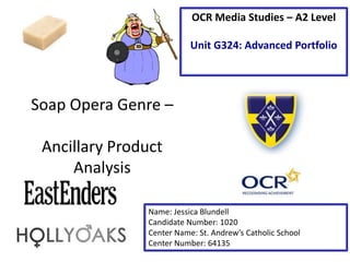
- 1. Soap Opera Genre – Ancillary Product Analysis Name: Jessica Blundell Candidate Number: 1020 Center Name: St. Andrew’s Catholic School Center Number: 64135 OCR Media Studies – A2 Level Unit G324: Advanced Portfolio
- 2. Tagline – the tagline ‘Walford will change forever’ is dramatic and foreshadows (‘enigma clue’ – Roland Barthes) a big event is going to occur and change everything the audience knows about the soap. The fact that it is on top of the Walford which fades to black connotes that the characters are going into a dark time and will be forever changed because of it. Image – The main image is of an EastEnders character who is looking to the right, it appears as though she is looking back at Walford, the fictional location of EastEnders. This connotes that she is looking back as it is her past which reveals that this character is potentially gone and not coming back. The fact that there is some red colouring denotes that this character could or has been in danger and leaves the rest of the characters in danger too. Synergy with social media – encourages the audience to be interactive with the soap and the rest of the audience. It also acts as free advertising as word of mouth will happen as people will see the hash tag on their social media and discuss it, especially twitter and possibly want to watch to find out more Institution Logo – The institution logo helps to promote BBC and its programming, as well as providing a easily recognizable brand identity. It is also placed in a position where it doesn’t interfere with the main image Brand Identity
- 3. Image – This non-verbal code of the image of the soaps characters has been manipulated to look like flames. This connotes that there is fear, rage, danger and destruction in the episodes this poster is promoting. This foreshadows future events in the soap as unpredictable and dangerous as it can be suggested that the characters have the ability to be threatening towards each other. Institution Logo – The institution logo is in white and is to the right of the page so that it doesn’t obstruct the main image consisting of edited characters. It is also not too bold and is transparent so that the main image is still visible. Tagline – The tagline denotes how there is going to be permanent change to the characters’ lives on the soap. The words ‘week’ and ‘forever’ contrast as they are such different lengths of time which could denote how the soap will be dramatic and full of tension in that one week and have long lasting effects. By looking and this poster and understanding the ‘Propps character roles’ the centralised female character would be known as the ‘princess’ because she looks vulnerable as she has her arms around herself as if she is protecting herself. The male at the right in the back would be known as the ‘hero’ because he is looking in the distance with his arms folded which could suggest he is a protector.
- 4. Social media synergy – The twitter and facebook idents along with the #hashtag allows the audience to be active with the soap and will also act as free advertising as the #hashtag will be discussed on social media and bring in new audience members. Quotes – quotes critics and stars the soap has got helps promote the soap as it makes it seem interesting and exciting. The fact they are from professional TV magazines further promotes the soap because if it has been reviewed by critics people are more likely to want to watch it. Main image – the main image shows 5 of the soaps characters looking serious, symbolising the themes of the soap and how it is serious and dramatic. The pictures are medium shots show that the characters are not close and allows you to see the dark clothes they are wearing, highlighting how the soap has dark themes and bad things may occur. Tagline – The tagline connotes that the soap will get dramatic very quickly and no one has any control over it. It is outlined in a red/brown colour which represents heat but also how the characters are under threat from the themes present in the soap. Institution logo – the institution logo is one that many people will be familiar with and therefore will be more likely to watch it. It is also placed in the corner so that it doesn’t distract people from the main image but is still in a position where people can see it.
- 5. From looking at these posters I have gathered ideas and got a better idea of what codes and conventions I should use in my own poster. In my poster I will ‘repeat’ (Steve Neale - 1980) the use of a tagline to increase the drama and anticipation to watch and find out what happens in the soap. Another convention I will ‘repeat’ is Walton Hill’s social media idents and hashtag. This is because it will increase discussion about the soap, convincing people to watch another episode and possibly inviting new audiences. It also makes the soap seem like it wants to interact with the audience which makes it appear friendlier and like it wants the audience to interact.