The document provides analysis of three horror/thriller movie posters. It discusses genre conventions like dark backgrounds, limited color schemes, and the villain or main character centered. It then analyzes three specific posters, noting elements like blurred faces in the background of one and the shocked expression of a woman in another. The analyses highlight elements incorporated into the author's own poster plans, such as dark spaces surrounding characters and hidden villains. The document concludes posters provide less information to build intrigue before a film's release.
UGC NET Paper 1 Mathematical Reasoning & Aptitude.pdf
poster.pptx
1. Poster planner
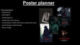
Genre conventions:
- thriller/horror
- psychological
- dark background
- usually only 2 color schemes
- main character or Villan of the story usually at the center
- specific design to match the plot
- little or no light
2. Poster analysis
What I like about this poster is the blurry pale faces enlarged in the background hiding in the
black as if their ghosts hiding in the shadows. The similarities between this poster and mine
is that they have a lot of darkness surrounding them with a faint light source coming from
the center. The genre conventions they highlight is horror especially with the tagline "a
ghost's story" as ghosts and paranormal themes are linked with horror films. This poster
appeals to the paranormal type of style horror fans as they have a lot of ghostly typefaces
surrounding the two characters and broken run-down walls which could suggest the film is
set in an old abandoned house and those types of houses are usually haunted. The broken
creaks in the walls and run-down old door tells me that this narritive sets place in an
abonded house that a family may move in due to the taller figure rapping their arm around
the smaller figure and due to the blurred faded faces, it may be haunted.
3. Poster analysis
What I like about this poster is the white and black colour scheme as It adds to the dark and
creepy aspect of the film. The audience is attracted by the sesne of creepyness and mystery
as everything in the poster is blacked out apart from the girl and the blinds which makes the
audience think what could be hiding in those shadows and what is she looking at that has
shocked her so much. What I will be incorporating from this poster is the blacked-out space
surrounding the character with the shine of light showing their figure. The genre conventions
this poster highlights is thriller as it gives off more tension and unpredictable events more
than gore, fear and doom. This poster tells me that the women peeping out the window is
the victim of the narrative as the shadowed blinds on her face make it look as if she's
trapped hinting that she's trapped a killer or something onto her and can't get away
especially due to her scared and cautious facial expression.
4. Poster analysis
What I like about this poster is the red circled v in the title as it adds their own type of style
and font without overdoing it. The similarities between my poster and this poster is that the
light shining in the middle and outlining the villain and the red font. The genre convention
this poster highlights is science fiction action as the tagline mentions it's for the creators of
the matrix which is a science fiction itself and the other tagline mentions government which
suggests it may hint at a dystopian as the government usually plays a big part in dystopian.
The fact the character is wearing a creepy smiley mask like villain family in the purge tells me
that they are the villain of this narrative along with being hid away in the shadows as if they
are trying to hide their identity, I could incorporate this into my poster by hiding away the
villain of my film in the shadows. I believe this attracts their audience by adding ' from the
creators of the matrix trilogy' as fans of the matrix trilogy will see this and be eager to see
the film as they enjoyed the creators last piece.
5. The similarities between all these posters is that the main character is
always the only one in the poster and is usually a close up of them with a
plain background that’s usually white. I believe the people who have made
these posters has done this to highlight this character as a sign saying that
they should be giving their full attention to this character and this character
only.
6. Light shining from computer screen
Figure of female sat at computer
Décor around her is just pictures of
her ex
Dark room only light source is from
her computer screen
9. PROPOSAL
TITLE: the ex
The purpose of this film is to entertain thriller fans and educate the audience on how scary and obsessive exes can become. The
genre of this film is a psychological thriller, elements of the plot will be blood, a person rather than a paranormal entity causing
harm and more messing with the mind than a killer going on a killing spree. The plot of this film is basically a girl in her early 20s
whose very obsessed with her ex girlfriend to the point she has convinced herself that they are meant to be together to the point
where she has revolved her entire life around this one person to the point of sanity. My finished poster will look be a dark smallish
room with no windows or any light source apart from the computer screen with a figure of a girl sat down surrounded by pictures
of her ex all over her walls with the title on her computer screen with the film 4 logo in one of the corners and the billblock along
with actor names will be at the bottom. The images I will use are a wall covered in pictures of a girl with another girl sat Infront of a
computer screen, this is because I want to make it obvious that this film is about some sort of stan/ stalker while also making it look
creepy. The font styles I will be using will look like someone wrote the title in blood to hint that this film will include gore and blood
to intensify this stalker/ stan. The audience is both male and females in their late teens to those in their 30s with an aim for a 15
certificate. I will appeal to this specific audience by using a hint of romance to attract the female side of the audience by showing
the main character having an interest in another, and a hint of thriller by using blood and dark surroundings but not too gory so the
younger audience aren't put off. I will advertise this product to reach the younger side of the audience by posting about it on social
medias such along with sponsoring celebrities that the targeted audiences like to promote it on their socials and for the older
audience simply putting posters on bus stops or getting it on the bus so they see it on their way to work. The resources I will need
are women in their 20s, pictures of one woman to put all over wall, and a computer. The software I will be using is photoshop.
Distribution is sharing something to a lot of people, posters fit this into film distribution as you are sharing your merchandise/
advertisement to the public. The reason posters give away less information is because they want to gain an audience before they
release anything more as it creates a buzz around friends and family trying to theorize the movie's plot and what will happen,
which guarantees sold tickets already.
10. sketches
The ripped-up picture
represents an end to a
relationship
Shows the age
suitability
Billblock as it’s a quad poster
the audience know where to
watch the film
blood – shows horror element
Horror element/ shows
character is vengeful
shows she's a stalker
only light source coming from
laptop screen – makes it
creepy
Faced away to add mystery
14. Graphic layout
MAIN IMAGE TITLE MAIN IMAGE
TITLE
BILLBLOCK
RELEASE DATE
STUDIO
AGE CERTIFICATE
STUDIO AGE CERTIFICATE
RELEASE DATE
MAIN IMAGE
RELEASE DATE
TITLE
AGE CERTIFICATE
STUDIO
BILLBLOCK
Quad
theatrical teaser
15. photography
TYPE OF
SHOT ORIENTATION DESCRIPTION LOCATION INT/E
XT
MODELS
NEEDED EQUIPMENT
PHOTO 1
Mid shot Portrait A woman sat
Infront of a
computer screen in
front of a wall of
pictures of her ex
My
bedroom
int
two women
Pictures of a
women and a
computer and
camera
PHOTO 2
Close up landscape A wall of pictures of
a women with a girl
standing Infront
holding a knife
My
bedroom
int
Two women
Pictures of a
women on a wall
and camera
PHOTO 3
Close up portrait A picture of two ex-
girlfriends ripped up
with blood coming
from behind it
My
bedroom
int
Two woman
A desk, fake blood,
a polaroid picture,,
camera
16. Graphics POSTER 1 Type of graphic (I.e.
font, shape, logo)
Colour Description How will it be
created/ where will
it be otained
Release date Font Dark red Time stop https://www.dafont.
com/search.php?q=t
ime+stop
Billblock Font White Universal accreditati
on
https://www.dafont.
com/universal-
accreditation.font
title Font Dark red Nightmare https://www.dafont.
com/nightmare-
5.font
Studio Logo Black and red Block lines making
up the number 4
with the word film
placed in the middle
Film 4
Age certificate Logo Pink and white A pink circle with the
number 15 in white
BBFC
17. Graphics POSTER 2 Type of graphic (I.e.
font, shape, logo)
Colour Description How will it be
created/ where will
it be otained
Release date Font Dark red Time stop https://www.dafont.
com/search.php?q=t
ime+stop
bill block Font white Universal accreditati
on
https://www.dafont.
com/universal-
accreditation.font
title Font Dark red Nightmare https://www.dafont.
com/nightmare-
5.font
Studio Logo Black and red Block lines making
up the number 4
with the word film
placed in the middle
Film 4
Age certificate Logo Pink and white A pink circle with the
number 15 in white
BBFC
18. Graphics POSTER 3 Type of graphic (I.e.
font, shape, logo)
Colour Description How will it be
created/ where will
it be otained
Release date Font Dark red Time stop https://www.dafont.
com/search.php?q=t
ime+stop
title Font Dark red Nightmare https://www.dafont.
com/nightmare-
5.font
Studio Logo Black and red Block lines making
up the number 4
with the word film
placed in the middle
Film 4
Age certificate Logo Pink and white A pink circle with the
number 15 in white
BBFC
20. Legal and ethical
Copyright/ copyrighted materials
There are no copyrighted materials in any of my posters
Content clearances
I will need permission to use BBFCs and film 4 productions
logo
Location agreements
I used my own house, so I didn’t need any permission
Discrimination
I have not represented any social group unfairly
21. Legal and ethical
Informed consent I have consent from both my models (slide 19)
Child consent There are no children in my posters
Sex, violence, language
The use of blood may upset some children in my quad
poster
Over stereotyping
I have not stereotyped anyone
22. way too zoomed in didn’t even
mean to take this one
Angle is tilted and weird
Can't see laptop screen
Can't see wall of pictures or
computer screen
Model is looking at camera
can't see computer screen
Poster is in shot
i chose this one because it’s
the most accurate to the one I
had in my head and the laptop
screen is actually in view
23. POSTER ONE (THEATRICAL)
ISO APERTURE SHUTTER SPEED
400 f/5.6 47mm 1/60
Equipment: canon EOS 450D
- the setting for this photo is a room made to look narrow
- I intended to make it as you can't see the models face to make her a mystery and show
that her character is anti-social and may not be aware/ thinks its normal or there's
nothing wrong with her creepy behaviour as she's casually scrolling through her laptop
while surrounded by a wall covered in pictures of her ex
- I intended for the laptop screen to be fully in frame so that I can put the title on the
screen and the audience can still see it
- I however dislike how little pictures I printed out and how unorganised they are and how
a few unnesarry objects made it in the frame such as the iPad and phone, but it can make
it look more like the main characters on own home and can hint that she's good/ fond
with her technology
- I didn’t intend for the flash to be on but it makes the photo look creepier and stalkerish
and I can always adjust it in photoshop
- I made the model wear a grey sweater as it doesn’t show off her personality and
adds more of a mystery to her, so the audience feels the need to see the movie just to
figure out this character
24. Model was overtaking pictures
Angle is sort of tilted
i chose this one because you
can see the images and model
Decent the wall just looks
empty plus the knife is being
awkwardly held
25. ISO APERTURE SHUTTER SPEED
400 f/5.6 55mm 1/60
POSTER TWO (TEASER)
Equipment: canon EOS 450D
- the setting for this photo is a dark room with pictures put all over the wall to give a
creepy stalker vibe
- I didn’t originally intend to use flash but somewhat glad I did because it makes it look
even more creepy however, the glare it gave the pictures is annoying
- I made the model face away as it adds mystery to the character and the audience may
be curious to put a face to this figure
- I made the model hide a knife behind her back to hint at the horror element plus
because shes facing the wall of pictures of her ex while hiding the knife behind her back
it shows that her ex may have not seen this side of her/ the main character was hiding
this side from her
- I do however wish I could have printed out more pictures, but I can always just copy
and paste them in photoshop
- I made the model wear a grey sweater as it doesn’t show off her personality and adds
more of a mystery to her, so the audience feels the need to see the movie just to figure
out this character
- something I really like about this picture is the reddish nail vanish I just feels it looks
nice with the knife
26. I didn’t use this photo because of the
glare and angle plus the fake blood
looked unrealistic and more like paint
Lighting is too pink
Chose this one because it was
at a good angle, the blood
splotch isn't overdone, and the
lighting wasn’t too much or
too little
not in character
i chose this one because it isn't
too zoomed in and both
models are in character
27. ISO APERTURE SHUTTER SPEED
500 f/8 40mm 1/60
POSTER THREE (QUAD)
Equipment: camera NIKON D3400
- the setting for this image is my desk as its plain and the blood
looks cooler and more in the audiences faces
- I chose to rip up the photo to show a breakup between the
two
- I made both the models wear grey sweaters as it looks like
they're matching to show these two characters closeness
especially because it's sort of an LGBTQ+ film and some people
may get these two confused for ex friends instead of ex-lovers
- I chose to make the blood splatter start from the middle of
the rip to represent the heart break and again hint at the
horror/thriller element of this film
- I dislike how the fake blood looks more like paint than fake
blood but this was my seventh time doing this shoot and I was
running out of fake blood
- however, I do like the angle of this image and how zoomed in
and clean it looks
- I made model A (the ex) have her mask off and more
expressive to show her extrovertiveness and how lovable and
friendly she is to hint that she's the good guy of this film
- I made model C (the protagonist) face away from the camera with her mask
on to show she's more introverted and awkward which is usually in traits of
stalkers and to also make the audience suspicious of her
- I also like how the two characters come off as opposites (cheerful and
extroverted vs awkward and introverted)
28.
29. Before after
- I used the text tool with the warp tool to make the title
appear sideways on the screen
- I then used the blur filter to make the title look as if its
apart of the screen
- I used the selection tool to copy and paste some of the
pictures on the wall to make it look as if there is a variety
of them as I didn’t print out enough
- I lowered the saturation to make the room darker
- I used the lasso tool to crop around the laptop screen to
raise the brightness then used the paint tool to give off
the glow effect
PROGRESS - THEATRICAL
30. Wall of pictures of same
person – stalker trope
Character faced away from
camera + grey sweater adds
sense of mystery on both
personality and physical
appearance wise
dark lighting makes it creepy
and spooky – horror/thriller
convention
Dark red colour + blood
dripping like font – horror
convention
Release date – near Halloween
shows its most likely horror
Logo – shows where it's going
to be streamed
Age certificate – 15, shows
there's going to be a bit of
gore/blood
Billblock - may recognize an
actor whose appeared in a few
horrors/ thrillers
31.
32. before after
PROGRESS - TEASER
- I used the crop tool to crop the image
- I used the warp tool that accommodates the text tool to
bend the 'coming soon' so it goes over the model's head
- I used the selection tool to copy and paste the pictures
and spread them all over the wall as I didn’t print out
enough
- I made a completely black layer then put it under all the
other layers then proceeded to grab the white paint tool
to create the shiny knife effect
- I made two white mini rectangles, angled them
horizontally and then used radius blur to create the shine
x effect
- I lowered the saturation
- I lowered the brightness
- I used hue to make the image the tiniest shade of red
33. Prop - knife, there's going to
be killings/ gore scenes
wall of pictures of same girl –
stalker trope, shows an
LGBTQ+ theme/ genre
no bill block – it’s a teaser
poster
model facing away from
camera – adds a sense of
mystery
Glow in shape of an x – the
film is called 'the ex' / x marks
the spot
34.
35. Before
after
PROGRESS - QUAD
- I used the crop tool to crop the image
- I lowered the saturation
- I lowered the brightness
- I increased the contrast
- I used the text and warp tool to make the titles bend to make it look
cooler
36. ripped up picture of two girls –
shows some sort of break up
Splattered blood – fits into
horror convention
ex-girlfriends – LGBTQ+
conventions
Release date – the fact it's
coming out around Halloween
shows its horror
37. EVALUATION
I used photoshop to edit my posters by using the crop tool to crop them down to the required size, I lowered the saturation to make the
posters darker and dim, the lasso and selection tool to raise brightness in certain areas such as the laptop screen in the theatrical poster, and
the motion blur tool to make glows fuzzy to make them look more realistic – such as the knife in the teaser poster. I created meaning in
my theatrical poster by putting the main character in front of a wall of pictures of her ex-girlfriend to show she's become obsessed with her,
and I also made her look as if she's scrolling through her laptop to make it seem as if she was stalking said ex-girlfriend's social media accounts.
I created meaning in my teaser poster by having the character hold a knife while looking at her wall of pictures covered in her ex to show she
wants revenge or as if she feels ' stabbed in the back ' by her ex. In the quad poster I created meaning in this poster by cutting a rip into the
picture in this poster, so it symbolizes a breakup and the blood bleeding out from the rip shows murderous/brutal intentions. I overall showed
meaning in all my poster by making the main character face away from the camera in all of them to add mystery to her character along with
making her wear the same grey plain sweater to even hide her personality from the audience – as it’s a dull plain colour. I showed narrative by
trying to make it as obvious as I can in all these posters that the two characters were dating and that they are both women to show an LGBTQ+
genre/ convention. I made the stalker narrative clear by using the wall of pictures in both my theatrical and teaser poster and trying to show an
introverted awkward attribute in the quad poster for the main character as these are usually traits of a stalker. I made the horror genre obvious
by the knife, blood and dripping blood like font for the titles and release dates (nightmare) I even made the posters low in colour and
brightness as mentioned before. I attracted the audience with these posters by making the characters lesbians to attract the LGBTQ+
community. I attracted the horror side of the audience by using a lot of blood and dark red colours. I met the brief by keeping the film at an age
15 certificate, using a diverse cast, I added the film 4 logo along with the BBFC logo, I used cast names, and a sense of the narratives conveyed
throughout all of my posters.