Textile Waste In India/managing-textile-waste-in-India
Magazine Powerpoint
1.
2.
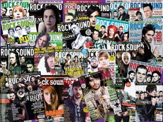
3. History of Rock Sound…
- Rock Sound is a British Magazine
- Publishes Alternative Music
- Aims at being more underground and less commercial
whilst giving information about well known acts
- Was launched in March 1999 by the French Publisher
Editions Freeway
- And was bought out by Patrick Napier in 2004
- First issue cost £1.95
4. Institution…
- The name of the Institution is call All Saints
Retail Limited
- They were created in 2002
- The other effects that they sell are clothing
http://www.companiesintheuk.co.uk/ltd/all-
saints-retail
5. The Magazine Analysis…
They have used the rule of 3,
black, pink, and yellow.
Makes the magazine look
more professional and
attractive. The colours that
they have chosen speaks to
their audience .
Masthead is bold and
recognisable. The
masthead directly says
what genre of music
the magazine is going
to talk about.
Primary lead on the
cover
Secondary leads
The main central image is of the
of the band members in ‘A Day
To Remember’. By using them is
helps put across to the audience
what the magazine is going to
be about and the fans of the
band would purchase this
magazine as they would want to
know more about them. They
all have eye contact with the
camera which engages the
audience and they would be
attracted to the band.
Instead of placing the puff at the
bottom of the magazine they
have put it in the middle so that a
customer walking past would see
it and would want to purchase it.
It is next to the primary lead so
the reader would definitely see it.
The primary lead and
the secondary leads are
different colours –
helps to make it look
colourful and not
boring.
I think that the USP would
be the 3 free posters and
the CD on the front.
6. Contents…
Main
Features
All the Main
Features in the
Magazine
The Primary
Lead
Picture of Jacoby
Shaddix- a
photograph from
one of the main
stories.
Staring into the
audience-
engaging them
Quotation from
the article-
makes the
audience want to
know more
The layout of the
contents is very simple
and makes it look
professional. They have
also used the same
colours, rule of three,
on the cover as well as
the contents. Makes the
magazine look
attractive
One main
image
7. Contents…
Feature
Picture of one
of the
Secondary
lead
Picture of one
of the
Secondary
lead Picture of one
of the
Secondary
lead
About the
magazine e.g.
editors
The layout of the
contents is very simple
and makes it look
professional. They have
also used the same
colours, rule of three,
on the cover as well as
the contents. Makes the
magazine look
attractive
They have also used a variety
of pictures some in a photo-
shoot others are of them
performing
8. Primary Lead… Photo taking up a
double page- big and
bold
Eyes are all
looking into
the camera-
engaging
with the
audience,
making them
want to read
it.
The name if the band takes up half of the page- in your face so you
will recognise it straight away
An
introduction
to the article,
makes the
reader turn
the page as
they would
want to find
out more
Talking about their
upcoming album-
informs the reader
11. Adverts…
In my magazine I have 38
adverts. These are there to
promote bands and acts.
There are also their for
fashion and new albums.
However in my magazine its
mostly for gig dates.
By having these magazine it
helps the reader to
acknowledge the type of
genre the magazine will be
focusing on and it is also
there to help space out the
magazine and to make it
look attractive and effective.