2. I edited my magazine on Photoshop in order to create the professional look:
First I started with the original image and duplicated the layer so I can edit it without any
hitches or problems …
Through this duplication I can edit the photo and
get rid of the background as I only want to use
the girl who is grabbing the camera due to the
girl in the background being in the way.
Now that I‟ve duplicated the layer I can now
use this tool to cut her out of the image and
place her on a new layer with the correct
measurements for my magazine layout.
However at the start of cutting her out, its not
going to be perfect, just as long as it doesn‟t
cut into the actual picture:
3. Now that I have a rough copy of Emillie, I can
now tidy up the image so I don‟t feature one
random part of the wall. To make sure that I
don‟t make any mistake I had to zoom (alt +)
into the image so I get a more precise
knowledge of what to get rid of behind her.
End Result:
As you can see it‟s still not perfect, but that doesn‟t matter
because for my background I am planning on having it pitch
black to connote danger and mystery as things may lurk in
the dark- ready to grab her. Just as long as I have a precise
and clean version of my main character.
Before I place a background
behind her, I need to use
“free transform” so I can
stretch her to make the hand
more dynamic and so she
can fit on the page without
looking too small.
4. After I have free transformed my image so she is in perfect
position, I can not move on to my background to make it less
boring. Due to an idea of my anchorage text “come out of the mist”
I have decided to add a fog image near her legs so it creates an
eerie and mysterious atmosphere. To do this I “Googled” fog and
found this image:
Now I can place it behind my character to create this odd
atmosphere:
Even though I have added fog into
the background, I still believe it is
quite boring and doesn‟t grab the
audiences attention, that‟s when I
came up with the idea of hands
poking into the page to grab her
and pull her into the darkness.
5. In order to edit these hands to make them blend into the background, I need to
open another page on Photoshop, otherwise the layers may overlap the picture:
All I want is the hands, so again I‟ve placed a
box around them and cut them out individually so
I just have the sharp detail of the hands peering
out of the background. After I‟ve taken them
apart from the picture, I then decide that I feel
like it‟ll be more effective if they were a different
colour, for example black and white. To do this I
need to go to “view” and find the editing pallet:
After changing both of the
hands to black and white, I
can then cut around them
again to get rid of the
excess parts that may be
hard to blend into the other
image.
6. Now that I have adjusted the hands to seem more
mysterious, I can add them into the magazine editing
page and place them where I want them to be. During
this process I decided to make it more ambiguous and
add three hands instead of two, so it creates the feeling
that there is more than one person trying to grab
Emillie.
Due to the hands being placed where
I want them to be, I can now focus on
adding reels and side images
showing what is going to be featured
in my magazine. I order to do this I
found the reel on Google then edited
it the same way I edited the girl and
the hands- just getting rid of the
excess parts so it would be easier to
place the images in the reel.
Fitting images
in:
After I‟ve fitted one image into the reel I can use the same process
of free transform to place them all on the reel. The images I have
used are an example of a new horror film, learning how some of
the directors film and two well-known stars sharing the limelight:
7. After the adjustment of the reels
and the side images, I can focus
on the other text to advertise
what‟s in store for the magazine:
This text is all in the same font, but I‟ve readjusted the spacing to
make it look more professional and changed colours of the different
films so they come across as eye catching and readable. I‟ve only
included five, but they are in different genres so it shows what my
film magazine is capable of: comedy, Indie, drama, horror and
animation (child's).
Now I can focus on making the title and making it seem in place
with the rest of the layout, by free transforming it again to fit the
whole page. The font I used was downloaded of a site, but it is
now embedded on this Photoshop system-
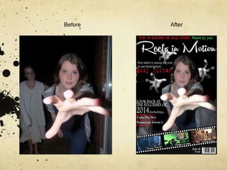
BEFORE-
AFTER-
8. In order to have continuity within my trailer and poster, I used the
same font that I found on the internet: 1942- to advertise my film
and support the film that is featured on my cover. However when
it comes to continuity, I‟ve had to change the colour of my name
because I don‟t believe it‟s as eye catching in white. Plus the titles
name connotes danger, blood and possibility of near death.
Almost done, but now I have to sort out a few hitches like behind the reel, I can still see
Emillie‟s legs poking out of the reel which make her look like she is floating. I‟ve tried to
stretch her, but it just look unusual, so I‟ve added a black rectangle underneath the reel so it
blends in and look more professional. On top of this reel- I‟ve added a barcode, issue
number and the price in ghost white:
9. To make my magazine appear complete, I‟ve added a skyline that will attract the attention of the
audience as “voted by you” is in emerald green and appears more eye catching than the „Top 50
Films…‟ The actress is also using direct address as if she was screaming to the audience for
them to help her.