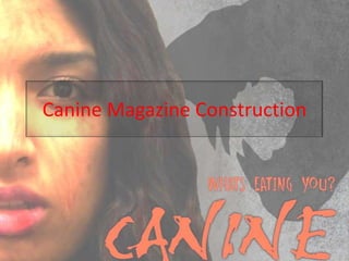
2. Possible images for the cover
The magazine cover will feature the sister and the wolf shadow. I
decided to use the half face image as this will give generous space
for the shadow and can still make eye contact with anyone who
picks up the magazine, encouraging them to look inside. By not
showing all of her face it also gives the impression that she has
something to hide.
3. Magazine construction 1
I began by adding a
layer mask to the
picture and then
using the magnetic
lasso tool to select
the subject. By
then inverting the
selection I could fill
just the
background with
colour and remove
it from view.
4. Magazine construction 2
I have begun to trim
away any stray bits of
hair by covering these
with the layer mask.
I used a similar
technique to cut out
the ‘empire’ title from
a real
magazine, which I
have then added to
my own cover.
5. Magazine construction 3
I have added the
copyright free
werewolf
image, applied a
layer mask and cut
round the view I
want to use.
6. Magazine construction 4
Having cut out the
correct view of the
wolf I then used the
paint bucket tool to
fill it in black.
7. Magazine construction 5
I have turned down the opacity
of the wolf to make it look
more like a shadow. I then
enlarged and repositioned it
in the top corner to give the
impression that the actual
wolf is stood in the same
place as the reader and this
is what the subject on the
cover is looking at.
I have added the title of my film
in a font downloaded from
www.dafont.com and with a
red outer shadow.
8. Magazine Construction 6
I have downloaded an
image from
www.brusheezy.com
and used it as the
background. I want
something that looks
like a wall or fence that
the sister can be
cowering against but
will also emphasise the
shadow. This
background is not very
effective at either of
these things, even after
changing its brightness
and contrast levels.
9. Magazine construction 7
This background (also
downloaded from
www.brusheezy.com
) works much better
as it both resembles
a stone wall and is
light enough for the
shadow to stand out.
Plus it also gives
subtle hints to the
moon as it
resembles the visible
surface.
10. Magazine Construction 8
I have added some
additional
articles and
features of my
magazine onto
the cover. I have
coloured them
red to continue
with the horror
theme but
outlined the
text in white to
give it emphasis
on the page.
11. Magazine construction 9 part 1
I am following the instructions
of a YouTube tutorial to add
a glamour glow effect to the
cover model
http://www.youtube.com/w
atch?v=64-23bvHi3Q
I have started by adding a
duplicate layer of the image
of the sister character.
12. Magazine Construction 9 part 2
• I then changed the layer
type to overlay so that both
images of the sister
effectively blend together.
13. Magazine construction 9 part 3
At this stage the image
is given the effect of
a very powerful
spray tan. I now have
to tone this down to
get the desired glow
effect.
14. Magazine construction 9 part 4
The way to tone
down the glow is
to apply a
Gaussian Blur onto
the top image.
15. Magazine construction 9 part 5
The general rule with
the Gaussian Blur
is to adjust it so as
you can just make
out the facial
features which is
what I have done
here.
16. Magazine construction 9 part 6
This is the before / after glamour glow effect comparison. As you can
see, the image on the right (after) looks far more professional and
glamorous than the image on the left (before). This look of glamour
is normal for images on the covers of magazines and this includes
those of the horror genre.
17. Magazine construction part 10 part 1
I now want to add
an outline to the
sister and found
this YouTube
tutorial which
should give me
the desired
look.
http://www.youtu
be.com/watch?v
=wcJB3db28p4
18. Magazine construction 10 part 2
I added a new layer
group and named it
brushes. I then added
brush strokes of
increasing lightness
onto separate layers
in the group and then
toned down the
hue/saturation to get
the look I wanted.
19. Magazine construction 11
This is the effect that
the background
brushes give, the
subject stands out
better from the
background and is
more dominant on
the page. I have
darkened the
background itself to
fit better with the
horror genre.
20. Magazine construction 12
I added a white box in
which to place my
barcode. After
downloading a barcode
font from
www.dafont.com I added
it to my cover. I then cut
off the excess barcode by
using the selection box
tool.
21. Magazine construction 13
After looking at other magazine covers again I noticed that the
text for the other features is much plainer but just as
effective. I therefore decided to change mine to match this.
22. Magazine construction 14
I have removed
the outline of
the text and
changed the
colour back to
just white
which stands
out very well
against the
dark
background
and image.
23. Magazine construction 15
I have spaced the text
out at the bottom to
further resemble the
published magazines.
I have also made my
magazine a special
‘monstrous’ issue
which will target fans
of the horror genre.
24. Magazine construction 16
I downloaded 3 different horror themed fonts from www.dafont.com
as possibilities for the ‘monsterous issue’ title and asked my
classmates to choose which one they preferred. Everyone chose the
middle font as they thought it suited the overall design of the
magazine cover the best and as a result this is the one I chose.
25. Magazine construction 17 part 1
Feedback from classmates also indicated that my magazine cover didn’t look horrific enough and
made my film look like just a thriller rather than a horror film. I therefore decided to add a
classic horror element to the cover: blood, which should fix this problem. I looked for a
tutorial on YouTube to show me how to add the blood and found one which explained it well
and made it easy to apply: http://www.youtube.com/watch?v=-udAS9Mn6XQ
26. Magazine construction 17 part 2
To add the fake blood I
changed the paint
brush palette to ‘dry
media brushes’ and
then selected a
patterned brush (like
the one circled red). I
have also changed the
layer type to multiply.
27. The blood itself has several connotations including the character having just been attacked or in a fight
but also that they could be responsible for the violence (the blood is on their hands). This means
that the blood is a polysemic symbol and all of the different possible meanings will help to interest
my target audience because they will have questions to which they desire answers.
Magazine construction 17 part 3
Here is the
before/after of
the fake blood
effect. Class
feedback
confirmed that
this had changed
their opinion of
the entire film to
now being a
horror rather
than just a
thriller, thus
achieving what I
had aimed for
when adding the
effect.
28. Completed
Magazine Cover
Cover model making eye contact with
readers, engages them.
Special ‘monsterous issue’ will create interest in
the magazine amongst fans of the horror
genre but monster movies in particular. It
will also generate hype for my film because
it is on the cover.
Red links to blood (horror and danger), white
links to the full moon (werewolf legends).
Werewolf shadow creates a sense of mystery
and makes the concept more scary
because we cannot see the
creature, conforms to my audience
research.
An ethnic minority character is featured on the
cover, challenging the norms of the
magazine industry where primarily
Caucasian models are used. The blood on
her face links the film to the horror genre.
Including the titles of other ‘monster themed’
articles in the magazine on the cover
reinforces the fact that this is a special
‘monster themed edition of the magazine
and will help to target fans of the genre.