
Recommended
More Related Content
What's hot
What's hot (20)
Similar to How album covers convey meaning through design
Similar to How album covers convey meaning through design (20)
More from caseypheby8
Recently uploaded
Recently uploaded (20)
How album covers convey meaning through design
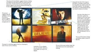
- 1. The title of the album is in bold which guides the audience to the main focus of the album. It also gives the user a understanding of what the album is going to about as the word believe makes you think of trust and achievement. This suggests that the album will be about the artist singing about the people who has believed in him in his life. Along with the title of the songs in the album, it includes a quote from his song which says ‘where would I be if you didn’t believe.’ This also gives the audience a understanding that he has linked his album to his fans/ The picture of Justin Bieber suggests that he is linking it to before he was famous when he used to busk on the streets. The fact that the case of the guitar says believe suggests that because people believed in him he was able to achieve his goal. This picture suggests that the spotlight is now on him and his posture suggests that it still has not changed who he is. The way he is standing suggests that he is showing his style of music such as showing. The use of the colours orange and yellow creates a sense of warmth. The use of the colour yellow makes the artist stand out as he is wearing dark clothing. Inspiration: For our digipak, we can use similar colours as Justin Bieber has used in his digipak.
- 2. Red is used throughout the digipak such as her hair colour, her red lipstick and the roses behind her. This suggests that she has created her house style for her digipak to give the audience an idea of what her album is going to be like. Rihanna is the main focus of the digipak which suggests that her image is important to her. The font of the title of the album is in capitals which suggests that this is the second important thing to her as she is drawing the audience attention to the album name. The fact that the album name is in capital suggests that she wants the album to be listened to and that she is going to express her views on whatever she wants on her album. The colour of Rihanna’s hair blends in with the roses. This suggests that she does not want to be seen, which also suggests that her image is now not important to her. The image of the CD links to the image of the roses of her digipak and matches the colour of her dress. This again shows that she has created a house style for her digipak. The fact that Rihanna is laying on the roses creates a calm atmosphere. This juxtaposes with the title of the album as we would expect an image that will represent the title of the album. On the front cover of the digipak, Rihanna has her eyes close. This suggests that she is hiding from the camera which again juxtaposes the album name as we would expect her to be looking at the camera. This is because the album name suggests that she is not shy and that she is confident. The red lipstick has been used to highlight her features. Inspiration: For our digipak, we can use a similar close up of one of the singers for the front cover.
- 3. The colour of the background relates to romance which is what most of her songs are about in this album. The way she has positioned herself suggests that she is vulnerable and shy as her eyes are closed and her face is resting on her hand. She is the main focus of the album cover as the text small. This suggests that she wants to show her image more rather than the title of the album. Her house style of black and white is also used in the album. Her name is written in bold writing to emphasise her name. The back of the album does not show an image of the artist which suggests that she wants her music to be the main focus. The artist is winking which creates mystery. This suggests that she doesn’t want to give clues about her album. The font of the title of the album looks handwritten which suggests that the album is something personal to her. Ariana Grande has the same hair style that her fans see her have all the time. This shows that it is used so that her fans recognise that it is her. Inspiration: We can use similar typography that is used for the artist name. We can use the typography for the front cover of the digipak and the back cover of the digipak.
- 4. On the front cover of the album, it includes news articles behind Taylor Swift. This suggests that the album gives her a chance to tell her side of the story about the things that have been said to her in the media. The news articles is also covering one side of her face. This suggests that she is representing that on parts of the album she is going to be singing about what the media has said about her, whilst on other parts of the album she is going to be singing her side of the story. One side of her face is covered with the track list. This suggests that she is showing pride in her songs. Even though, the colour of the album is in black and white, we can still see that she is wearing red lipstick. This shows that she has still shown her iconography which her fans will recognise. Taylor Swift is looking up at the camera which shows that she is has pride in her album. The CD is split into images. One of the image shows her covering her mouth with her finger. This creates mystery as it suggests that in the album she is going to express the personal things to her. This creates a relationship with her fans as it suggests that the album includes secrets that her fans will be able to hear. Another image, includes an eye. This suggests that it has been used to create tension as it suggests that she is trying to make the audience feel intimidated. Taylor Swift has created a house style of black and white. This suggests that it links to the theme of news as on the front cover she includes news articles and news articles are black and white. This suggests that she is expressing what her album is all about to her audience. Inspiration: We can use a close up of one of the artist on either the front cover or the back cover of the digipak.