
Recommended
More Related Content
What's hot
What's hot (19)
Similar to Brand guidelines
Similar to Brand guidelines (20)
Recently uploaded
Recently uploaded (20)
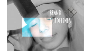
Brand guidelines
- 2. CONTENTS 1) About my brand Who I want my brand to be and what they do 2) Visual identity ~ Logo ~ Naming ~ Colours ~ Typefaces 01
- 3. 1) ABOUT MY BRAND I would like my brand to be a brand whose primary principle is honesty to its audience. Since my products (including the music video, magazine advert, and digipak) target a very young and impressionable audience, having a brand that stands for the right values is highly important. What I mean by having an ’honest brand’ is that the brand does not exploit its audience by selling merchandise at an unreasonable price or create music videos that will have no meaning to its target audience solely so that the brand remains a ”mainstream brand”. I would prefer to have my brand be an indie/independent type so that I have complete freedom of what gets put out to the audience as mainstream brands often have to follow certain regulations or have restrictions that leads them to focus only on making a profit. The song I have chosen is a folk/EDM genre which means I must create a brand that follows this concept in the sense that its main focus will be on the audience and this will be done by having my brand monitoring the type of products that are produced and released and being aware of what impacts such products will have on the audience. WHO I WANT MY BRAND TO BE AND WHAT THEY DO 02
- 4. 2) VISUAL IDENTITY LOGO 03 My main logo will be similar to the logo of the entertainment company AKMU (artists of my chosen song “Dinosaur”) are currently signed with. I like the simplicity of the ‘YG ENTERTAINMENT’ logo which I incorporated into my own design. This style of using geometric shapes/designs inspired me to create a logo that follows the same theme. I have incorporated the initial of my first name ‘M’ as I am the producer/director of the product. Having my name on the logo of course just reiterates the fact that I am responsible for the final results/products that are made. I wanted my logo to be something that can be easily recognised and remembered by the audience hence the use of the 2D shape of a diamond and my initial in the middle of the diamond. I believe my logo is simple yet unique enough to stand out from others and it appeals to the target audience as the use of geometric designs is considered as a ‘trend’ amongst teenagers and young adults. MY LOGO ORIGINAL YG LOGO
- 5. 3) VISUAL IDENTITY NAMNG 04 In regards to the chosen names for the album and artist I chose to follow a different approach for both individually. Firstly, I decided to use the original of the artist who sang the song I have used for my music video. The artist/s are a sibling duo called “Akdong Musician” or “AKMU” for short. It is of course a Korean name hence why I have used the acronym for it. It being the abbreviation for the full name makes it easy for the audience not only to remember but also say/pronounce as not all listeners will speak or know Korean. In my magazine adverts, I have also added the Korean spelling of ”Akdong Musician” for the audience to see what it looks like and possibly be able to recognise it by its Korean spelling for future reference. It is common for the audience of K-Pop to learn the Korean alphabet ’Hangul’ so that they can connect with their favourite artists at a higher level, thus I found it important to include in one of my products. For the name of the album however, I chose to make up a different name from the original as I realised that by changing the name, it will allow me to use different concepts for the images I use in the ancillary tasks. The original name of the album is “Summer Episode” however I knew that the filming and taking pictures period would take place in Autumn/Winter time and so I thought it would be more appropriate to use a different name that would work with everything else. I chose the name “Fine” as it was a name that gave hints of what to expect from the album without giving everything away. The word fine can have different meanings and I thought it suited my concept overall.
- 6. 3) VISUAL IDENTITY COLOURS 05 The colours I mainly used for my ancillary tasks are blue and yellow. Whilst I was taking the pictures for my digipak and magazine ad, I used blue fairy lights as my only source of lighting and used the night portrait setting on the camera (Canon 550D). This made the images have a blue/green/yellow hue to them which I thought was very unique as it makes the images stand out due to the vibrant colours that show up. Thus, I wanted to use this odd colouring for the other parts of my ancillary tasks by having blue borders and yellow text that compliments the images used. Both these colours have the similar connotation of the emotion/feeling of ’happiness’ which is a big theme within my actual music video. Having turned down the opacity of these colours led to their pastel shades which are more subtle and gentle to the eyes. Whilst it is good to use such vibrant colours to catch the audience's eye, it can often be too harsh for the eye to see hence why I altered the opacity of both colours. Using vibrant colours is also one of the key conventions of my chosen song genre but having this product available in this country means that it will appear very different to similar products as the colour combination is an uncommon pairing. This will actually help promote the products more due to the drastic differences that exist between the K-Pop genre and Pop genre.