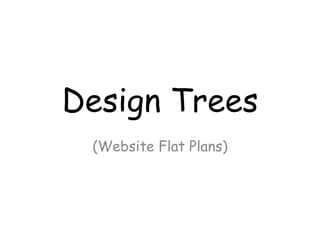
2. This image if
clicked will
take you to
the ‘Beauty
page’
All buttons at top will be
hyperlinked to take you to
the page suggested.
Title
Home Fall 2015 Beauty Fashion Guru Contact us
Log in
Sign up
Main image/scroll to get
other images
Description/caption
Beauty Image
This week’s
Guru
Caption
for
beauty
Caption
for Guru
This week’s Guru
will be an image of
the model who did
the Q&A and when
clicked it will take
you to the Guru
page.
3. Guru
Home Fall 2015 Beauty Fashion Guru Contact us
Log in
Sign up
Article Image of model
Sub image
Sub image
Description/caption
Caption
Caption
4. Beauty
Home Fall 2015 Beauty Fashion Guru Contact us
Log in
Sign up
Beauty images
Image of model and her beauty
products
Sub imageSub image
Description/caption
Sub image Sub image
Where products are bought from
and price range
5. Rationale questions
• Colour Usage: I am going to be using autumnal colours for my website, it will fit in with the
colour scheme of the magazine and genre. The colours I will be using are dark reds, greens
and whites/black. I will be using a three-shade colour scheme using these colours. This will
atract the target audience as they are looking for something bold and vibrant that fits well
with the genre, and because my genre is autumnal fashion I will need to use colours which
associate with this scheme. My colours should fit well with the contrast because all will
bring out the autumnal feeling towards the target audience and I feel like these colours
could be mixed well to attract the reader.
• Image Usage: The images used will be both Washington Old Hall and Herrington Country
Park. The props my model will be wearing will be scarfs, umbrellas (dependent on weather). I
am hoping the weather to be sunny yet cold so it fits in with the autumnal genre. When it is
sunny and day time the background and scenery of my photo-shoot will really stand out with
the colours of the autumn season which is what I am hoping for when I take my images. The
body language will be friendly and facing the camera on most of the images so that my
target audience don’t feel threatened by the model who is supposed to draw the target
audience in. This will fit well in the genre of magazine I am doing because when looking at
magazines of similar genre for inspiration I have found that most have been showing their
model facing the camera smiling this will hopefully allow my target audience to enjoy autumn
as much as I do. The makeup worn will be a light face, with a dark undertone on the lips and
eyes where this will accentuate them and fit well with the background of my image. The lips
and eyes are the most important feature which I would like to stand out on my model. I will
be taking a range of camera angles, going from close ups of the beauty products, to long shot
where the background is able to be seen within the shot. The image connotations could be
seen if the reader see’s a beauty product or fashion item that they like this may make them
emotionally attached to this magazine whereby they feel like because the model pulls off
the outfit so well, they want to buy it.
6. Rationale continued
• Text Usage: My text will be regional dialect therefore will use some slang to connect emotionally to the reader. When
reading the article and text in the website they should feel a sense of community and togetherness within the text
due to it being able to relate back to them. My readers may feel the emotional connotations used such as the Q&A
article will relate back to their life because my Q&A is about a girl who started off just loving beauty and fashion and
made something with her life devoted to that world. The teasers will be placed on the home page of the website, giving
the reader a little insight into the magazine, teasing them to want to read more, its got to be short and snappy for
them to want to read on and see more into my website. Alliterations may be used on some of the hyperlinked pages,
this will give humour to the reader and hopefully connect with them on an emotional level. I will put puns in the website
as well as the magazine so that it yet again creates a humour which will connect to my audience which will make them
feel more involved within the website and should hopefully encourage them to want to read on. Masthead will be placed
at the top of each page and the heading underneath so it is easily seen. My slogan will be placed near the masthead to
that it is seen by the audience that my slogan goes with my masthead and I want them to remember the slogan when
they see my masthead anywhere such as on Billboards, hopefully my slogan will pop into their heads. My logo will be
placed along with the masthead and will feature on each page preferably on the top left hand side of the page like it is
given on many fashion websites which I have looked at for example H&M logo is always placed on the top left hand side
of the screen where it is always in view of each
• Layout and Font: My fonts will be downloaded from Dafont and I have written them on my blog. I will be using Press
style and Buy More as two of my main fonts for masthead and sell lines. These two fonts are both bold, and easily read
which is why it would fit well with my magazine and website. The layout of my website will be clear, so there won’t be
lots of scattered images, it will be in an aligned order so it is easy for my target audience to view. I will be placing
them in rows for my beauty and fashion page because this will be the easiest to read and click on. The key focal points
will be the fashion and beauty tips which will be given on the linked pages. The framing will be the same frame
throughout, the layout will be simple and eays to use, the masthead at the top of the page with the hyperlinked pages
underneath the pages, then depending on what page it’s on the page layout will be different due to more photo’s being
on one page than it might on the other.