1. I like the fact that the large ‘L’ is red as it adds some
colour to the page and draws your attention to the
information rather than the image, adding a burst of
colour to an otherwise black and white toned spread.
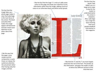
The fact that the
image takes up a
whole page makes it
clear that Lady Gaga
is the main focus of
the article. The black
and white filter
makes the image
appear old fashioned
and also reverts your
attention to the
other side of the
page.
I like the way that
the page is very
simple and the
composition is quite
linear as is keeps the
audiences attention
the actual text rather
than having colourful
images and text.
The fact that the
words ‘lady
GAGA’ are in a
larger print make
it easy for the
reader to
understand what
the article is
related to.
Also, Lady Gaga
has a large fan
base meaning
that more
people wop8uld
find interest in
the magazine.
I like that the ‘S’ and the ‘I’ are more largely
sized than the rest of the font. This breaks up
the information and gives the reader an idea
of where the different sections of the
interview start.
2. The image used in this double page spread is very casual and
informal as it displays the band ‘The Teenagers’ lounging in what
seems like a young persons bedroom. This image attracts a
young target audience as they could relate to the image and the
people in the image.
The seemingly hand written font appeals to the
younger audience of NME magazine and allows
the reader to relate more to the article.
This section of the page
shows the reader what is
popular in the music industry
at that time. This allows the
audience to keep up with the
latest music trends.
I like the way that
the page is cluttered
and full as it makes
the spread
interesting and
keeps the readers
attention.
By drawing the readers
attention to the main
quote/ line of the
interview, the audience’s
becomes interested and
therefore wants to read to
find out more.
The torn out page effect looks casual and
appealing to the target audience of young
people. This effect stands out on the
background as it has an interesting shape.
I like the fact that the NME section of the
magazine is red as it stands out against the
blue, white and black colour scheme. By making
this red, the readers attention is drawn to it and
makes them want to visit the website.