
Recommended
More Related Content
What's hot
What's hot (19)
Similar to Media controlled assesment Magazines
Similar to Media controlled assesment Magazines (20)
Recently uploaded
Recently uploaded (20)
Media controlled assesment Magazines
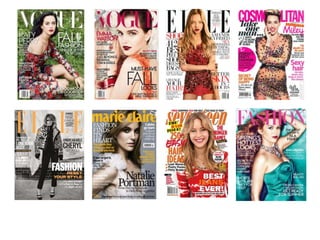
- 2. I based my magazine around “ELLE” magazines. Elle is for older teenage women because they are more expensive then Seventeen and Cosmopolitan, so older young women age 18-40 who would be able to afford them because they most likely have a job so have more money to spare on magazines. I would use this as it broadens the market range so it would increase the amount of sales. Elle’s front covers look sophisticated and less busy then the other fashion magazines so this shows it appeals to more of a mature young adults as the language its uses is more adult friendly. The langue I would use would be informal but mature as my magazine would be for young adults. The main target audience for Elle is for adult females as the key image on the cover are always of a female celebrity or model consistently within the different issues. They never use a child star as the magazine is not directed to children. I would do the same as it makes it obvious who the target market is. The topics that are inside are most likely to appeal to females as they relate to female gender serotypes such as fashion and beauty and gossip. I would only use fashion and beauty because I think it is more sophisticated than ‘chatty’ gossip. The celebrity or model in the middle is always wearing stylish clothing looking at the audience in direct mode of address, so the audience feel the magazine is directed towards them. I would use this for my magazine cover as it empathises the female audience as the models are female and the direct mode of address is effective as it is eye catching and persuasive for the audience to buy the magazine. The stylish clothing show that the magazines knows what they are talking about as it shows that have a knowledge of fashion as it is a fashion magazine which I would also use for my magazine. They use a celebrity because the audience would know who it is so they might want to read about them and it makes the magazine look well known with a good status because a celebrity has agreed or wanted to be on the cover. All the colours on the cover corresponded and relate to each other to make it look like professional and sometimes relate towards the season, the colours go well together as well to make the magazine look appealing. I would make sure the colours I use complement each other and sometimes relate to the season. Elle a general magazine towards women as it is about fashion, beauty, celebrity gossip and health care but I would have my magazine as fashion and beauty so it is more specialised. Elle Magazine Research
- 3. Cbeebies Magazine Research Cbeebies magazine is a children's television magazine as it is about the Television program called Cbeebies which runs a lot of separate children's programs. The magazine is specially for this Chrildren’s program so this makes it a specialist magazine. about The Publisher is Immediate Media Company London Limited under Licence from BBC Worldwide. The Masshead ( Cbeebies magazine) is large and bold and colourful to attract children’s eyes. The font and layout of the title is the same logo used for the Cbeebies children TV show apart from the ‘magazine’ written under the title so young children will understand this is a magazine. This makes the target audience know this magazine is directly related to the TV show as they will recognise the same logo being used. Because Cbeebies is a children’s TV show age range 1-8 years, the magazines target audience is the children who watch the TV show and the parents who would be buying the magazine for their children. The cover lines mention what is inside the magazine so this will persuade the audience to buy the magazine, as they would want to use and have fun with the contents inside the magazine. Showing the contents on the front cover gives more information to children about what is inside and helps persuade the audience to have the magazine as they might like to do the activities. This magazine has lots of key images that are characters from the Cbeebies TV show. The children would recognise their favourite character so would want their parents to buy it, this persuades the audience to buy the magazine as they might want to read stories about their favourite characters from the TV programs. It also has the yellow trade mark characters Cbeebies, this is used to emphasise that this is for that specific TV program. For young children who can’t read the title, this make it easier for them to know that this is a Cbeebies magazine as they will recognise the yellow characters as well as seeing pictures of the characters from the programs. The ‘little learners’ on this tagline appeals to the parents of the children as it makes the parents think the magazine is fun for their children while learning educational skills. Parents think the magazine would be good for their child’s learning so they are more persuaded to buy the magazine for their children. The colour scheme is bright and colourful to attract children’s eyes. The colours consist mostly of primary colours to make the gender of the magazine unisex so boys and girls can both enjoy the magazine. Using lots of bright colours makes the magazine look appealing for children as it gives off a positive, happy fun attitude that children love.
- 4. General Magazine The cover lines mention other celebrities that feature inside the magazine so this will attract the audience and the “…” makes the audience want to read the magazine to find out more information. The model is Emma Watson who is a famous actress known for her role in the famous Harry Potter film’s so this attracts the audience as she is well known. The anchorage text links to the key image effectively because Emma’s hair has been drastically changed compared to the Harry Potter films to represent “Life after Harry Potter” so this engages the audience as they would want to know what Emma Watson is doing after Harry Potter. The main colour scheme is burgundy which a feminine colour is so this appeals to the female target audience. The burgundy also relates to the “fall” theme as fall is American for autumn and burgundy corresponds with the season so it makes the magazine look like it knows what it is talking about as “Must-Have Fall Looks” is the main cover line. The models lips are bright burgundy that contrasts to her pale skin so this attracts the “Male Gaze” as men find lips attractive. This cover line attracts the female target audience as it sounds gripping and important information as this is mostly a fashion magazine so the female target audience are buying this magazine so they know the latest fashion so they feel like they can trust this magazine as it delivers what they want. The model is the key image as she is big and in the middle of the page. She is looking directly at the audience in Direst Mode of Address so the audience is drawn into buying the magazine as they feel it is directly towards them and attracts their attention. The model is the key image as she is big and in the middle of the page. She is looking directly at the audience in Direst Mode of Address so the audience is drawn into buying the magazine as they feel it is directly towards them and attracts their attention.
- 5. The elegant font of the logo of the magazine is large and bold at the top of the page to remind the reader what magazine they are reading. This is also so as a marketing technique because the contents page would be the page the readers look at the most besides the cover so other people might see the title/logo of Elle when the reader is looking at the contents page. This is an effective marketing strategy as it could encourage people to buy the magazine as they see another person reading inside. The information is split up into nine sections with bold subtitles to make it quick and easy to find things to read. This clearly separates the topics and makes the layout look less cluttered as it is presented in columns. I would use different sections and titles in my contents page because it makes the magazine look more professional and simple to read. The colours that are used are mostly monochrome with a pop of colour in the subtitles so the page looks classy and stylish and appeals to young women. The colours used in the subtitles are used to add brightness; they are bold positive colours to brighten up the page to contrast the white and black. I think the black lines that are used to divide the sections up are effective as it makes it easy to read and makes the page look modern and artist as it also compliments the Elle logo. There are hardly any pictures or photos on the contents page because this should have information and be easy to understand. This also makes the page look less cluttered compared to the rest of the magazine; as fashion magazines are dominated by pictures so this evens out the magazine. The small photo that is being used is to add a bit of colour and to show directly what is on page 199. This is being used so the reader knows the page is about fashion and to also attract the reader’s attention, as they would be intrigued to find out more by turning to the page. Content Page
- 6. Target Audience After looking at the UK tribes website The target audience that would be for my magazine would be the “Aspirant” tribe. The teenagers that fit in this tribe are the ones who love the latest designer fashion, music and work hard into looking “trendy” and cool. They are “social butterflies” who love to addend high end events and wear and buy high end designer clothing. Their clothing style as seen as “fashionable hipster” so they work expensive brands into their own style to seen more “hip” and “stylish” as everyone else. They often have money to spend on the expensive clothing as well as fairly expensive high- street brands such as River Island and Top Shop, as well as being influenced by celebrity styles.
- 7. https://www.surveymonkey.com/r/TD6PSQ6 Questionnaire Research The majority of the people I asked was in the 15-20 age range so I will focus more on this target market. But I will also aim it at the 21+ age range to expand trade and too encourage more ages to invest in it. I asked the same amount of males and females as I was interested what males would answer to my questions. This is also because the majority of the questions in my questioner were about fashion magazines towards male and female and not just only towards women. My Questioner