1. The logo “INTERIOR DESIGN’
stands out significantly to the rest
of the page by the use of
contrasting colours. It is very
visible. It is very visible which
would make it stand out in shops
and to consumers.
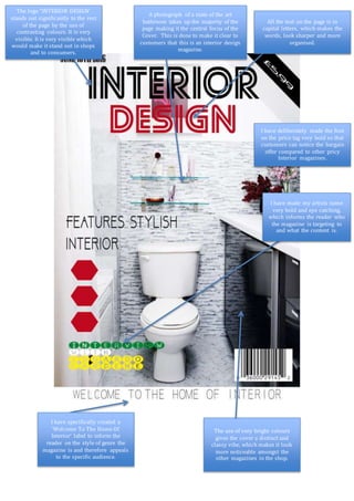
A photograph of a state of the art
bathroom takes up the majority of the
page making it the central focus of the
Cover. This is done to make it clear to
customers that this is an interior design
magazine.
All the text on the page is in
capital letters, which makes the
words, look sharper and more
organised.
I have made my artists name
very bold and eye catching,
which informs the reader who
the magazine is targeting to
and what the content is.
I have specifically created a
‘Welcome To The Home Of
Interior’ label to inform the
reader on the style of genre the
magazine is and therefore appeals
to the specific audience.
The use of very bright colours
gives the cover a distinct and
classy vibe, which makes it look
more noticeable amongst the
other magazines in the shop.
I have deliberately made the font
on the price tag very bold so that
customers can notice the bargain
offer compared to other pricy
Interior magazines.