Unveiling the Characteristics of Political Institutions_ A Comprehensive Anal...
Ancillary task2/Final magazine cover evaluation
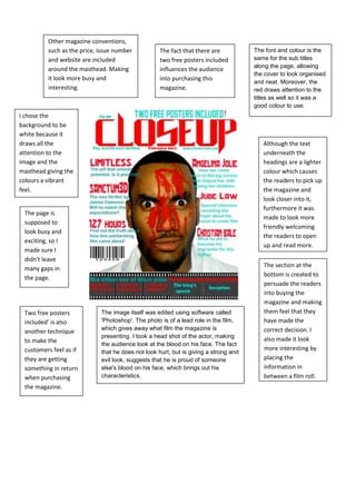
1. Other magazine conventions, such as the price, issue number and website are included around the masthead. Making it look more busy and interesting.The fact that there are two free posters included influences the audience into purchasing this magazine.The font and colour is the same for the sub titles along the page, allowing the cover to look organised and neat. Moreover, the red draws attention to the titles as well so it was a good colour to use. <br />1895475318770<br />I chose the background to be white because it draws all the attention to the image and the masthead giving the colours a vibrant feel.<br />Although the text underneath the headings are a lighter colour which causes the readers to pick up the magazine and look closer into it, furthermore it was made to look more friendly welcoming the readers to open up and read more.<br />The page is supposed to look busy and exciting, so I made sure I didn't leave many gaps in the page.<br />The section at the bottom is created to persuade the readers into buying the magazine and making them feel that they have made the correct decision. I also made it look more interesting by placing the information in between a film roll.<br />The image itself was edited using software called 'Photoshop'. The photo is of a lead role in the film, which gives away what film the magazine is presenting. I took a head shot of the actor, making the audience look at the blood on his face. The fact that he does not look hurt, but is giving a strong and evil look, suggests that he is proud of someone else's blood on his face, which brings out his characteristics.Two free posters included' is also another technique to make the customers feel as if they are getting something in return when purchasing the magazine.<br />