Basic Civil Engineering first year Notes- Chapter 4 Building.pptx
Interior design dps annotation finally
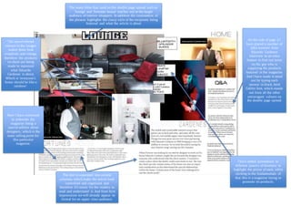
1. The many titles that used on the double page spread such as
‘lounge’ and ‘fortunes house’ reaches out to the target
audience of interior shoppers. In addition the connotation of
the phrases highlights the classy style of the recipients being
featured and what the article is about
On the side of page 2 I
have placed a number of
Q&A answers from
Eduardo Cardenes
interview as an extra
feature to find out more
on the guy who is
supplying the products
featured in the magazine.
And I have made it stand
out by typing each
answer in black, bold
Calibri font, which stands
out from all the other
extravagant colours on
the double page spread.
I have added annotations to
different peace’s of furniture to
highlight the prices of each, while
sticking to the fundamentals of
that this is a magazine trying to
promote its products.
Here I have continued
to elaborate the
magazine being a
special edition about
designers, which is the
main selling point for
this particular
magazine.
The text is separated into several
columns, which make the article look
controlled and organised, and
therefore it’s easier for the readers to
read and understand it. And from first
impressions we will already appear to
formal for an upper class audience.
The use of vibrant
colours in the images
makes them look
simplistic and vintage,
therefore the products
on show are being
made to represent
what Eduardo
Cardenes is about.
Which is ‘everyone’s
home should be like a
rainbow’.