
Recommended
More Related Content
Similar to Interior design dps annotation
Similar to Interior design dps annotation (20)
Recently uploaded
Recently uploaded (20)
Interior design dps annotation
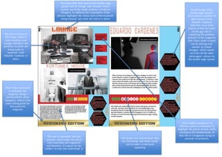
- 1. Pull Quotes are used because they are interesting and break up the text to make it look more appealing. The many titles that used on the double page spread such as ‘lounge’ and ‘fortunes house’ reaches out to the target audience of interior shoppers. In addition the connotation of the phrases highlights the classy style of the recipients being featured and what the article is about The text is separated into two columns, which make the article look controlled and organised, and therefore it’s easier for the readers to read and understand it. The lack of colour of the image makes it look simplistic and vintage, therefore the products on show are being made to represent what Eduardo Cardenes is about. On each page of the double page spread I have placed a number of Q&A answers from Eduardo Cardenes interview as an extra feature to find out more on the guy who is supplying the products featured in the magazine. And I have made it stand out by placing each answer in a black hexagon, which stands out from all the other extravagant colours on the double page spread. I have added annotations to different peace’s of furniture to highlight the prices of each, while sticking to the fundamentals of that this is a magazine trying to promote its products. Here I have continued to elaborate the magazine being a special edition about designers, which is the main selling point for this particular magazine.