2. The poster is a key
element of the
media package, as
it needs to capture
the public’s
attention as this
shall be a source of
information.
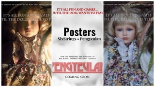
3. No.1
This was one idea put together
for the poster, it has the doll,
the main focus of the film. The
colours of the image hve be
dulled down to give it a faded,
aged look.
4. No. 2
This has an ECU of the dolls
face, the lighting makes her
eyes ‘pop’. The typeface is fit for
purpose and is colours which
are easy to read.
5. No. 3
Below is a full picture of the
doll, at night. She looks directly
at the audience.
6. The Chosen One
This is the final poster. The image
of doll is faded and obscure - this
leaves it open for interpretation: is
it a doll? Is it a young girl? The
typefaces are in red which stands
out against the primarily white
background