SlideShare a Scribd company logo
1 of 6
The purpose of the poster is to suggest the film is about making people more aware of global warming and the melting ice caps and the species it is affecting, specifically polar bears Black, blue and white have mainly been used. These colours have associations with nature, and connotations of death.  These colours are commonly found on posters  The main image is the polar bear, which gives the viewer an idea of what the film is primarily about. This type of documentary is quite uncommon, so the image is not found on many posters   The lower half of the poster is an image of the globe, which eventually fades into black, this suggests the fate of the earth.   The images are very realistic, no animation is used. They are very effective   The text is a white/grey colour, which could signify the melting ice caps or the polar bears  The font size is quite large so it catches the viewers eyes, so they remember the name, which is a way of advertising  This poster is for the target audience of this documentary, which includes a broad age range  Personally, I really like this poster, I looks high budget, and appealing. This would definietely make me interested in seeing the film
Simple colours are used, just red and white, this little amount of colour is uncommon for a poster. Theses colours are to make the man stand out as he is then portrayed as the protagonist   ,[object Object],the key image is the man, the show what the documentary is primarily about. This is a common effect in documentaries as they are usually focused on one specific subject  The image is very realistic, as it is a real-life image and close up.   The colour of the text is yellow and orange, which is significant as these are the colour that represent the food chain restaurant McDonalds   Bold font has been used to emphasise the title ‘Supersize Me’   The tag line ‘A film of Epic Portions’  to suggest the films common theme is food  The poster has a simple but effective layout.   This poster is an audience of a wide range from kids to adults  I like this poster as it is very simple but gives away the ideas of the film
Simple colours are used, just blue, white and orange this little amount of colour is uncommon for a poster. A lot of background colour is used to show the significance of the plane, and the statue of liberty.  ,[object Object],The key image is the plane and the statue, to show what the documentary is primarily about and to emphasise the city of New York. This is a common effect in documentaries as they are usually focused on one specific subject  The image is very realistic as it is of the iconic statue of liberty The colour of the text is orange and white, which contrasts with the background colour to make it stand out   Small font has been used to emphasise the statue of liberty The tag line ‘September 11, 2001. Four planes were hijacked. Three of them reached their target. This is a story of the fourth’. This gives the audience a huge clue about the plot of the film The poster has a simple but effective layout.   This poster could be aimed at an audience that is more mature I like this poster as it is very simple but gives away the ideas of the film
Bright colours are used also against the black background  so signify the importance of religion in this film as connotation with the stain class window. Pictures of the four girls give the audience of who the film is based on. These are not uncommon colours used on posters   ,[object Object],The colour of the text stands against the black background, the emphasises the importance of the title Uncommon  font has been used to drag attention to title  The tag line ‘the story of four young girls who paid the price for a nations ignorance’ suggests the girls fate in the film The poster has a a complex layout but as it follows the narrative of then film, it therefore makes sense to the audience .   The poster would attract a range of different audiences  This poster has many different links to the film, including religion, society, and the four main characters in the film
Colours such as red, orange and yellows are used, which contrasts with the subject of the film ,[object Object],The image is very realistic, as it is a real-life image and close up, and the chains are being shown to suggest slavery or war. The colour of the text is red, which could have connotations of blood, romance, mabye death. To do with the narrative of the film itself The title has been outlined to have a high impact on the viewer The film poster has reviews on it to show the viewer to convince the audience it is worth seeing  The poster has a simple but effective layout.   This poster may be more suited for an older audience as it contains mature subjects I like this poster as it is very simple but gives away the ideas of the film , and is emotional only by looking at the poster
Simple colours are used, just yellow colours, this little amount of colour is uncommon for a poster. Theses colours are to increase authenticity as woodstock occurred in the late 60’s   ,[object Object],the key image is the man, the show what the documentary is primarily about. This is a common effect in documentaries as they are usually focused on one specific subject  The image is very realistic, as they are pictures from the event. Big white font has been used on the poster, the title stands out The tag line ‘3 days of peace and music’ describes what happened at the festival  The poster has a complex and busy layout   This poster is an audience of a wide range from kids to adults  The poster is of a crowd of people at the festival, which is primarily what the documentary is about

More Related Content

What's hot

Conventions of film festival post cards
Conventions of film festival post cardsConventions of film festival post cards
Conventions of film festival post cards
Jeppe Laursen
 
Bullet boy film poster analysis
Bullet boy film poster analysisBullet boy film poster analysis
Bullet boy film poster analysis
Amymedia123
 
Conventions of film festival post cards
Conventions of film festival post cardsConventions of film festival post cards
Conventions of film festival post cards
Jeppe Laursen
 
Deconstruction of film posters
Deconstruction of film postersDeconstruction of film posters
Deconstruction of film posters
annaloynsasmedia
 
Research on Romance Drama Film Posters
Research on Romance Drama Film PostersResearch on Romance Drama Film Posters
Research on Romance Drama Film Posters
hhsmediastudies
 

What's hot (19)

Horror Poster Analysis
Horror Poster AnalysisHorror Poster Analysis
Horror Poster Analysis
 
Horror Poster Analysis
Horror Poster AnalysisHorror Poster Analysis
Horror Poster Analysis
 
School of rock
School of rock School of rock
School of rock
 
Horror Posters over the years
Horror Posters over the yearsHorror Posters over the years
Horror Posters over the years
 
Conventions of film festival post cards
Conventions of film festival post cardsConventions of film festival post cards
Conventions of film festival post cards
 
Bullet boy film poster analysis
Bullet boy film poster analysisBullet boy film poster analysis
Bullet boy film poster analysis
 
Magazine research
Magazine researchMagazine research
Magazine research
 
Poster Analysis
Poster AnalysisPoster Analysis
Poster Analysis
 
Poster analysis
Poster analysisPoster analysis
Poster analysis
 
Conventions of film festival post cards
Conventions of film festival post cardsConventions of film festival post cards
Conventions of film festival post cards
 
Poster analysis
Poster analysisPoster analysis
Poster analysis
 
Poster analysis
Poster analysisPoster analysis
Poster analysis
 
Horror film poster analysis
Horror film poster analysisHorror film poster analysis
Horror film poster analysis
 
Media Semiotic Film Poster Analysis
Media Semiotic Film Poster AnalysisMedia Semiotic Film Poster Analysis
Media Semiotic Film Poster Analysis
 
Documentary of your Choice
Documentary of your ChoiceDocumentary of your Choice
Documentary of your Choice
 
Deconstruction of film posters
Deconstruction of film postersDeconstruction of film posters
Deconstruction of film posters
 
The conjuring – semiotic analysis of movie poster
The conjuring – semiotic analysis of movie posterThe conjuring – semiotic analysis of movie poster
The conjuring – semiotic analysis of movie poster
 
Research on Romance Drama Film Posters
Research on Romance Drama Film PostersResearch on Romance Drama Film Posters
Research on Romance Drama Film Posters
 
Film poster analysis
Film poster analysisFilm poster analysis
Film poster analysis
 

Similar to Poster analysis (20)

task 2
task 2task 2
task 2
 
James and jack radial analysis
James and jack radial analysisJames and jack radial analysis
James and jack radial analysis
 
James and jack radial analysis
James and jack radial analysisJames and jack radial analysis
James and jack radial analysis
 
Media radials
Media radialsMedia radials
Media radials
 
Media Radials
Media RadialsMedia Radials
Media Radials
 
Media Radials
Media RadialsMedia Radials
Media Radials
 
Ancillary task (film poster) research
Ancillary task (film poster)   researchAncillary task (film poster)   research
Ancillary task (film poster) research
 
Poster analysis Textual Analysis Horror
Poster analysis Textual Analysis HorrorPoster analysis Textual Analysis Horror
Poster analysis Textual Analysis Horror
 
Movie Poster Codes and Conventions
Movie Poster Codes and ConventionsMovie Poster Codes and Conventions
Movie Poster Codes and Conventions
 
Poster Analysis
Poster AnalysisPoster Analysis
Poster Analysis
 
Horror poster analysis
Horror poster analysisHorror poster analysis
Horror poster analysis
 
Poster analysis slideshare
Poster analysis slidesharePoster analysis slideshare
Poster analysis slideshare
 
Film poster 2
Film poster 2Film poster 2
Film poster 2
 
Film poster research
Film poster researchFilm poster research
Film poster research
 
Coming of age film poster analysis
Coming of age film poster analysisComing of age film poster analysis
Coming of age film poster analysis
 
Bullet boy film poster analysis
Bullet boy film poster analysisBullet boy film poster analysis
Bullet boy film poster analysis
 
Film poster & webpage analysis
Film poster & webpage analysisFilm poster & webpage analysis
Film poster & webpage analysis
 
The fault in our stars Analysis
The fault in our stars AnalysisThe fault in our stars Analysis
The fault in our stars Analysis
 
Zombieland Poster Analysis
Zombieland Poster AnalysisZombieland Poster Analysis
Zombieland Poster Analysis
 
Textual analysis
Textual analysisTextual analysis
Textual analysis
 

More from JoeRobert

Object costume arrangement
Object costume arrangementObject costume arrangement
Object costume arrangement
JoeRobert
 
Unfinished double page spread
Unfinished double page spreadUnfinished double page spread
Unfinished double page spread
JoeRobert
 
Find your tribe
Find your tribeFind your tribe
Find your tribe
JoeRobert
 
Model organisation
Model organisationModel organisation
Model organisation
JoeRobert
 
Questionaire
QuestionaireQuestionaire
Questionaire
JoeRobert
 
Magazine analysationnnn
Magazine analysationnnnMagazine analysationnnn
Magazine analysationnnn
JoeRobert
 
Magazine analysationnnn 2
Magazine analysationnnn 2Magazine analysationnnn 2
Magazine analysationnnn 2
JoeRobert
 
Magazine analysationnnn
Magazine analysationnnnMagazine analysationnnn
Magazine analysationnnn
JoeRobert
 
Evaluation pp
Evaluation ppEvaluation pp
Evaluation pp
JoeRobert
 
Joe production log
Joe production logJoe production log
Joe production log
JoeRobert
 
Joe production log
Joe production logJoe production log
Joe production log
JoeRobert
 

More from JoeRobert (20)

Object costume arrangement
Object costume arrangementObject costume arrangement
Object costume arrangement
 
Unfinished double page spread
Unfinished double page spreadUnfinished double page spread
Unfinished double page spread
 
Find your tribe
Find your tribeFind your tribe
Find your tribe
 
Flat plan
Flat planFlat plan
Flat plan
 
Media pack
Media packMedia pack
Media pack
 
Model organisation
Model organisationModel organisation
Model organisation
 
Flat plan
Flat planFlat plan
Flat plan
 
Brain storm
Brain stormBrain storm
Brain storm
 
Logo
LogoLogo
Logo
 
Questionaire
QuestionaireQuestionaire
Questionaire
 
Magazine analysationnnn
Magazine analysationnnnMagazine analysationnnn
Magazine analysationnnn
 
Magazine analysationnnn 2
Magazine analysationnnn 2Magazine analysationnnn 2
Magazine analysationnnn 2
 
Magazine analysationnnn
Magazine analysationnnnMagazine analysationnnn
Magazine analysationnnn
 
Decades
DecadesDecades
Decades
 
Reflection
ReflectionReflection
Reflection
 
Analysis pp
Analysis ppAnalysis pp
Analysis pp
 
Evaluation pp
Evaluation ppEvaluation pp
Evaluation pp
 
Joe production log
Joe production logJoe production log
Joe production log
 
Joe production log
Joe production logJoe production log
Joe production log
 
Day 1
Day 1Day 1
Day 1
 

Poster analysis

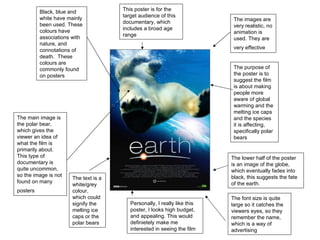
  • 1. The purpose of the poster is to suggest the film is about making people more aware of global warming and the melting ice caps and the species it is affecting, specifically polar bears Black, blue and white have mainly been used. These colours have associations with nature, and connotations of death. These colours are commonly found on posters The main image is the polar bear, which gives the viewer an idea of what the film is primarily about. This type of documentary is quite uncommon, so the image is not found on many posters The lower half of the poster is an image of the globe, which eventually fades into black, this suggests the fate of the earth. The images are very realistic, no animation is used. They are very effective The text is a white/grey colour, which could signify the melting ice caps or the polar bears The font size is quite large so it catches the viewers eyes, so they remember the name, which is a way of advertising This poster is for the target audience of this documentary, which includes a broad age range Personally, I really like this poster, I looks high budget, and appealing. This would definietely make me interested in seeing the film
  • 2.
  • 3.
  • 4.
  • 5.
  • 6.