
Recommended
More Related Content
What's hot
What's hot (20)
Similar to Transition Project
Similar to Transition Project (20)
More from lucyallbutmedia
More from lucyallbutmedia (20)
Recently uploaded
Recently uploaded (20)
Transition Project
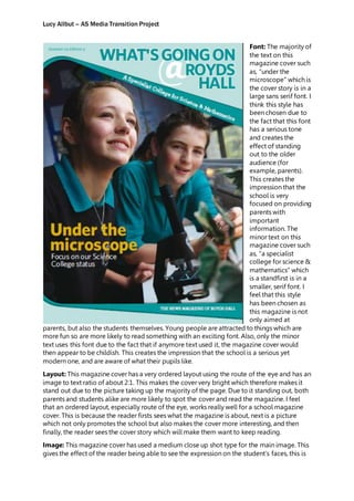
- 1. Lucy Allbut – AS Media Transition Project Font: The majority of the text on this magazine cover such as, “under the microscope” which is the cover story is in a large sans serif font. I think this style has been chosen due to the fact that this font has a serious tone and creates the effect of standing out to the older audience (for example, parents). This creates the impression that the school is very focused on providing parents with important information. The minor text on this magazine cover such as, “a specialist college for science & mathematics” which is a standfirst is in a smaller, serif font. I feel that this style has been chosen as this magazine is not only aimed at parents, but also the students themselves. Young people are attracted to things which are more fun so are more likely to read something with an exciting font. Also, only the minor text uses this font due to the fact that if anymore text used it, the magazine cover would then appear to be childish. This creates the impression that the school is a serious yet modern one, and are aware of what their pupils like. Layout: This magazine cover has a very ordered layout using the route of the eye and has an image to text ratio of about 2:1. This makes the cover very bright which therefore makes it stand out due to the picture taking up the majority of the page. Due to it standing out, both parents and students alike are more likely to spot the cover and read the magazine. I feel that an ordered layout, especially route of the eye, works really well for a school magazine cover. This is because the reader firsts sees what the magazine is about, next is a picture which not only promotes the school but also makes the cover more interesting, and then finally, the reader sees the cover story which will make them want to keep reading. Image: This magazine cover has used a medium close up shot type for the main image. This gives the effect of the reader being able to see the expression on the student’s faces, this is
- 2. Lucy Allbut – AS Media Transition Project good for parents because they will see that their child will enjoy their time in class and leaves a positive impression on the school itself as their pupils are happy. The effect of the mise-en-scene is that the setting of a classroom is very appropriate for the type of magazine, showing parents, students and teachers a like that it is a genuine, serious, school. It will make the reader interested as it is very topical and matches the costume of school uniform and lab equipment. The props match the cover story “under the microscope” which will make the reader want to read the magazine as they can actually imagine what the article will be about. Mode of Address: The tone of this magazine cover is both formal and informal to match the requirements of both the target audiences; parents and students. The informal tone is created through some of the language such as “what’s going on @ royds halls”. This gives the impression that they know what students like, in this case, technology as shown with the use of ‘@’. An informal tone is also created by the font used for the standfirst “a specialist college for science and mathematics”. The serif font, gives a fun vibe and makes the magazine look more appealing to read as it isn’t all boring fonts and language. The formal tone is created through some of the language such as “focus on our science college status”. This is something only parents and teachers would be interested and by using vocabulary such as “focus” and “status” the magazine gives a professional impression. An informal tone is also created through the image. The fact that the setting is in a science lab shows that the school is serious about education and cares for its students. Conventions: The layout of the page is typical because on a magazine, you want the target audience to be as intrigued as possible and want to pick up your magazine. By using route of the eye, this can be achieved because the reader will see all of the important information as soon as they first scan the page. Many magazines use this technique to sell as many copies as possible. The content of the magazine is typical because it includes positive images to give the school a good impression, it also clearly states the name of the school to avoid confusion if an outsider decides to read the magazine and also, the language used is very related to school, making it easy to understand for everyone reading it.