1. Analysis of school magazine
This is my analysis of an existing school
magazine cover.
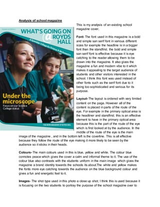
Font- The font used in this magazine is a bold
and simple san serif font in various different
sizes for example the headline is in a bigger
font than the standfirst. the bold and simple
san serif font is effective because it is eye
catching to the reader allowing them to be
drawn into the magazine. It also gives the
magazine a fun and modern vibe to it which
makes it appealing to the target audience of
students and other visitors interested in the
school. I think this font was used instead of
other fonts such as the serif font due to it
being too sophisticated and serious for its
purpose.
Layout- The layout is ordered with very limited
content on the page. However all of the
content is placed in parts of the route of the
eye. For example in the primary optical area is
the headliner and standfirst; this is an effective
element to have in the primary optical area
because this is the part of the route of the eye
which is first looked at by the audience. In the
middle of the route of the eye is the main
image of the magazine , and in the bottom left is the coverline. This is all effective
because they follow the route of the eye making it more likely to be seen by the
audience so it sticks in their heads.
Colours- The main colours used in this is blue, yellow and white. The colour blue
connotes peace which gives the cover a calm and informal theme to it. The use of the
colour blue also contrasts with the students uniform in the main image which gives the
magazine a brand identity towards the schools its about.The white and yellow makes
the fonts more eye catching towards the audience on the blue background colour and
gives a fun and energetic feel to it.
Images- The shot type used in this photo a close up shot; I think this is used because it
is focusing on the two students to portray the purpose of the school magazine over to
2. the audience. The setting of the image is a classroom; this is effective because it is
relevant to the school magazine rather than in a irrelevant setting such as a shop.The
props which are used is science equipment; this is effective because it contrasts with
the standfirst of specialist college for science. The costume is the students uniform; this
element has been used because the uniform shows who the students are representing
and fits in with the theme of the magazine.
Mode of address- The mode of address of the magazine cover is an informal tone; I
think that is because some sentences are abbreviated such as in the title they use the
@ sign instead of at giving it a more informal vibe.
Conventions- Things that are typically on a school magazine cover are a main image;
this will be an important part of the magazine displaying what it is about and makes it
more interesting and intriguing. Another thing which is typically on a magazine is a
headline; this is the part which draws the audience into the magazine making them want
to read or look inside it. They also have subheadings of stories which are inside the
magazine; this also draws the reader in to want to find out more about the news which
they give you glimpse of on the front of the magazine.
Evaluation
For the transition project i produced a school magazine cover for Neale- Wade
Academy. I will be explaining my production choices and comparing my cover to an
existing school/ college magazine.
3. Fonts- For the headline font I used a very basic font; which was big bold font and had
bulker ends to the letters. I thought that this sort of font was an effective choice for my
school magazine because due to it being bold creates a eye catching font towards the
audience allowing them to be drawn in by the cover making them want to pick it up and
read it. Also due to the font being bold and clear it gives it a modern vibe; this is
effective to the school magazine because it will be aimed at the students of the school
as well as people who are interested in the school. This ensures that the production
choices of the font are appealing towards the target audience. For the subheadings on
the magazines next to the images they were similar to the headline however slightly
different. The subheading fonts are a bit less bold but still striking and eye catching
towards the reader. This is effective also because the readers will see the short
subheadings about different headlines and it will intrigue them into the magazine to find
out more about each of the story lines.
Colours- The colours which were mainly used was white and black. The colours that I
used for the text was black; this colour worked well with the white background because
it contrasted with it well making it stand out more than other colours would have done.
Also black and white connote sophistication and shows a sense of professionalism in
the cover towards visitors which are interested in the schools news and existing
students. The background of the magazine is white; I chose the white background for
my school magazine because it made the features on the magazine such as the images
and subheadings stand out much better than with a coloured background. I found using
a colour on the background made the whole cover not as noticeable and instead made
it blend in more.
images- For the images for my magazine I used one main image and two smaller
pictures for the subheadings of the magazine cover. The main image that i used was a
year 11’s leavers photo of myself and four other students. The setting of the image was
in the school dinner hall; this was an effective destination for the magazine because it is
a school based setting and relevant towards the purpose of the magazine. The camera
shot that was used was of a medium/ long shot. Although it wasn't an exact medium
shot I thought it was a successful choice because it displays the full uniform of the
students showing who they are representing in this image by wearing that uniform. The
smaller photo I used was one consisting of Louis Smith (olympian ) visiting the school.
This is an effective image because it bring in some celebrity endorsement into the
magazine and makes people want to read it due to someone famous featuring in it. The
other image I chose to feature on the school magazine was an image of the school
hallway. I chose this image because I thought it made the school look welcoming due to
4. the bright coloured wall used in this shot. It also doesn’t give too much of the storyline
away because of the picture, still intriguing them into the magazine.
Mode of address- The mode of address for my magazine is a very informal tone; this is
created by the text because it is very abbreviated and doesn't have a lot of text making
it look more casual. Also this is suggested by the bold modern font which is used;
instead of a san serif small font which would make it look more informal which is why I
decided to use the opposite.
Conventions- I think my cover is conventional in many different ways. One of them
being that the different features in parts of the route of eye. For example the main
headline is in the primary optical area of the route of the eye. Features like this in the
route of the eye is conventional because it is the first places that the reader will look,
making them stand out much more.
Another convention of my magazine is using a main image in the centre of the
magazine. My main image is of a leavers photo.This was conventional because it draws
the reader into the front cover and also the majority of magazines have them due to it
giving the reader an insight into what's in the cover.
Comparison
In this comparison, i will be comparing my magazine cover which i created with an
existing school magazine cover.
Font- The use in fonts in both of these magazines are quite familiar;In the royds hall
magazine they use big bold fonts for the main font and a smaller less noticeable font for
other texts such as the strapline.In my magazine i also have a big bold font so that it
grabs the audiences attention; however i did not use the smaller font types. This is
because I think that the smaller font isn't as effective
and noticeable towards the reader.
layout- The layouts of both magazines have a lot of
similarities; both magazines have the main headline
“Neale-Wade news” and “ What's going on royds hall “
in the primary optical area of the magazine. This is one
of the first places that the audience look; this should
give an effect of intriguing them into the cover. They
both also have the main image of the entire cover in the
centre of the route of the eye which is the next place
that the audience will look and the centre point of the
5. cover. However in part of the terminal area on my cover I placed a subheading there
along with another image; this is the last place that the audience look therefore it sticks
into their heads more.
Image- in The Royds hall magazine they use one main image of two students smiling in
a science room, however on my cover I used one main image and two sub-images. The
main image is of four students in the dinner hall and the two subheadings of a celebrity
visiting the school and the school hallway. The royds hall image only has one image on
the entire cover therefore it just has one main focus which is the two students on the
front. However on my cover I have a variety of different images for the audience to
focus on illustrating the interesting stories which are inside through the images.
Colour- On my own magazine i used quite simple colours such as white and black to
make the rest of the features such as the font and images contrast and stand out more.
However the royds hall magazine focuses more on using colours such as blue to
contrast with the students uniform which is the same colour. This displays a brand
identity for the school so when people see the colour they will associate it with the
school.
mode of address- The mode of address for both magazines is informal; this is
illustrated in their language.In the royds hall magazine the abbreviated language of the
@ sign instead of putting at suggesting it is informal. One my cover it is suggested as
an informal magazine due to it having very limited text and straight to the point rather
than more text and less images.