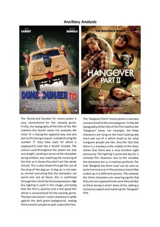
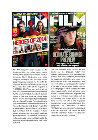
Ancillary Analysis
The ‘Dumb and Dumber To’ movie poster is
very conventional for the comedy genre.
Firstly, the typography of the title of the film
matches the ‘dumb’ name. For example, the
letter ‘b’ is facing the opposite way and also
due to thisbeingasequel,insteadof usingthe
number ‘2’ they have used ‘to’ which is
supposed to look like a ‘dumb’ mistake. The
colours used throughout the poster are also
very bright, creating a sense of the characters
being childish, also matching the meaning of
the title as it shows they don’t act like adults
should. This is also shown through the use of
the prop of the dog car. A dog car is not seen
as normal connoting that the characters are
weird and not all there, this is confirmed
throughtheirchildlike facialexpressions.High
key lighting is used in this image, connoting
that the film is positive and a feel good film
which is conventional for the comedy genre.
The twomainactors’namesstandoutinwhite
against the dark green background, making
themeasyfor people tospot, especially fans.
The ‘HangoverPartII’movie posterisalsovery
conventionalforthe comedygenre.Firstly,the
typographyof the title of the filmmatchesthe
‘hangover’ name. For example, the three
characters are lying on the floor looking very
tired and out of it which tends to be what
hungover people are like. Also the fact that
there is a monkey in the middle of the floor,
shows that there was a very drunken night
previously. The lighting is quite low key for a
comedy film. However, due to the situation
the charactersare in,itmatchesperfectly.The
text ‘Bangkok has them now’ can be seen as
quite humorousas in the previousmovie they
ended up in a different country. The costume
the three characters are wearing signify that
theyare notsupposedtobe weartheyare due
to them being in smart dress shirts, adding a
humorousaspectandmatchingthe‘Hangover’
title.
This film magazine cover focuses on the
Spiderman film and other heroes within
movieswhichisdoesveryeffectively. Firstly,in
the centre third is filled with a large, bright
image of Spiderman. This not only catches
people’s eyes but also sets the theme for the
magazine whichis crucial in attracting buyers.
Also, across the centre of the magazine is
“HEROES OF 2014!” in a sans-serif, bright red
font. This connotes an informal magazine due
to the simple font but also stands out and
makes it clear that they are talking about
heroesin films.Thisespeciallyattractspeople
who are fans of heroes. The magazine also
usesnamesof well-knownmovie starssuchas
‘Leonardo Dicaprio’ and ‘Simon Pegg’. This
attracts readers who are fans of these actors
but also shows that the magazine features
people whoeveryone hasheardof, creatinga
good reputation. The layout of this cover is
ratherclutteredcreatingalaidbackfeel tothe
magazine whichisappropriate for theirtarget
audience.
This film magazine cover focuses on the
Charlie and the Chocolate Factory film
howevermentionsotherfilmssuchasBatman
and Star Wars too. Like before, the centre of
the magazine isfilled withalarge image of the
maincharacter. Inthiscase, WillyWonka. This
especiallycatchespeople’seyeswhoare a fan
of the book or the old movie.The background
is also bright green which stands out next to
other magazines of a shelf, attracting more
readers. Also like before, this magazine uses
names of well-known movie stars such as
‘Johnny Depp’ and ‘Naomi Watts’ to attract
more readers and add to the magazines
reputation of being a reputable brand. The
typography of “ULTIMATE SUMMER
PREVIEWS”isin large,sans-seriffontsignifying
a laid back magazine. The use of the word
‘ultimate’ also shows that it is the best film
magazine that a reader cam buy.
Ancillary analysis

Ancillary analysis

  • 1.
    Ancillary Analysis The ‘Dumband Dumber To’ movie poster is very conventional for the comedy genre. Firstly, the typography of the title of the film matches the ‘dumb’ name. For example, the letter ‘b’ is facing the opposite way and also due to thisbeingasequel,insteadof usingthe number ‘2’ they have used ‘to’ which is supposed to look like a ‘dumb’ mistake. The colours used throughout the poster are also very bright, creating a sense of the characters being childish, also matching the meaning of the title as it shows they don’t act like adults should. This is also shown through the use of the prop of the dog car. A dog car is not seen as normal connoting that the characters are weird and not all there, this is confirmed throughtheirchildlike facialexpressions.High key lighting is used in this image, connoting that the film is positive and a feel good film which is conventional for the comedy genre. The twomainactors’namesstandoutinwhite against the dark green background, making themeasyfor people tospot, especially fans. The ‘HangoverPartII’movie posterisalsovery conventionalforthe comedygenre.Firstly,the typographyof the title of the filmmatchesthe ‘hangover’ name. For example, the three characters are lying on the floor looking very tired and out of it which tends to be what hungover people are like. Also the fact that there is a monkey in the middle of the floor, shows that there was a very drunken night previously. The lighting is quite low key for a comedy film. However, due to the situation the charactersare in,itmatchesperfectly.The text ‘Bangkok has them now’ can be seen as quite humorousas in the previousmovie they ended up in a different country. The costume the three characters are wearing signify that theyare notsupposedtobe weartheyare due to them being in smart dress shirts, adding a humorousaspectandmatchingthe‘Hangover’ title.
  • 2.
    This film magazinecover focuses on the Spiderman film and other heroes within movieswhichisdoesveryeffectively. Firstly,in the centre third is filled with a large, bright image of Spiderman. This not only catches people’s eyes but also sets the theme for the magazine whichis crucial in attracting buyers. Also, across the centre of the magazine is “HEROES OF 2014!” in a sans-serif, bright red font. This connotes an informal magazine due to the simple font but also stands out and makes it clear that they are talking about heroesin films.Thisespeciallyattractspeople who are fans of heroes. The magazine also usesnamesof well-knownmovie starssuchas ‘Leonardo Dicaprio’ and ‘Simon Pegg’. This attracts readers who are fans of these actors but also shows that the magazine features people whoeveryone hasheardof, creatinga good reputation. The layout of this cover is ratherclutteredcreatingalaidbackfeel tothe magazine whichisappropriate for theirtarget audience. This film magazine cover focuses on the Charlie and the Chocolate Factory film howevermentionsotherfilmssuchasBatman and Star Wars too. Like before, the centre of the magazine isfilled withalarge image of the maincharacter. Inthiscase, WillyWonka. This especiallycatchespeople’seyeswhoare a fan of the book or the old movie.The background is also bright green which stands out next to other magazines of a shelf, attracting more readers. Also like before, this magazine uses names of well-known movie stars such as ‘Johnny Depp’ and ‘Naomi Watts’ to attract more readers and add to the magazines reputation of being a reputable brand. The typography of “ULTIMATE SUMMER PREVIEWS”isin large,sans-seriffontsignifying a laid back magazine. The use of the word ‘ultimate’ also shows that it is the best film magazine that a reader cam buy.