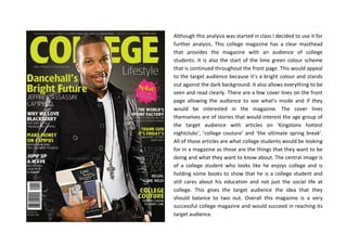
1. Although this analysis was started in class I decided to use it for
further analysis. This college magazine has a clear masthead
that provides the magazine with an audience of college
students. It is also the start of the lime green colour scheme
that is continued throughout the front page. This would appeal
to the target audience because it’s a bright colour and stands
out against the dark background. It also allows everything to be
seen and read clearly. There are a few cover lines on the front
page allowing the audience to see what’s inside and if they
would be interested in the magazine. The cover lines
themselves are of stories that would interest the age group of
the target audience with articles on ‘Kingstons hottest
nightclubs’, ‘college couture’ and ‘the ultimate spring break’.
All of those articles are what college students would be looking
for in a magazine as those are the things that they want to be
doing and what they want to know about. The central image is
of a college student who looks like he enjoys college and is
holding some books to show that he is a college student and
still cares about his education and not just the social life at
college. This gives the target audience the idea that they
should balance to two out. Overall this magazine is a very
successful college magazine and would succeed in reaching its
target audience.
2. This magazine has the same name as the previous magazine
but it can be told by the cover lines that it’s a different sort of
magazine. Although it is still a college magazine this one
seems to focus more on balancing out the social life side
andthe educational side of college, well that’s what the cover
and cover lines suggest that to me. I think that the main
image and anchorage text for it would appeal to the target
audience of college students because it’s Mike Posner, a
singer that they would be interested in. In the anchorage text
it refers to one his songs and this would again appeal to the
target audience. The cover lines would appeal to the target
audience because they are on topics that young people are
around all the time. For example “I slept with my professor”
would interest them because it’s gossip and young people like
gossiping, they would want to read the story. And then a
couple of educational ones like “should I break up… with my
major?” is a good one because it’s incorporating student life
of relationships and breaking up but then switching to what
they’re majoring in. The magazine is “100% free” which allows
students to read without having to pay which can be essential
to college life as students don’t tend to have a lot of money.
Overall I think this magazine would definitely appeal to the
target audience because it balances out the two sides of
college well and includes many cover lines that would interest
them.
3. I think this contents page already appeals to the target
audience because it’s funky and the colours are bold and
that’s the type of thing that young people like. This is the
contents page for the video issue which shows that this
magazine does special issues which can reach out to the
students of the college. The layout of the contents page is
easy to follow and then the “also in this issue” feature
would appeal to the target audience as it involves graphic
features so the students eye would be drawn towards them
and then they can see the page numbers by the side of the
graphic features and find out where to look for the stories
that interest them and they want to find more about.
Overall I think that this contents page works well and would
appeal to the target audience.
4. Simply set out for college students to follow and find out
where the stories that interest them are. The contents
page title says “what’s inside?” not contents page like
other magazines, makes it interesting and different to
other magazines. Regulars are in their own section in the
bottom left corner; this allows young students to see
what their college magazine offers every issue. A
welcome message to students making them feel a part of
the college magazine and like it’s made for them. Graphic
features of stories inside the magazine, making students
more interested and are able to see pictures of how good
their college is. Page numbers are a standard way to
work out what’s where and how to find it. Information
about the stories help the students to see what they
want to read. Logos of companies that the college is
connected with allowing the students to see who the
college is involved with and what they do. Overall this
contents page would really apply to the target audience
of young college students and would make them want to
read their college magazine.