
Recommended
More Related Content
What's hot
What's hot (20)
Viewers also liked
Similar to Codes and conventions of a contents page
Similar to Codes and conventions of a contents page (20)
More from lucy_reynolds
Recently uploaded
Recently uploaded (20)
Codes and conventions of a contents page
- 1. Codes and Conventions of a contents page
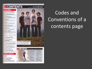
- 2. Main Image: this is usually an image of the main feature article, the main image is important as it will connote the genre of the magazine. Captions on the image: this explains the image, such as who it is, and what’s the article about.
- 3. Page numbers: these are next to each head line, they are always in chronological order per section and, big and bold to stand out and with this they are in a different colour. Head lines: these are the titles of the articles, they are usually in bold lettering and in capital letters to stand out to the reader.
- 4. Masthead: this is usually placed along the top of the page, it is in a block of colour to stand out to the reader. This identifies the magazine to the reader. Date of release/ contact details: this gives information to the reader. It also tells us how we can contact the magazine.
- 5. Categories: this sections is the special features/ every month/ news/ reviews. These are highlights of the magazine and are in a different colour to the magazine however still keeping with the colour scheme, the heading, in this case is “ every month” is in a block of colour.
- 6. Typography: this will be the same font used throughout the magazine, it signifies the genre and is also readable to the reader. Font size between 12pt and 13pt for headlines and sub lines are usually 11pt. Colour scheme: the colour scheme will connote the genre and be the same throughout the magazine. It will consist of 2-4 main colours which match the front cover.
- 7. Subheadings: this gives extra information of what each article is about. This entices the reader to read the articles. Graphics: these are blocks of colours or shape, these are used to entice the reader into the article.
- 8. Columns: 2-3 are used, this is to split the magazine up and make it clear for the reader to read or find information easier. Subsidiary images: these are other images of articles that feature within the magazine. Line gaps between sections to break up the information.