3. Text and colour research
For the text on my cover and contents pages I used Tw Cen MT
Condensed Extra Bold for the bigger, more important things such as the
Masthead or important Headings, while for the smaller text and less
important I used Times New Roman.
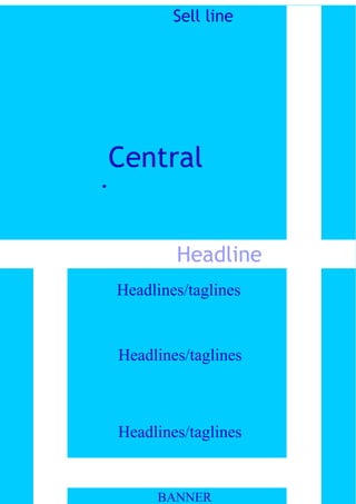
The colours I chose for my third music magazine draft were two
shades of light blue and white. The lighter of the blues was used for the
background and the darker blue for text so it stands out. I used white
strips across and along the cover and contents to make it look different
and more appealing. The Masthead of both the cover and contents page
are in white and bold so they stand out from the rest of the text at the
top centre of the page.