The document summarizes key design elements of a magazine page layout. Images are situated down the left side depicting different genres to appeal to various readers. Subheadings in all capital letters and a larger text size emphasize the section topics. A consistent red, white, and black color scheme throughout the magazine helps with branding and makes it seem more professional.
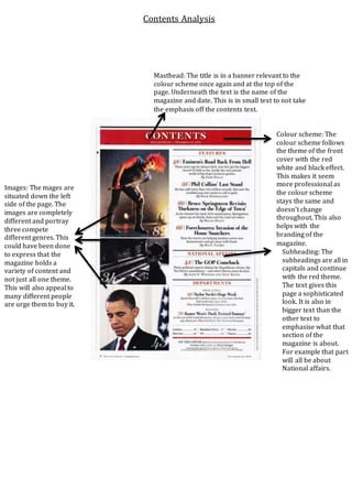
1. Masthead: The title is in a banner relevant to the
colour scheme once again and at the top of the
page. Underneath the text is the name of the
magazine and date. This is in small text to not take
the emphasis off the contents text.
Images: The mages are
situated down the left
side of the page. The
images are completely
different and portray
three compete
different genres. This
could have been done
to express that the
magazine holds a
variety of content and
not just all one theme.
This will also appeal to
many different people
are urge them to buy it.
Subheading: The
subheadings are all in
capitals and continue
with the red theme.
The text gives this
page a sophisticated
look. It is also in
bigger text than the
other text to
emphasise what that
section of the
magazine is about.
For example that part
will all be about
National affairs.
Colour scheme: The
colour scheme follows
the theme of the front
cover with the red
white and black effect.
This makes it seem
more professional as
the colour scheme
stays the same and
doesn’t change
throughout. This also
helps with the
branding of the
magazine.
Contents Analysis