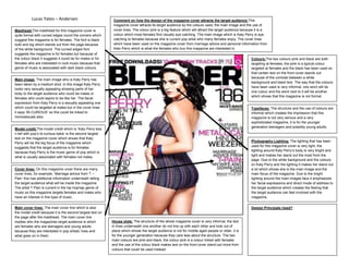
1. Lucas Yates – Andersen Comment on how the design of the magazine cover attracts the target audience:This
magazine cover attracts its target audience by the colours used, the main image and the use of
Masthead:The masthead for this magazine cover is cover lines. The colour pink is a big feature which will attract the target audience because it is a
quite formal with curved edges round the corners which colour which most females find visually eye catching. The main image which is Katy Perry is eye
suggest this magazine is for females. The font is black catching to females because she is current pop artist who many females enjoy. The cover lines
bold and big which stands out from the page because which have been used on the magazine cover from marriage advice and personal information from
of the white background. The curved edged font Katy Perry which is what the females who buy this magazine are interested in.
suggests the magazine is for females but because of
the colour black it suggests it could be for males or for Colours:The two colours pink and black are both
females who are interested in rock music because that targeting at females, the pink is a typical colour
genre of music is associated with dark black colours. targeted at females and the black has been used so
that certain text on the front cover stands out
because of the contrast between a white
Main image: The main image who is Katy Perry has
background and black text. The way that the colours
been taken by a medium shot. in this image Katy Perry
have been used is very informal, one word will be
looks very sexually appealing showing parts of her
one colour and the word next to it will be another
body to the target audience who could be males or
which shows that this magazine is not formal.
females who could aspire to be like her. The facial
expression from Katy Perry is a sexually appealing one
which could be targeted at males but in the cover lines Typefaces: The structure and the use of colours are
it says ‘BI-CURIOUS’ so this could be linked to informal which creates the impression that this
homosexuals also. magazine is not very serious and a very
sophisticated magazine, it is for the younger
generation teenagers and possibly young adults.
Model credit:The model credit which is ‘Katy Perry kiss
n tell with pop’s bi-curious babe’ is the second largest
text on the magazine cover which shows that Katy
Photography Lighting: The lighting that has been
Perry will be the big focus of the magazine which
suggests that the target audience is for females used for this magazine cover is very light, the
because Katy Perry is the music genre of pop which is lighting around Katy Perry’s body is very bright and
what is usually associated with females not males. light and makes her stand out the most from the
page. Due to the white background and the colours
on Katy Perry and the lighting it makes her stand out
Cover lines: On this magazine cover there are many a lot which shows she is the main image and the
cover lines, for example, ‘Marriage advice from T – main focus of the magazine. Due to the bright
Pain’ this has additional information underneath telling lighting around the main images face it emphasizes
the target audience what will be inside the magazine. her facial expressions and direct mode of address to
The artist T Pain is current in the hip hop/rap genre of the target audience which creates the feeling that
music so this magazine targets females and males who the target audience can feel involved with the
have an interest in this type of music. magazine.
Main cover lines: The main cover line which is also Design Principals Used?
the model credit because it is the second largest text on
the page after the masthead. The main cover line
implies who the magazines target audience is which House style: The structure of the whole magazine cover is very informal, the text
are females who are teenagers and young adults in lines underneath one another do not line up with each other and look out of
because they are interested in pop artists’ lives and place which shows the target audience is not for middle aged people or older, it is
what goes on in them. for the younger generation because they care less about the structure. The two
main colours are pink and black, the colour pink is a colour linked with females
and the use of the colour black makes text on the front cover stand out more from
colours that could be used instead.