1. Colour– 4 colours used; red, gold, white, black – quite simple and basic. Quite common for a Design Principle Used – it follows the Rule of thirds design principle
magazine cover to use the same colours through the cover and a small range of them it keeps on the magazine as the top left third of the cover is the huge
Salford City College the cover basic and simple, also more formal. For example the colour gold is used as it is masthead of Q and the big main image attracts the viewer to it as it
Eccles Centre symbolised to mean wealth, fame, power, and this suggests that the people in the magazine is in control of the majority of the thirds of the magazine.
AS Media Studies and the main image are associated with this. Also the colours used are brighter, cheerful
Foundation Portfolio covers suggesting that the magazine brings almost good news to the audience.
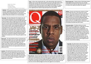
Dominic Hayes Q Magazine Cover Analysis
Masthead– “Q” big, unusual type of design, huge font, the titles in
the corner. Recognisable it is easy to remember, short, bold, red Typefaces– The text is more formal and is common as it frames
and white colours, top left hand corner so it is less formal. A the main image of the cover, a more mature font is used to
unique design of the masthead which has a strong impact on the appeal to a more mature audience and the style of the writing is
audience it helps them remember it as it is short and simple formal this suggests that it is aimed at an older audience. The
typical convention of text framing the image is included here. The
selling line of the cover is the top of the page going straight
Main image– The unique selling point of the magazine cover, the
across covering the whole top line saying “The 10 most exciting
centre of attention meaning he is the central protagonist of this
people in music now” this suggests that the magazine has a
cover. The size of it is big and in the centre of the page, placed there
whole load of stars in just for the audience to read about, appeals
so that the audience notices it straight away and once they notice
to the audience and makes them want to read it.
who the star is they instantly become gripped and want to read the
magazine, it attracts readers and attention to the magazine through
the use of this star profile. The star is giving direct address to the Photography Lighting– The lighting is high key, the white
camera and this is used to make the audience feel like they are background. Giving it a suggestion he’s a bright figure, the colour
connecting with the star, this is a typical convention of what you white is usually connoted with heaven, god, sparking a
would expect on a music magazine cover, a big star that is known suggestion that Jay-Z is being shown as a godlike figure in the
worldwide for his achievements. This is a relation to the uses and music industry. It surrounds the indication that his serious look
gratifications theory that if you read this magazine you will get the with the close up shot used it suggesting he is a serious man and
inside view on stars and find out more about them how to be and takes care with his work. This look also links to his style of music;
dress like them. He himself is an ideology to having this perfect rap. It is a serious type of style he does. The lighting is bright and
lifestyle that everybody wants. Fame, money, girls, appeals to male dominates the stars face this is showing his full face to the
audience audience which appeals to females who would love a man like
Jay-Z and it’s near enough seductive to the female gender. He is
Model credit– The model credit that is shown is not directed at the stereotyped with the type of music he does through the serious
main image of the magazine cover so it is quite unique and unusual, look that is represented by the lighting.
it is formal, but the artists stated of the model credit is a different
colour so that aspect is not formal of the magazine cover. For
example it says “Muse? That guy is a superstar” this appeals to the House Style– The colours that are used on this cover are
audience and fans of this artist as this also connotes that the whole used to show different meanings and connote things to the
magazine is packed with stars so the target audience of the cover is star of it that is the main image; the cover is more direct
widened due to this. and less relative to the main image itself which is unusual
to most magazine covers. Also the colours that are used
automatically suggest it is formal and indicates that the
Coverlines– The Coverlines that are shown on the cover are not target audience may be older and more that style. The
related or direct to the main image whereas the main cover line is. colour also suggests it is more aimed at the male audience
The Coverlines are aimed at other artists, suggesting that there is a as they are linked to men more the colours. The size and
lot in this magazine for the reader and it is worth the money they style of the font through the cover is similar so that
pay for it so this therefore appeals through this, it gives the reader a Main cover line– The main cover line of the magazine cover is the star of the main images name, this indicates it is more formal. The placement of the image is
very brief text to what their story in the magazine will be about, suggests that the magazine will be about him mostly in an article through it, that this star is so big he empathised by the photography lighting with a bright
gripping them to buy and read. gets to be the centre of attention on this issue of the magazine. It appeals to fans of Jay-Z and a more symbolisation. The image is in the centre to be the unique
male audience, more likely an old teens-middle age.Which maybe even listen to his music and enjoy selling point of this it is a convention of placement on
it, follow him round for gigs that he does?He is the star profile of the cover and the fact the main magazines and it is there to be centre of attention.
cover line is his name in bold and biggest size of the cover suggests he is very important.