1. Lucas Yates – Andersen
Media Studies A2
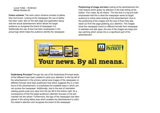
Colour scheme: The main colour scheme consists of yellow,
blue and brown. Looking at the newspaper the use of yellow
has been used, also on the web page and application along
side the actual advertisement which allows the target
audience so recognise the brand of newspaper it is.
Additionally the use of blue has been emphasises in the
actual logo which helps the audience identify the newspaper.
Positioning of image and text:Looking at the advertisement the
main feature which grabs my attention is the bold writing at the
bottom ‘Your news. By all means.’ The fact that it is big and bold
emphasises that this is what the newspaper wants its target
audience to notice when looking at this advertisement. Due to
the positioning of the images and the size of them they also
stand out from the page grabbing your attention. The images
show the newspaper brand on different formats from newspaper
to websites and web apps, the size of the images are large and
eye catching which shows this is a significant part of the
advertisement.
Guttenberg Principal:Through the use of the Guttenberg Principal areas
of the billboard have been created to catch your attention. In the top left of
the advertisement in the primary optical area images of the newspaper on
different formats have been positioned here which suggests this is a main
focus of the advertisement, to emphasise the available ways in which you
can access the newspaper. Additionally, due to the axis of orientation
reading gravity pulls your eyes from the top left to the bottom right. As a
consequence of this the target audience’s attention focuses on the text
inserted into the advert. Furthermore, the logo of the newspaper has been
placed in the strong fallow area which enables the advertisement to catch
the viewer’s attention and recognise the brand of the newspaper.