
Recommended
More Related Content
What's hot
What's hot (20)
Viewers also liked
Similar to Research
Similar to Research (20)
Research
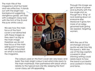
- 1. The main title of the magazine is short but bold Through this image we and very effective, it stands get a sense of power out with the bright red and authority with the background suggesting low angle shot as dangerous gossip, yet stays though he is ‘King’ of with a elegant classy look rock looking down on with the font of the Q and everyone else. the pure white colour. Moreover it gives him more of an edgy groomed look giving We see how the main sex appeal, targeting focus of the front women. cover is not distracted with these images as they aren't as big as the main image therefore we do not With the use of this lose focus of the main anchorage and pull selling point however quote we see how big we still get educated this band is. With the on what is included in use of the big capital's the magazine. covered in silver shinning writing could The colours used on this front cover are very basic and relate back to how bold. The main bright colour is red which links back to the band is successful the main masthead, then partnered with black which and coated in money relates to the typical rock star life, keeping the front and fame. cover classy yet still appealing.
- 2. Unlike the front cover we get more in the contents page, revealing more of what is in the magazine and also giving us more to look at. We see how the magazine is very consistent as it stays with the main colour of red by doing this is allows us to focus on the main information we need to look at. Alongside the writing we get more pictures, with some out doing the others through size and focus. Some of the images are even over lapping the others like some sort of collage, which shows how busy this contents page is. Allows the consumer to think they have a lot more then what they paid for, as with all the information closer together it makes you think there's a lot included within the magazine. We now have more writing on these pages, which could indicate how the main target audience is readers and people who like to find out more, therefore more of the older generations would buy a magazine like this.
- 3. Through this double In contrast to the black and page spread it seems white, we now get an image as though we are with a lot of colour especially getting the double life red which could show Pitbull’s to Pitbull, with the use seductive naughty side of half the page being appealing to the female black and white it audience and also could show could relate to his past how he lives two lives. Where and who he is. the black and white side may Moreover, we see how be more of his personal life he is placed right in the including his past and journey centre of the page to get famous, then leading to underneath the bold the more colourful and bright banner. Its as though picture symbolizing his life now, he is dangerous and with the fame, money and the bold yellow banner success. is a restriction for the audience from Pitbull. The use of the language is very harsh and standout. It makes readers think and read twice as they try to guess the aims behind the quote. The clear use of oxymoron is used through the two terms ‘loveable’ and ‘asshole’ which creates some humour. This targets the audience through the mode of address as this wouldn’t be seen in a children’s or even young teens magazine, evidently shows how it is aimed at people 16-40 as it is the type of language used in that age group.
- 4. The masthead is covered by the heads of the artists. However it still links to the danger of the rock band, with the use of the crack in The front cover of this the wording. It allows us magazine is very busy to think they are and cluttered, which can breaking through the link to how the lifestyle of music industry. a rock star is. Moreover, with the use of the skyline it promotes what else is being sold within the magazine and the sell This image lives up to the line with the free posters stereotypes as it shows two makes the consumer rock stars covered in believe they’re getting tattoo’s with dark hair and more. vicious faces. Moreover we see the rebellious side as the spray cans show how they do what they please. Also with the use of the word ‘warped’ we The colours are very important on a front cover as they can reveal understand how the tour the target audience. On this front cover, the main colour is blue has been bent and twisted which could demonstrate they are cool which can be aimed at according and suiting teenagers and rock lovers. It is less likely older generations would them. buy this magazine as it does not appeal to them in anyway.
- 5. This contents page is very simplistic and Unlike the other contents straight to the point. It page there is only one gives us the page focus which is the big number and a title image that takes up ¾’s of with a little description. the page. It is another This keeps it short picture of a rock band allowing the reader to sticking to the obvious read on. Moreover, it theme, but can appeal to appeals to the a more open range of audience as people as the band is well stereotypically rock known and established in stars are usually lazy, the rock industry. In therefore this change to the front cover magazine seems to we see this page to be consist of more images more clear and structured, than writing. whereas the front cover was messy and over flowed with images and writing.
- 6. The main title relates back to the front cover with the spray cans leading to graffiti and rebellious behaviour. Moreover as it takes up a big space of the page it becomes a main focus, alongside with the colours used as they are bright and colourful and look like flames of fire. This image is a mid shot showing half of the This is a big eye artists body revealing catcher as the his tattoo’s and skin. reader would want This could act as a sex to find out more appeal to the female about his past and audience members, as negatives, and why he looks onto the he was in a bad reader. His face looks place. that is why more bigger and this quote has been defined as his pulled out of the expression screams text, to make the mystery an seriousness, contents seem as he reveals all about interesting. his life and the last tour. On this double page spread we get a lot more writing to the Q magazine. This gives us a more detailed description to the rock stars life, which allows us to think all is being revealed.