Recommended

Recommended
More Related Content
Similar to Newspaper Billboard Analysis 3
Similar to Newspaper Billboard Analysis 3 (20)
More from lucasyatesandersen
More from lucasyatesandersen (20)
Newspaper Billboard Analysis 3
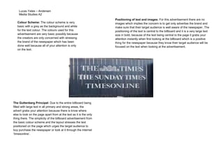
- 1. Lucas Yates – Andersen Media Studies A2 Colour Scheme: The colour scheme is very basic with a grey as the background and white for the text colour. The colours used for this advertisement are very basic possibly because the creators are only concerned with stressing the brand of the newspaper which has been done well because all of your attention is only on the text. The Guttenberg Principal: Due to the entire billboard being filled with large text in all primary and strong areas, the advert grabs your attention because there is know where else to look on the page apart from at the text as it is the only thing there. The simplicity of the billboard advertisement from the basic colour scheme and the layout stresses the text positioned on the page which urges the target audience to buy purchase the newspaper or look at it through the internet ‘timesonline’. Positioning of text and images: For this advertisement there are no images which implies the concern is to get only advertise the brand and make sure that their target audience is well aware of the newspaper. The positioning of the text is central to the billboard and it is a very large text size in bold, because of the text being central to the page it grabs your attention instantly when first looking at the billboard which is a positive thing for the newspaper because they know their target audience will be focused on the text when looking at the advertisement.