1. Lucas Yates – Andersen
Media Studies A2
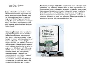
Colour Scheme:The use of colours on this
billboard advertisement is very minimal with
the use of only two colours, white and green.
The white background allows the text and
image to stand out and grab your attention
visually. The green stems from the newspaper
Metro’s main colour. The consistency of the
green ables the target audience to recognise
the brand easily.
Guttenberg Principal: At the top left of the
page in primary optical area the main focus
of the advertisement has been positioned
here which is the large text. Due to the text
being in the primary optical area it stands out
from the billboard the most enabling the
target audience to look at the text because of
its importance to the advertisement. Reading
gravity pulls your eyes from the top left of the
page to around the bottom right of the page
which is where an image of the newspaper
has been inserted, due to image being
positioned here and it grabbing your
attention secondly from the text it suggests
this is also a main focus of the
advertisement, possibly to show the target
audience what the newspaper will look like
and also become familiar with the brand.
Positioning of images and text:The advertisement on the billboard is simple
yet effective. The positioning of the text at the top of the page stands out the
most when you first look the billboard because of the boldness of the text and
the actual size, because of this it implies that the main focus of the advert is
the text. The second part of the billboard advertisement is the image of the
Metro newspaper and two hands sharing which suggests the newspaper is
communal and free to the public. The positioning of the image also allow the
audience to recognise what the newspaper looks like.